| Image |
Comment |
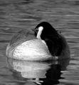
| 09/30/2003 06:06:15 PM |
Resting after the stormby PirateDiversLtdComment: Eeugh!! Sorry, but I really don't like the color adjustment that you've done on this. Color adjustments should be subtly used to draw highlights or achieve a look that's better than original - I daresay the original would have looked better. |
| 09/30/2003 06:04:02 PM |
|
| 09/30/2003 06:02:25 PM |
Baskingby DigitalGravyComment: There are too many hot spots on this photograph. If your camera has exposure lock and is able to be changed to spot, you should set it to spot and take your reading from the brightest point of the photo - ie the lizards back. Otherwise its taking the luminance of the entire photo and takes it to 17% gray (or something like that) Could have been a great shot otherwise! |
 Photographer found comment helpful. Photographer found comment helpful. |
| 09/30/2003 06:00:16 PM |
Afternoon snoozeby justineComment: Great idea and photo. Watch your thirds. As your subject is looking to the right, he should be positioned in the left hand third looking into the space. |
| 09/30/2003 05:58:10 PM |
"Pray"by smellyfish1002Comment: Amazing!!! I love it! Wonderful lighting and exposure - the detail is fantastic! This is my favourite thus far! |
| Photographer found comment helpful. |
| 09/30/2003 05:56:39 PM |
A Night of Restby NicNic101Comment: If this had have been executed better (ie focus right and lighting manipulated to suit) and the crop not so savage top and bottom, this may have been a great shot. The DOF would have been nice with the other cat in the BKG. |
| Photographer found comment helpful. |
| 09/30/2003 05:55:06 PM |
Cowgirl at Sunset by Firstrich1Comment: This is great! Nice job on the contrasting againt the background. The only thing that I would say is that if there was more colour in the background, it would fit with the 'outback' theme better. A very well executed shot! |
| Photographer found comment helpful. |
| 09/30/2003 05:52:17 PM |
z z z z zby vtruanComment: I think this would have looked better in colour. However its still a great shot! Well done :) |
| Photographer found comment helpful. |
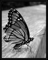
| 09/28/2003 08:29:59 PM |
Tattered And Tornby jmsetzlerComment: I was going to suggest color, but I really like it in B&W too! The gradients in the colors are really emphasised in B&W and its different. Why does it all have to be in colour? |
| 09/28/2003 08:28:09 PM |
|
| Photographer found comment helpful. |
Home -
Challenges -
Community -
League -
Photos -
Cameras -
Lenses -
Learn -
Help -
Terms of Use -
Privacy -
Top ^
DPChallenge, and website content and design, Copyright © 2001-2025 Challenging Technologies, LLC.
All digital photo copyrights belong to the photographers and may not be used without permission.
Current Server Time: 04/07/2025 05:53:18 AM EDT.