|
|
| Image |
Comment |
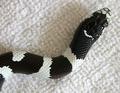
| 03/24/2003 05:02:08 PM | baby snakeby LanSnakeComment: Greetings from the Critique Club!
COMPOSITION... Mostly favorable composition... I would have loved to have seen this against a more solid background..white or black, to go with one of the snake's colors. Would look less like its shot in the house also... Might also be nice to get more of the snake in a more coiled or windy position, but like this is good also!
TECHNIQUE... There is a little details lost in the shadows. Perhaps your monitor does not show this but I try to keep mine calibrated. This could be fixed in photoshop if the information is there, or by exposing the shot a little more, but I wouldn't go much more. Focus is also not as sharp as it could be, perhaps due to the wide aperture. I tried sharpening the image in Photoshop and it does help the focus somewhat. Every image always needs a little sharpening :) Only thing left would be the slightly uneven lightning on the background. If you ever find this to be a problem in natural light, try using a reflective surface to bounce light back into areas that may not be lit properly. Overall though, its still a compelling and effective shot of a snake. |  Photographer found comment helpful. Photographer found comment helpful. |
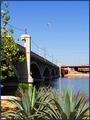
| 03/21/2003 04:48:23 PM | Tempe Town Lakeby rcrawfordComment: Greetings from the Critique Club!...
COMPOSITION... The scene is well exposed and lit, nice vivid colors...nice deep blue sky,,, if you're not using a polarizer you should try it and see how bluer the sky turns out :) Two things I'd mention composition-wise... The airplane is way too small to make much of an impact in the scene. I would have waited for it to pass. If it were conveniently flying overhead just as you snapped the shutter, that would be another story :) I also find that the orange overpass in the background detracts and clutters up the scene. My crop would be a little lower at the top, and cropped on the right just enough to exclude the orange overpass. I think that even results in a nice leading line in the image...your main bridge would then extend from the left border in the foreground to the right border in the background, strengthening the composition. I like the foreground objects,,,they add interest and almost frame the bridge. Too bad there wasn't overhanging branches of a tree or something similar to complete the frame :)
TECHNIQUE... Light's a little harsh and direct. Some evening or morning light would be excellent. Dramatic clouds too but you can't control the weather :) Nice sharpness, excellent image quality.
OVERALL... With a little cropping I think the composition can even be better, but still a nice colorful shot. I always try to keep elements that are too small to see out of the composition, unless they are part of a larger scheme, like people in a crowd... | | Photographer found comment helpful. |
| 03/17/2003 05:34:37 PM | Dumbarton at Sunsetby lennierComment: Greetings from the Critique Club!
COMPOSITION... This is a powerfully composed shot, with the horizon line along the bottom third of the image, the bridge forming a path for your eye to follow, from one corner of the photo all the way to the other, to the simpleness and clarity of the rest of the shop. All major elements of a strong composition exist: leading lines, rule of thirds, getting close to the subject, keeping the rest simple... What's distracting in the composition is the electrical pylon, and to a much lesser extent the lights on the bridge. I could live with the streetlights - they are evenly spaced and don't really interfere with the image that much but the pylon just distracts the viewer a little too much. A small change in angle would also have eliminated seeing the headlights from the other side of the bridge, leaving fewer of them in the image and creating in my opinion, a more powerful shot. Not much can be done about the pylon short of cloning it out or finding a different viewpoint, but everything else about this angle is appealing ... I would have hated having to try something else just because a pylon happened to be lying about. Perhaps a small shift in angle may have hid most of it behind columns but I doubt that could have helped much...
TECHNIQUE... What meticulous timing! The sunset has rendered a the sky a dramatic shade of blue, given quite a nice glow to the clouds, and the flare from the sun, not to mention the sun's placement itself. really gives the shot that extra something :) The bridge is nicely silhouetted as well.
OVERALL... A simply beautiful shot! Really wish less of the light posts and pylon were around there, but an excellent shot regardless :) |
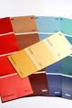
| 03/01/2003 03:48:37 PM | Pick a shade...by efatapoComment: Greetings from the Critique Club!
COMPOSITION... I think the idea behind the shot was interesting, but its execution has left a photo that doesn't have uniqueness to it - has a snapshot quality to it. The crop cuts off a corner of the yellow swatch and the rest seems oddly placed. It is hard to photograph paint samples in an interesting way... you're right - perhaps more would have given the shot something more... More swatches mean the possibility of more of a "fan" effect, and you could have arrange the swatches so the colors follow in a continuous tone. The shape of the fan of color samples could have sweeped across the frame...
Just before clicking always make a final check to ensure all your important elements are within the frame.
TECHNIQUE... I would angle the shot so its directly overhead - I think that approach works best here. At the angle chosen, the light is being reflected back at the bottom of the swatches, which has resulted in an uneven light across the samples.. Other than that, its a clear, clean image.
OVERALL.. A lot more samples could have helped.. Still life shots have the benefit of allowing you all the time in the world to shoot, so try different angles, view points, setups, lighting scenarios. With lots of shooting under your belt you'll soon realize what works and what doesn't, not to mention you'll hone your eyes to pick out interesting compositions with your subject matter. Good luck in future challenges!
|
| 02/27/2003 07:47:30 PM | Delightfully Yellowby margieComment: Greetings from the Critique Club!,
COMPOSITION...composition seems a little haphazard - or rather its a standard placement of objects that can perhaps be improved by using a different viewpoint or arranging the elements in a different or unique perspective. Parts of the banana are bring cropped out of the frame as well. Cropping like this can be okay if intentional, but it looks like an accidental crop here. If you pull out just a tad, the banana would fit completely in the frame. The tablecloth and wooden background are a little distracting. Try using a material (usually a neutral color) that can you can pin up so that the background appears seamless. Or you can try draping it over a chair if you can't pin the material up. If still life photography is your thing, you can find all sorts of interesting backdrops at fabric stores - you can stock up on materials from the bargain bin and I'm sure they'll come in handy for future projects...
TECHNIQUE... the image suffers with focus - I'm not exactly sure why... your aperture is adequate enough...At a shutter speed of 1/1025, I doubt camera shake is a fator. I'm surprise yor shutter speed is that high granting the lighting conditions and your aperture setting... I don't find any part of the photo that's exactly in focus though...some unsharp masking in photoshop could have improved the photo in this area somewhat... a slight boost in saturation also gives your photo an added "punch" Lighting's slightly harsh. looks like you're using a natural light - excellent for still lifes. You can change the angle the light is hitting the objects. Maybe some more side-lighting would help in this case. Or use the warm window light of a rising/setting son...
OVERALL...Hope some of these tips have helped... with some practice, trial and error, and sometimes luck, you can get amazing still life photos with minimal equipment in your own home. Keep trying, and good luck! | | Photographer found comment helpful. |
| 02/26/2003 06:30:59 PM | 120 Seconds of Fameby stephanComment: Greetings from the Critique Club!
COMPOSITION...Interesting background, though it could hurt the eye if you stare at it too long :) Certainly an interesting departure from the usually solid backgrounds. The pattern's a little intense, but it nonetheless makes your subject stand out. Placement of said banana in frame? I'm trying to imagine how the image would look if the two ends of the banana were placed at the intersection points of the imaginary rule of third lines (rotate banana a little more clockwise, etc)... Its hard to say how much an improvement it would be since the shadow would be displaced somehow also and that should be taken into account... As for the shadow, I don't find the way its placed here helps the image - it makes another likeness of the banana that overlaps the actual banana and at an odd angle. I think a slight angled shadow would work better (ie, overhead lighting)
TECHNiQUE... Just two concerns here - banana doesn't seem to be in focus. Close, but not as sharp as can be, and the bright white spot on the banana... its bright enough to have started burning away the detail of the banana surface. You can reduce the intensity of your light source, move it a bit further away, or diffuse the light with some opaque material... Or try to angle your light source so that the effect of the hot spot is reduced by aiming it on t he side of the banana perhaps, or at an area that is already very dark.
OVERALL... A nicely composed and graphic image, strong yellow colors add to its punch, you couldn't fit into the theme any better :) Lighting can be tricky, lots of problems you don't see until after the photo is taken and its too late to do anything about it (in your case you ate your banana :) :) | | Photographer found comment helpful. |
| 02/25/2003 06:45:01 PM | Yellow Bellyby greenem2Comment: Greetings from the Critique Club!
COMPOSITION... While I don't find the subject matter to be particularly evocative on a personal level, I would suppose that if you wanted to take a decent photo of a pillow, this would be it. I like the simplicity of the photo (just a couple of different shades), and you really made the yellowness of the pillow stand out by putting it against a black background and removing color from the hands. I'm not fond of how there's more black space on the left and right sides of the pillow. I cropped a bit off these sides in photoshop and despite it being a small adjustment, I think it justifiably improves the photo. If you wanted to even make the shot more symmetrical after that you could have had another person holding the bottom corners in a similar fashion as the already existing hands :)
TECHNIQUE... Nothing much to add here. You managed to render the background nice and black while keeping the pillow evenly lit... There seems to be more noise than I would expect on the pillow itself...could this be a post-processing result?
OVERALL... Pretty good shot that could have benefitted from some more symmetry since its already halfway there to being perfectly symmetrical :) | | Photographer found comment helpful. |
| 02/24/2003 02:19:32 PM | Homemade card, unmade bedby GordonComment: Greetings from the Critique Club!
COMPOSITION... Not at all bad here, maybe the photo is missing a bit of the elusive "wow" factor, but compositionally I find it sound. The subject is placed nicely off center, I like the contrast between the black and white sheets, and also the shadows falling on the covers - gives the sheets depth and shows their texture a little better. Don't like the way you see the end of the sheet at the bottom center of the image. May sound like nitpicking but it adds a distraction seeing that nowhere else in the photo do you find this feature - the sheets are otherwise continuous and cover the area of the image, and my eye just ends up always falling to that small section.
TECHNIQUE...colors are great, but a little too soft. You're using a very wide aperture which may contribute to the problem, but I have a hard time finding the part of the image that's totally in focus... A little sharpening applied to the image might help somewhat. At 1/8 of a second, i hope the camera was really steady or it may have contributed to the softness of the shot.
OVERALL... This is nonetheless an interesting image. A very small number of elements, few colors provide a simple, but elegant arrangement. |
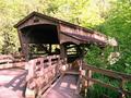
| 02/23/2003 06:42:25 AM | Bridge To My Heartby jerrftComment: Greetings from the Critique Club!...
COMPOSITION... The elements in the photo are presented in a slightly static way. That is, it appears as a straight-on snapshot and can benefit from an interesting angle. Did you try going really low, perhaps more to the left or right, or how about a shot into the tunnel that adds a bit of perspective as you see the road wind off in the distance? Just some possibilities... of course, your goal is to attempt to hide people in the photo and perhaps other vantage points might not have achieve this too well... On a smaller note, since the covered bridge is your main subject, you could have had the bridge fill the frame more, excluding some of the trees.
TECHNICAL... The image is overexposed on the tree section. I would imagine the photo was taken on a very bright sunny day. Some clouds may have diffused the light a bit and allowed you to expose all areas evenly. As it stands, it looks like the light hitting the trees has quite a difference in intensity than the light hitting the subject. Since you don't control the weather, you have no choice in a case like this (without using some kind of graduated ND filter) than to exclude the trees altogether. Moving in close and letting the bridge fill the frame, as mentioned above, is one solution. Finding another viewpoint could be another.
OVERALL..Watch out for harsh lighting conditions where there is a large contrast between the bright and dark areas of your photo, and don't forget to try lots of viewpoints when you find an interesting subject to photograph. |
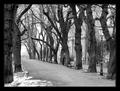
| 02/23/2003 06:24:49 AM | Empty promenade by miracComment: Greetings from the Critique Club!
COMPOSITION... The photo has very strong compositional elements... The path is placed on the lower 3rd of the photo, and the eye naturally follows it from one end to the other. Trees are sometimes difficult to arrange in a pleasing manner, but here they are at even spaces away from each other, and I like how dow the road, two branches almost seem to meet and form an arch over the roadway! Nothing else clutters up the picture... As for the person, as a standalone photograph, if an element like this is too small and obscured to see, then I don't find it does much for the photograph, and can even hurt it in fact - since its something that doesn't have to be there - if an element can be removed without it seriously affecting the mood and strength of a photo, then its extraneous and shouldn't be there. But challenge-wise, without it the photo could have scored lower. I think its the nature of the contest that caused all these small elements to be in photos that didn't need them.
TECHNIQUE... Great choice of black and white.. might not have been as strong if you stuck to color. The contrast is just excellent - adding an extra punch to your image. Sharp, clear image, and neutral, effective border...
OVERALL... An excellent shot!, Congratulations on your first place win! | | Photographer found comment helpful. |
Home -
Challenges -
Community -
League -
Photos -
Cameras -
Lenses -
Learn -
Help -
Terms of Use -
Privacy -
Top ^
DPChallenge, and website content and design, Copyright © 2001-2025 Challenging Technologies, LLC.
All digital photo copyrights belong to the photographers and may not be used without permission.
Current Server Time: 04/11/2025 04:40:43 PM EDT.
|