| Image |
Comment |
| 05/09/2007 11:16:39 PM |
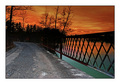
Burning Bridgeby FauxtoemanComment: Greetings from the Critique Club.
Hi Jae,
Welcome to DPC. Well done on your second submission.
Wonderful rich colours here, although the whole does look a bit unnatural. The colours in the sky are remarkable, and such a contract to the lit road stretching forward. The leading lines of the road run the eye right off the image, drawing it away from your colours.
Not really sure what you have done in post-processing so the following may be off track. The colours on the water look a bit odd - the sky is all orange, but in the water the reflection contains pink and quickly transisions to blue. It just looks a bti unnatural to me (which doesn't mean it is unnatural.
It is my hope that these insights are helpful and constructive. Please feel free to PM me if you have any questions regarding this critique. And please remember to mark it "Helpful" if you found it so. Good luck with future challenges.
Cheers
Paul |
 Photographer found comment helpful. Photographer found comment helpful. |
| 05/09/2007 10:36:45 PM |
Phantom of the ruinsby thorgilsComment: Greetings from the Critique Club.
Hi Thorgils,
Well done for going for such a different concept for your submission. IT's always a bit of a risk to try these sorts of things on DPC. Per the comments you have already recieved this is haunting, or a bit spooky - depending on how you interpret it. In this respect you have doen a greta job of layering the 'phantom' into the ruin in a convincing fashion. I only part a bit less convincing is the side of his face where his left eye is - because the background is much lighter there it looks a bit odd. I think the whole would have been better if you had shrunk the phantom and shifted him to the left a bit.
It is my hope that these insights are helpful and constructive. Please feel free to PM me if you have any questions regarding this critique. And please remember to mark it "Helpful" if you found it so. Good luck with future challenges.
Cheers
Paul |
| 05/09/2007 10:03:23 PM |
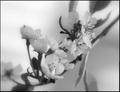
Pear Blossomsby Shea927Comment: Greetings from the Critique Club.
Hi Hannah,
I think you have had some useful comments on this already (and soem less so). I would like to start with the positive - you have put together a lovely composition, I especially like the sense of depth and the curve of the lives from the top right towards the bottome left.
You have had a few comments to the effect that it is not sharp enough/too soft or out-of-focus. I note that you put in the soft focus (I suspect you did the same with yout triptych entry). The main problem to me seems to be that there is no clear focal point to really enage the viewer. I would love to see this image with just the front blossom in sharp focus and the rest as it is. With perhaps a slighty tighter crop on the left. Then the flow of the lines would lead the eye to the focal point. Maybe.
There are also a few comments on your choice to go for B&W. The tona contrast of the image certianly does look flat, but that doesn't mean going for B&W was a mistake. What method did you use to convert to B&W? I recommend first finding out which channel has the best contrast, and then using the channel mixer to convert to greyscale.
It is my hope that these insights are helpful and constructive. Please feel free to PM me if you have any questions regarding this critique. And please remember to mark it "Helpful" if you found it so. Good luck with future challenges.
Cheers
Paul |
| Photographer found comment helpful. |
| 05/09/2007 09:36:09 PM |
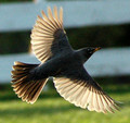
Unfriendlyby HizzleComment: Greetings from the Critique Club.
Hi Hizzle,
This is indeed a striking image. You have done an excellent job of making that eye piercing - a very effective use of selective desaturation (and a bit of selective saturation too). It combines to give a high-impact impression. I love the funky 'hairstyle' of the featehers, and think you have done a good job on the texture and sharpening here - it would have been easy to over do it, but you haven't. I don't think that the overall image gets much from the negative space to the left and right of the bird; a better crop in my opinion would have been closer horizontally, and with a bit more vertical to include the top of those interesting feathers.
It is my hope that these insights are helpful and constructive. Please feel free to PM me if you have any questions regarding this critique. And please remember to mark it "Helpful" if you found it so. Good luck with future challenges.
Cheers
Paul |
| Photographer found comment helpful. |
| 05/09/2007 01:26:37 AM |
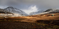
Welcome to the valleyby eliniasComment: Greetings from the Critique Club.
Hi Karl,
A superb landscape vista. What I realy like is the sense depth in this shot - nice use of the wider-angle. The dappled patches of light on the plain do a ncie job of keeping the attention focused. In your notes you mention the moody weather. I really would have liked to see more evidence of this - especially in the texture of the clouds. It was expert editting after all so you could have put in soem nice dodging and burning to really emphasise this. Still, 6.2x with no 1s, 2s or 3s is a good outcome.
It is my hope that these insights are helpful and constructive. Please feel free to PM me if you have any questions regarding this critique. And please remember to mark it "Helpful" if you found it so. Good luck with future challenges.
Cheers
Paul |
| Photographer found comment helpful. |
| 05/09/2007 01:06:58 AM |
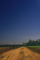
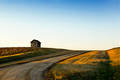
Dirt Roadby yondermanComment: Greetings from the Critique Club.
Hi Matt,
A good long-exposure shot. Always good to experiment with these. The first thhing I notice about this shot is the apparent inconsistency between the sky and the ground - they juts don't look like they go together. The ground looks as if it was light seperately (although in all likelyhood thsi is as a result of post-processing).
Regarding the post-processing. While I'm note really sure what you did, it looks to me like you were focusing very much on the sky and didn't pay enough attention to how the ground was being impacted - specifically with the green of the grass looking too saturated. You could have masked this out.
Another thing you could have done would be to decrease your aperture to f/10 or so. This would have created flares on your light-sources. If this worked on the stars the sky could have been more engaging.
It is my hope that these insights are helpful and constructive. Please feel free to PM me if you have any questions regarding this critique. And please remember to mark it "Helpful" if you found it so. Good luck with future challenges.
Cheers
Paul |
| Photographer found comment helpful. |
| 05/09/2007 12:55:15 AM |
Transparent Freedomby sweetnessComment: Greetings from the Critique Club.
Hi Lar,
Welcome to DPC! Congratulations on your first submission. It's very brave of you to enter a Free Study for your first submission - the voters are always that much mroe critical because there are no subject limitations.
Others have already commented on the noise and general softness in this image. I'm sure you can see it too, so I won't dwell on what is wrong. Instead I will try to help you understand why this has occurred. looking at your Aperature, ISO and Shutterspeed it is easy for me to understand why there is so much noise. The ISO of 1600 is very high, and almost certian to give this much noise with a D70. so how could you reduce the ISO? After all you need the quick shutterspeed to 'stop' the bird. The answer would be to increase the size of the aperture (a smaller f/number). I'm guessing you were near full zoom for this so you could have gone up to f/5.6. This would have drastically increased the size of the hole to let light through when you made your exposure, and would have allowed you to use a lower ISO - maybe 400.
I note that you don't yet have any editing software. There are some on the web that you can download for free that would help you. GIMP is a shareware photo editting product that is pretty powerful. And NeatImage is a noise removal product that has a free demo version. I recommend you take the tiem to download both. A little bit of sharpening would have worked miracles here.
Keep at it, and hope to see more submissions from you soon.
It is my hope that these insights are helpful and constructive. Please feel free to PM me if you have any questions regarding this critique. And please remember to mark it "Helpful" if you found it so. Good luck with future challenges.
Cheers
Paul |
| Photographer found comment helpful. |
| 05/09/2007 12:39:33 AM |
Lines and Lightby ColeyComment: Greetings from the Critique Club.
Hi Cole,
Congrates on a superb take. I'm personally find the score low, but there you go. What absolutely makes this image for me is the golden light and shadows raking across the fields - beautiful. The shed gived a nice focal point, but isn't really what the shot is about.
So I ask myself what is there not to like? Not a lot really. Perhaps you've hedged your bets a bit with the sky - either more or less. I think a centimeter crop off the bottom and left would have helped, but thats just my opinion. I disagree with the comment below about this needing clouds; I think that would have detracted from the overall starkness.
It is my hope that these insights are helpful and constructive. Please feel free to PM me if you have any questions regarding this critique. And please remember to mark it "Helpful" if you found it so. Good luck with future challenges.
Cheers
Paul |
| Photographer found comment helpful. |
| 05/08/2007 09:59:45 PM |
Uncertain Crossingby neophyteComment: Greetings from the Critique Club.
Hi Dexter,
This is a superb shot. Regardless of how it has scored; if this is your kid then I think you should take the time to get it printed. Th child itself could probably do with a bit more sharpening (at this size anyway, its probably fine at full size). Otherwise - lovely.
I'm sitting here pondering the combined effect of the great leading line/vanishign point of the bridge rail and the bokeh in the background. My initial impression was that I liked it, but the more I look at it the more inclinded I am to agree with adeldegan that it is distracting. The problem for me is that the rail leads the eye away from your subject and straight into the bokeh.
It is my hope that these insights are helpful and constructive. Please feel free to PM me if you have any questions regarding this critique. And please remember to mark it "Helpful" if you found it so. Good luck with future challenges.
Cheers
Paul |
| Photographer found comment helpful. |
| 05/08/2007 09:22:56 PM |
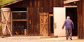
Mike the Eggmanby GeeeComment: Greetings from the Critique Club.
Hi Sharon,
A nice effort - I see what you mean about the gait. You've got a nice characterful chap in the frame, and some nce grainy wood. These, I would say, are the things that you would be wanting to show to your viewers. The lack of detail in the wood is a a big let-down for me. I think this is largely due to the straight-on POV. The first things that I noticed when I opened this shot was the how long and narrow the image was when the subject matter didn't really lean towards such an aspect ration. I'm assuming you went for this crop to include both Mike and the hens on the left. It might have been better to achieve this by shooting from further to the right - that would have brought the two closer together in your frame (and perhaps created soem shadows on the wood). It also would have allowed you to exclude the distracting green grass for the image.
It is my hope that these insights are helpful and constructive. Please feel free to PM me if you have any questions regarding this critique. And please remember to mark it "Helpful" if you found it so. Good luck with future challenges.
Cheers
Paul |
| Photographer found comment helpful. |
Home -
Challenges -
Community -
League -
Photos -
Cameras -
Lenses -
Learn -
Help -
Terms of Use -
Privacy -
Top ^
DPChallenge, and website content and design, Copyright © 2001-2025 Challenging Technologies, LLC.
All digital photo copyrights belong to the photographers and may not be used without permission.
Current Server Time: 04/07/2025 06:11:32 AM EDT.