| Image |
Comment |
| 05/20/2007 09:06:55 PM |
drugs.porn.liquor.by meneleComment: Greetings from the Critique Club.
Hi Mark,
the moment I saw you image I scroleld down to the voting breakdown to find out how hard you had been hit the frump-trolls. Only two 1s is a good starting point. On the whole I think the shot did well. I personally am not really getting an album cover feel, but I find it hard to put my finger on why.
Composition-wsie it looks as if you have executed your concept effectively. The main area for improvement seems to be the quality of the lighting, and the mix of noise-control and sharpness. Lighting is an area where (I am assured) you will never stop learning. In this case I think large diffused light sources would have helped. It may be worth your effort to download NoiseNinja or NeatImage (you can get the demo version of Neat Image free).
It is my hope that these insights are helpful and constructive. Please feel free to PM me if you have any questions regarding this critique. And please remember to mark it "Helpful" if you found it so. Good luck with future challenges.
Cheers
Paul |
 Photographer found comment helpful. Photographer found comment helpful. |
| 05/20/2007 08:41:49 PM |
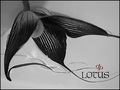
Dubious Parenthetic Lotusby SACComment: Greetings from the Critique Club.
Hi SAC,
Welcome to DPC. Congratulations on your new personal best.
I really like your basic composition here - I find it nicely balanced, and that my eye flows neatly over the image, ultimately being led to the title. There are however a number of negatives to the composition that are lkargely due to the water and the lighting - I really don't like the shadow in the top right and below the flower. I'm not sure what caused the 'scratches' or marks on your background, but these are unnecessary and detract from the rest of the image. Under advanced editting it would have been fairly easy to remove these. There are a number of brighter marks around the edge of the flower that look as if they might be due to over-shapening - they too detract from the good.
On the whole I think this is a great effort that sufferred a bit due to the DPC taste for bright colours and contrast.
It is my hope that these insights are helpful and constructive. Please feel free to PM me if you have any questions regarding this critique. And please remember to mark it "Helpful" if you found it so. Good luck with future challenges.
Cheers
Paul |
| Photographer found comment helpful. |
| 05/17/2007 11:22:43 PM |
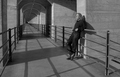
My favourite vanishing point placeby RUEDISCHMUTZComment: This shot deserves a better title. Excellent lighting and shadows. Only negative is that my eyes can't decide if the focal point is the vanishing point or the guy. Regardless, this is a superb shot. |
| 05/17/2007 10:01:32 PM |
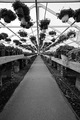
Greenhouse Effectby cloudsmeComment: This somehow gives me a sense of vertigo. Very odd, a real sense of movement. Your various lines leadign to your vanishing point are great. |
| Photographer found comment helpful. |
| 05/17/2007 08:23:04 PM |
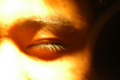
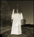
In to Tranceby dogmaNDComment: Greetings from the Critique Club.
Hi Rath,
Welcome to DPC, and congratulations on your first submission. I hope you are not too discouraged from your first showing, and stay involved with the site - it really is the best place to learn.
I think you have had a lot of useful feedback already. Many people didn't feel that you had met the challenge (in their eyes at any rate). I cannot over-emphasise how important it is on this site to clearly meet the challenge. Many also found the image too out of focus. one of the reasons for this is the difficult lighting that you were working under - it would have been much easier with more light.
Please do take the time to mark the helpful comments you have recieved as helpful, to show your appreciation to the commenters.
It is my hope that these insights are helpful and constructive. Please feel free to PM me if you have any questions regarding this critique. And please remember to mark it "Helpful" if you found it so. Good luck with future challenges.
Cheers
Paul |
| 05/16/2007 09:56:36 PM |
Peekby bananashayComment: Greetings from the Critique Club.
Hi Shanna,
This sure satisfies the challenge - nice stopped action here. you've managed to capture a really interesting, enaging pose that garbs the viewers attention, and holds those few seconds while they are voting. This is technically very sound - you've stopped the motion with a fast shutterspeed, and kept the apperature closed enough for your required DOF. The main points I would make have already been covered by both yourself and the other commentors. The drab sky isn't attractive, but you could have mitigated this with a closer crop. Indeed a much closer crop could have removed much of the distracting elements in the frame, such as the other people, the metal, etc. And of course a bit of USM on Jason would have help make him pop out from the busy trees behind him.
It is my hope that these insights are helpful and constructive. Please feel free to PM me if you have any questions regarding this critique. And please remember to mark it "Helpful" if you found it so. Good luck with future challenges.
Cheers
Paul |
| Photographer found comment helpful. |
| 05/16/2007 09:44:04 PM |
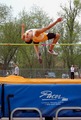
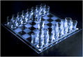
Chess with a twist - Shots of Tequilaby heavyjComment: Greetings from the Critique Club.
Hi Jason,
So; you've been beat up by the DNMC crowd - pretty badly too. The vote distribution tells the story! Some would have marked you down because they don't think chess is a sport, others because they can' see the action (must admit those opening moves are on a par with a golfer walking onto the tee - hardly what the sport is about), and others because they can't see the human element. Is this fair? Not really, but it is their vote to do with as they please.
The above aside lets consider the image itself. I agree with boyd2000 that a lower POV would suit the subject better - giving a greater sense of depth. You've got some lovely lighting, especially in terms of the light on the glasses - I would have loved these reflections to be sharp and crisp. Perhaps the DOF was too short. I see you had a very long exposure. A better approach would probably have been to shoot at f/8 and then lit the scene with a stronger light to keep the shutter speed down.
It is my hope that these insights are helpful and constructive. Please feel free to PM me if you have any questions regarding this critique. And please remember to mark it "Helpful" if you found it so. Good luck with future challenges.
Cheers
Paul |
| Photographer found comment helpful. |
| 05/16/2007 06:32:24 PM |
|
| Photographer found comment helpful. |
| 05/14/2007 07:03:37 PM |
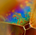
Microcosmby ralphComment: Hi Ralph - well done. Just realised that I gave you 10 for this. |
| 05/13/2007 06:59:11 PM |
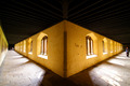
The cloistersby mimidComment: Greetings from the Critique Club.
Hi Michal,
Congratulations on a new personal best. Well done. Helps make that new lens feel worth it.
An awesome perspective, although it takes a moment for the eyes to make sense of the it. I imagine you were near the very wide end of your focal range. You've got some nice interesting light and detail here. The focus looks a bit soft, which I think can largely be put down to the combination of your fast aperture and the huge depth of field in the image. I've found with my wide-angle that I get best results keeping the aperture between f/8 and f/10.
You sure have the Symmetry challenge covered, although it would have been better to have the far sides fo the image similar. My first thought was that a crop on the left would have done the job, but actually I really would have preferred a run of wall down the right edge to match the one on the left. I think this woul;d have served to draw the eye in on both sides, and really high-lighted the symetry in the image.
It is my hope that these insights are helpful and constructive. Please feel free to PM me if you have any questions regarding this critique. And please remember to mark it "Helpful" if you found it so. Good luck with future challenges.
Cheers
Paul |
| Photographer found comment helpful. |
Home -
Challenges -
Community -
League -
Photos -
Cameras -
Lenses -
Learn -
Help -
Terms of Use -
Privacy -
Top ^
DPChallenge, and website content and design, Copyright © 2001-2025 Challenging Technologies, LLC.
All digital photo copyrights belong to the photographers and may not be used without permission.
Current Server Time: 04/07/2025 06:23:01 AM EDT.