|
|
| Image |
Comment |
| 10/16/2007 06:06:28 PM | bitechchotomyby _DaveA_Comment: Greetings from the Critique Club.
Hi Dave,
Well, you got a bunch of really positive comments, as well as a mass of votes in 4/5 space. A 7.57 avg for commenators is pretty good. You really hit a cord with a few people, but not many. Not much below, and with good reason - there isn;t much to dislike.
Its an interesting take to critique - as my eye moves over I personally pass from being really engaged to not very interested at all. Lets consider this. The subject and foreground is superb - there is a sense of movement, and action, and power - lovely lines and swirling dust. Would have liked to see more of the workers face - maybe with soem sweat and a grimace, but understand that you couldn't engineer these things. The near-background of the cars, especially the blow-out on the hood is an annoying distraction, and the far-bacvkground is a lto of negative space that doesn't really add value. I think you got a positive reponse from those who dwelt on your foreground and subject.
What could make this a better image? Not too much considerign the circumstances it was made in. Fo mysefl I would have cropped the top off, and tried to burn the hood of the car and the pole.
It is my hope that these insights are helpful and constructive. Please feel free to PM me if you have any questions regarding this critique. And please remember to mark it "Helpful" if you found it so. Good luck with future challenges.
Cheers
Paul |
| 09/02/2007 09:56:00 PM | |
| 06/03/2007 08:22:27 PM | |  Photographer found comment helpful. Photographer found comment helpful. |
| 05/27/2007 06:20:48 AM | IMG_9947-01.jpgby taljComment: I would give this a 10; maybe even regardless of challenge. Um, no, that would be bad. Still love the shot though. | | Photographer found comment helpful. |
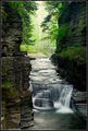
| 05/23/2007 10:40:55 PM | Mold and Corrosion to Flowing Silkby empiresbmComment: Greetings from the Critique Club.
Hi Joel,
Welcome to DPC. Congratulations on your third challenge entry and new personal best.
You have very clearly satisfied the challenge with wonderfully smooth flowing water. I personally think your idea of retaining the corroded stone was effective in off-setting the smoothness of the water, but do agree with comments that imagewould be better if the leaves on the left were excluded. Other than that the composition is not overwhelmignly engaging, I think due to a lack of clear focal point - without the title and challeneg I wouldn't conclude that you were trying to tell me anything about smoothness.
This is a technically sound shot. With ISO at 100, your aperture at F/22, and using an ND filter I see that you have already doen loads to try drag out the shutter.
It is my hope that these insights are helpful and constructive. Please feel free to PM me if you have any questions regarding this critique. And please remember to mark it "Helpful" if you found it so. Good luck with future challenges.
Cheers
Paul |
| 05/22/2007 10:11:39 PM | ... legsby ClayaComment: Greetings from the Critique Club.
Hi Clay,
Is this your leg?
A good concept - many of us have very positive connotations with beautiful, silky-smooth, shaved legs. Unfortunately you haven't really conveyed the idea of silky-smooth here. I think perhaps if there had been more smooth leg, and less ripples of foam it would have doen better. My main issue here is the lighting. There is a little bit of noise in the foam shadows and in the tiles in the background which indicates inadequate lighting. Was this shot under the normal bathroom lighting? The tiles in particular add nothing to the overall image - perhaps a closer crop on the leg would have worked. In conclusion - showing more leg is good.
It is my hope that these insights are helpful and constructive. Please feel free to PM me if you have any questions regarding this critique. And please remember to mark it "Helpful" if you found it so. Good luck with future challenges.
Cheers
Paul | | Photographer found comment helpful. |
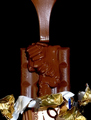
| 05/22/2007 09:53:33 PM | Ribbons of Indulganceby LipstudiosComment: Greetings from the Critique Club.
Hi Andrea,
Congratulations on a very good execution of a very difficult concept. I've learnt from my own experience just how difficult it is to photograph brown chocolate in an attractive fashion. I think you have doen a superb job of getting your lighting just right on the folds of molten chocolate - they look beautifully silky-smooth - this is what your image is about, and is why it did as well as it did. The excessive blow-out on the pouring chocolate however looks harsh; and with this challenge harsh is bad. Likewise the wrapper, especially the gold, is harsh, and detracts from the smoothness. It could be argued that it provides the a contrast to emphasise the smooth, but I think that could have been achieved with less wrapper. One idea might have been to have a white background to brighten the image up - brown on black leaves little scope for your subject to stand out.
It is my hope that these insights are helpful and constructive. Please feel free to PM me if you have any questions regarding this critique. And please remember to mark it "Helpful" if you found it so. Good luck with future challenges.
Cheers
Paul | | Photographer found comment helpful. |
| 05/22/2007 09:31:28 PM | Line of Travelby VenomComment: Greetings from the Critique Club.
Hi Brandon,
Welcome to DPC. Congratulations on your first challenge submission.
Railway tracks were a fairly common choice of subject matter for this challenge - this makes it all the more difficult for you to make your submission stand-out from the crowd. It does however mean that one of the best ways you can learn from this challenge is to look at all the other rail shots, especially those that did well, and really consider what they did differently and what impact it had on the final product. What POV (point-of-view) did they use? What time of the day did they shoot? Where are the shadows? What post-processing did they do? I notice that the first four rail shots all chose a B&W duo-tone conversion to make the shots look out of a different era. They also used a change in the tonality to emphasise the vanishing point - often with the vanishing point itself a bit blown out.
On the positive side, your shot is technically sound, and represents a good starting point: it is in focus and well framed. I think you might want to start developing your post-processing skills so that with similar shots in future you will be better equiped to bring all that is good out of the exposure.
It is my hope that these insights are helpful and constructive. Please feel free to PM me if you have any questions regarding this critique. And please remember to mark it "Helpful" if you found it so. Good luck with future challenges.
Cheers
Paul | | Photographer found comment helpful. |
| 05/20/2007 10:23:59 PM | Diddy 'Photog' Laneby Buckeye_FanComment: Greetings from the Critique Club.
Hi Gayle,
The picture of the pear is pretty darn cool; strangely engaging, and with an odd sense of movement. I know the flames are buring up, but it looks like the pear in falling downwards.
The main thing which has stung you here is your choice of border and text-style. Niether ap(pear) to work with the pear, or even each other. A great shame as you would probably have scored much better with a simple text style and no border.
I don't really get the Diddy 'Photog' Lane link. Perhaps a better title would have been something like Dangerous Pear Light (or something) to directly associate the image with the title.
It is my hope that these insights are helpful and constructive. Please feel free to PM me if you have any questions regarding this critique. And please remember to mark it "Helpful" if you found it so. Good luck with future challenges.
Cheers
Paul | | Photographer found comment helpful. |
| 05/20/2007 10:07:23 PM | Drain Pipe Loversby ColeyComment: Greetings from the Critique Club.
Hi Cole,
Well done on the 7th place. I always find it difficult to critique your shots as they are always technically excellent, and often clever. What can I say - I like it.
I like what you have doen to make use of the strong, heavy shadows. I guess the construction site anf pipe really needed conversion to greyscale. Nonetheless, you've done an excellent job kof bringing out the detail. Well done.
BTW - that sure doen't look comfortable for your wife.
It is my hope that these insights are helpful and constructive. Please feel free to PM me if you have any questions regarding this critique. And please remember to mark it "Helpful" if you found it so. Good luck with future challenges.
Cheers
Paul | | Photographer found comment helpful. |
Home -
Challenges -
Community -
League -
Photos -
Cameras -
Lenses -
Learn -
Help -
Terms of Use -
Privacy -
Top ^
DPChallenge, and website content and design, Copyright © 2001-2025 Challenging Technologies, LLC.
All digital photo copyrights belong to the photographers and may not be used without permission.
Current Server Time: 04/07/2025 06:23:58 AM EDT.
|