| Image |
Comment |
| 09/11/2006 05:12:24 PM |
Top Gunby alpharichComment: Greetings from the Critique Club.
Hi Richard,
Looking through your comments it seems a few too many voters know their aircraft better than you or I. I don't think you were too badly marked down for it as the score seems adequate. Still, it couldn't have been nice getting so many 'negative' comments through the voting.
I'm going to go with the comment from Cheerz below. This is a difficult attempt, and not one I would have tried. There are far too many simply awesome professional pictures of fighter aircraft, usually taken from another plane; so the standard is high.
On the whole, given that you were at sea-level and not able to influence your subject with regard to the light, I think this shot has turned out well. There is enough light on the plane to show the detail. A bit of USM could have brought this out some more and given it a bit of depth.
I hope my comments help and Good Luck in future Challenges!
Cheers
Paul |
 Photographer found comment helpful. Photographer found comment helpful. |
| 09/11/2006 04:51:07 PM |
Dance of the Auroraby pearlseyesComment: Greetings from the Critique Club.
Hi Alecia,
This is a lovely image. I do like your models pose and the general scene. On the whole I think 6-plus is a comfortable score here. Nonetheless this could have done better but for a few small details. It is clear that a number of commentors rated this very highly indeed.
It seems a number of voters marked you down because they could make out detail in your subject. I'm guessing that they have their monitors better calibrated than either you or I. Always a shame to be marked down for something like that. As has been commented a bit more contrast should have dealt with that. A bit of a rotation to get the horizon horizontal would also have been good.
Looking through the challenge entries it seems that the more vibrant sunset colours did very well. By comparison the tones here are muted. Bumping up a bit of selective saturation on orange and red might have helped. In terms of composition I would have liked to see a space to the left where the model is facing - as it stands I think she is facing out of the frame whch draws my attention away.
I hope my comments help and Good Luck in future Challenges!
Cheers
Paul |
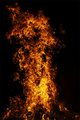
| 08/24/2006 10:01:42 PM |
Shadow and Flameby indridistefansComment: Greetings from the Critique Club.
Hi Indridi,
This is a tremendous flame - lovely colour, shape and form. As one commentator put in - it looks so violent.
There is one point though that hit you on the voting - context. This for two reasons. The first is that there were many other entries in the challenge with the same idea, so it wasn't very unique. With some voters your might have been the first they saw like this, but with other s your would be a repeat, and they would ahve scored it lower for that. The second is that the lack of context really makes it difficult for the view to identify with the flame. Just how large is it? How menacing is it? The shot needs somethign creative to put the flame in perspective - take a look at the top 20 shots in the challenge.
I hope my comments help and Good Luck in future Challenges!
Cheers
Paul |
| 08/22/2006 09:01:51 PM |
Hail Prometheus - Giver Of Fireby w4jzzComment: Greetings from the Critique Club.
Hi Mike,
That is some flame. Looking at your submisison to the Stupid challenge I get enough perspective to know it was really huge.
The existing comments give you the main feedback I think you need to consider - colour. This is a great big roaring blaze so viewers expect it to be very strong on the 'warm' colour tones - red, yellow and orange. As it stands the relatively soft, gentle colour that you have just doens't look hot. There are two ways you could have rectified this: in camera or post-processing.
- The in-camera solution would have been to reduce your exposure so the flames don't blow-out. It may be a night shot, but I would have suggested an ISO of 100 because you were directly shooting a huge light source. You could potentially sped up the shutter-speed too. In such an environment I recommend you play around with the exposure - checking the histogram and image to confirm you have it right.
- In post-processing it would have been possible to play around with levels, saturation and contract to bring out the reds and oranges that are there. The purest in me would prefer to see such things taken care of when capturing the shot though.
I hope my comments help and Good Luck in future Challenges!
Cheers
Paul |
| Photographer found comment helpful. |
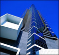
| 08/22/2006 08:49:44 PM |
Cobalt Reachby hotpastaComment: Hi Enzo,
I drew this for Critique Club but the site closed it down when they did the results refresh. I figure I owe you the Critique (anyway I had started thinking about it) so I've come back.
Congraulations on the great score - it's always nice to bring in what you set out for. This shot provides a magnificent sense of perspective - you have managed to get your angles just right to convey the sheer towering magnificence.Good going. The crispness and colours you have managed to achieve on the building are superb - good editing.
Personally I am not a fan of the extreme blue of the sky. I would have marked you down a bit for it. Clearly many other have a different take and love it. I'm guessing the change of hue to blue won you more votes than it lose you. Still I would have preferred a more natural colour.
Cheers
Paul |
| Photographer found comment helpful. |
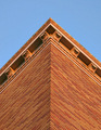
| 08/21/2006 09:36:48 PM |
Cornices at Sunsetby GeneralEComment: Greetings from the Critique Club.
Hi Paul,
I like the perspective you have used here - just looking at it I\'m inclinded to tilt my head up to see all the way up. The \'golden hour\' warm evening light really comes across beautifully. The various line (both on the corner and on the roof) really draw the eye in too. There isn\'t much to keep the eye there once it has been drawn in, but still the idea is there.
So there is a lot to be enjoyed for the viewer who cares to linger. Sadly there is not much there for the 2-second voter - a centred subject of brick and sky. It lacks the pop to grab attention.
I hope my comments help and Good Luck in future Challenges!
Cheers
Paul |
| Photographer found comment helpful. |
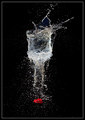
| 08/17/2006 09:34:44 PM |
Exploding Glassby JudiComment: Greetings from the Critique Club.
Hi Judi,
Great to draw you for my latest critique club comment, as I enjoy your work.
I like the fact that a good repeat of a 'done' idea can still do well on this site. It is nice to see some variance in the general shape of the captured water. I imagine this gave the shot some novelty value to those already familiar with the stopped water balloon idea. My guess is that this was caught a fraction of a second later then usual with gravity causing the balloon to collapse.
To my eye there is nothing wrong with this shot. It is (naturally) technically sound. The composition makes sense given the subject. There is a lovely balance across the whole shot. I am comfortable stating that the only reason this didn't do better is because it got voted down due to familiarity.
I hope my comments help and Good Luck in future Challenges!
Cheers
Paul |
| Photographer found comment helpful. |
| 08/17/2006 09:13:40 PM |
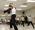
The Grass Dance to ask for a Blessing of the Circle.by MPRPROComment: Greetings from the Critique Club.
Hi Michael,
This has a great sense of movement, and you have succeeded well in stopping the motion. Well done.
The spectators in the background are indeed distracting, unfortunately there isn't really much you can do about it in such a setting. Apart from this my only comment is to do with the colour contrast: the combination of the blue and yellow overlapping as they do, with the green grass background makes it really difficult for the eye to pick out the definition on where the subject ends and the background starts. I think this might be a result of your boosting the saturation on the whole image. With an advanced editing challenge I would have recommended you place the dancer in a seperate layer to get perfect.
I hope my comments help and Good Luck in future Challenges!
Cheers
Paul |
| 08/17/2006 08:42:33 PM |
Pick Me, Pick Me!by angela_packardComment: Greetings from the Critique Club.
Hello again Angela,
The excitement, joy and sense of fun that this shot conveys is simply fantastic. You have done a wonderful job of capturing and conveying the the wonderful experience the girls are so clearly enjoying. You can see how intense and involved everyone is. Brilliant.
You have clearly met the challenge, and in doing so created an interesting and engaging image. So why the relatively low score? Personally I agree that it was 'shockingly underrated'. I like the composition and the point of view. In terms of composition the only things I would have liked different would be: exclude the boy on the right who isn't interested, include the adult males foot, and include the whole of the little girl on the left. The ceiling lights are distracting but to exclude them you would have to have shot downwards from higher up, which would have caused you to lose your connection with the children.
The colours are a bit flat. I see that in the post-processing you have performed the steps I would recommend. Is that the order you performed the pp in? If so, then I would recommend you move the resizing to the end of your work-flow to preserve the detail as long as possible. Also consider what you were doing in terms of White-Balance. Have you experimented with shooting in RAW to have better control over this?
I'm still confused by the technical details you have entered. I am convinced that you are entering shutter and aperture in the opposite fields. In this instance it is clear that the shutter-speed could not have been 3.2 seconds.
I hope my comments help and Good Luck in future Challenges!
Cheers
Paul |
| Photographer found comment helpful. |
| 08/17/2006 05:42:26 PM |
Here It Comes!!!by rossbillyComment: Greetings from the Critique Club.
Hi Billy,
Congratulations on a lovely shot that will no doubt be a great memory for you (and the grandparents). There is a wonderful sense of motion here (stopped of course). I can almost feel the angst and glee of the kids - in that sense the shot is very effective at conveyign this emotion.
The kids expressions are what make this shot so you would have done well to push that. A closer crop, and maybe a bit of contrast and sharpness around the faces could have brought this out a bit more. I would suggest you crop the top, left and right to compose your subject in the top third of the image - centrally composed subjects such as this generally look a bit flat (although not always).
I think you have scored well here with what some might regard as a snap-shot - that is a testement to the character of the shot. Well done.
I hope my comments help and Good Luck in future Challenges!
Cheers
Paul |
| Photographer found comment helpful. |
Home -
Challenges -
Community -
League -
Photos -
Cameras -
Lenses -
Learn -
Help -
Terms of Use -
Privacy -
Top ^
DPChallenge, and website content and design, Copyright © 2001-2025 Challenging Technologies, LLC.
All digital photo copyrights belong to the photographers and may not be used without permission.
Current Server Time: 04/12/2025 05:35:29 PM EDT.