| Image |
Comment |
| 02/26/2006 05:46:51 AM |
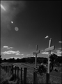
Double Tragedyby banditComment: I like how the flare actually points toward the crosses, but I think this would be a more powerful image without the car in the frame. |
 Photographer found comment helpful. Photographer found comment helpful. |
| 02/26/2006 05:34:15 AM |
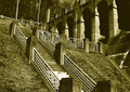
The Dam Stepsby ecameronComment: A vertical composition emphasizing the ascending steps might have worked better here. |
| Photographer found comment helpful. |
| 02/26/2006 05:30:58 AM |
|
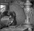
| 02/26/2006 05:25:16 AM |
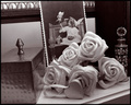
_by davidbedardComment: Nice nostalgic still life. Well composed with good DOF. |
| Photographer found comment helpful. |
| 02/26/2006 05:24:03 AM |
Hats Off To You!!!by doctabrezComment: Nice composition and pose, but a few problems lessen the impact. First, the face, especially the eyes, could stand being a bit sharper. Second, the edge of her sleeve overlapping the forehead is a bit distracting and takes away from the framing effect achieved with her arm and hair. These are somewhat minor and possibly subject to taste, but the real show stopper for me is the final issue. The blown out highlights in the shirt and near hand pull attention away from the face, which should be the main focus of attention. |
| Photographer found comment helpful. |
| 01/09/2006 03:45:08 PM |
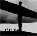
Shape of my Heartby unicumComment: I feel like there's just a little too much going on here. A simpler crop with just the central figure and the tree would be much more effective. |
| 12/08/2005 01:49:22 PM |
OH, HECK !!!!!by BeetleComment: Well thought out and staged. Good use of DOF to show the entire story without allowing the shot to get too cluttered. |
| Photographer found comment helpful. |
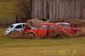
| 12/01/2005 03:27:53 PM |
3 of a kind!by willagherComment: There's some potential here but the cars should be further down near the bottom third of the frame, i.e. "rule of thirds". There are some situations where breaking the rule might work, but I don't think this is one of them. The centered composition here lacks interest. I'd also suggest a viewpoint further to the left so that the barn could form a consistent background across the entire photo as the weathered wood fits in nicely with the feel of neglect. Finally, the date in the lower right just plain needs to go. |
| 12/01/2005 03:17:32 PM |
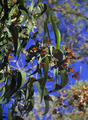
Butterfly Collectionby beafliesComment: Very nice colors but I think the crop should be a bit tighter on the butterflies as they are the subject of the photo. The strong contrast between the blue sky and green foliage currently dominates the photo and the eye is drawn to it rather than the butterflies since they make up such a small proportion of the image. |
| 12/01/2005 03:01:59 PM |
|
| Photographer found comment helpful. |
Home -
Challenges -
Community -
League -
Photos -
Cameras -
Lenses -
Learn -
Help -
Terms of Use -
Privacy -
Top ^
DPChallenge, and website content and design, Copyright © 2001-2025 Challenging Technologies, LLC.
All digital photo copyrights belong to the photographers and may not be used without permission.
Current Server Time: 04/12/2025 09:20:03 AM EDT.