| Image |
Comment |
| 11/20/2006 12:37:11 PM |
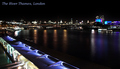
City Of Londonby jimnessComment: the thing (a dock, i guess) in the lower left hand corner is hard to identify. this really distracts from the wonderful skyline in the background. might have made for a better picture had you not included it and cropped a little closer in the top left hand corner. |
 Photographer found comment helpful. Photographer found comment helpful. |
| 11/20/2006 12:34:22 PM |
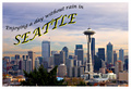
Wish You Were Hereby nheilweilComment: the image looks awesome. i like the telephoto effect that brings the buildings closer together. the colors look really great. the text looks a little weird and to me doesn't seem to fit the general look of the image/postcard. |
| Photographer found comment helpful. |
| 11/20/2006 12:30:24 PM |
Everyone's Welcomeby lentilComment: this is a little too close to a square for a postcard. the image looks great, i especially like how the rocks add interest to the foreground. the horizon does seem a little crooked, though. |
| Photographer found comment helpful. |
| 11/20/2006 12:28:36 PM |
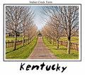
Indian Creekby philupComment: the aspect ratio is kinda weird for a postcard. i like the kentucky writing (is it a font or "handwritten" on a tablet?) |
| Photographer found comment helpful. |
| 11/20/2006 12:27:03 PM |
Matanuska Glacierby ShutterPugComment: Nice post card. The font fits the theme perfectly. my only problem with this image is that it's hard to distinguish the mountains and the skies right in the center. |
| Photographer found comment helpful. |
| 10/24/2006 11:15:12 AM |
Down the Lineby jenesisComment: absolutely great, colors, dof and sharpness are just right. the composition is awesome! |
| Photographer found comment helpful. |
| 10/24/2006 07:26:54 AM |
Conghaileby aznymComment: very nice, it almost has an abstract feel to it, created by the high contrast and the lack of humans in the picture |
| Photographer found comment helpful. |
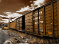
| 10/23/2006 08:05:55 AM |
A Strong Signalby hotpastaComment: awesome image. great composition, focus and point of view. i don't like the border being wider on top and bottom of the image. also on the part of the sign that reads "rail" it looks like the sharpening is a little too strong. i also like the slight blur in the corner. at first glance i thought the corners were out of focus. looking at the image a bit closer i think you added them later. it might actually look a little better if the effect was just a little weaker and shaped a little different in the top left corner. anyway - definately a great image! |
| Photographer found comment helpful. |
| 10/23/2006 07:57:14 AM |
|
| Photographer found comment helpful. |
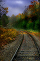
| 10/23/2006 07:52:05 AM |
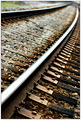
Rails Through Autumnby IvoryComment: Great colors and a nice composition. I am kind of puzzled as to why some of the shot is tack sharp and some of it is blurred. Were you going for this effect? To me it looks kind of arbitrary. |
| Photographer found comment helpful. |
Home -
Challenges -
Community -
League -
Photos -
Cameras -
Lenses -
Learn -
Help -
Terms of Use -
Privacy -
Top ^
DPChallenge, and website content and design, Copyright © 2001-2025 Challenging Technologies, LLC.
All digital photo copyrights belong to the photographers and may not be used without permission.
Current Server Time: 04/07/2025 06:08:17 AM EDT.