| Image |
Comment |
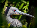
| 05/02/2007 08:06:11 AM |
The Hunterby NobodyComment: Excelent... great dof and spot on focus. Nice color combination and intensity. Love the texture in the feathers. Lots of angled leading lines that bring the viewer back to the eye. Finally, I also appreciate your crop on the image. Well done. |
 Photographer found comment helpful. Photographer found comment helpful. |
| 02/22/2007 04:15:42 AM |
|
| Photographer found comment helpful. |
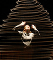
| 02/22/2007 04:14:27 AM |
My Daughter, a Future Prima Ballerinaby RazorsEdgeComment: Very nice tones. I think the lighting was a bit harsh, but you handled it well. Lovely eyes. Very nice focus. It would be fun to apply some of the more advanced editing rules to the image. |
| Photographer found comment helpful. |
| 02/22/2007 04:12:19 AM |
AKby rickylpComment: Very nice tones... I would be interested in hearing what duotone color values you used. Nice arrangement as well. AK? hum... that is my Daugther's initals. |
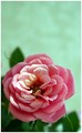
| 02/22/2007 04:10:04 AM |
Symbol of Loveby tfarrell23Comment: Very nice selection for DoF. Also, very nice composition... the Stems serve as nice leading lines to guide the eye back to the main subject. Well done. |
| Photographer found comment helpful. |
| 02/22/2007 03:12:09 AM |
Mothers Loveby CabramsComment: Nice soft focus. Bit of a halo around the subjects. Wonderful selection in subjects. |
| 03/08/2006 02:52:55 AM |
The Abductionby DrAchooComment: Another shot Across the bow! Great image. Keep that average climbing!! |
| Photographer found comment helpful. |
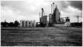
| 03/04/2006 11:40:29 PM |
Big City Meets the Middle of Nowhere.by tryals15Comment: You have a wonderful subject, here. I hope you go back an re-visit it sometime. Someone once told me to always look for the photo within the photo... I think in this case, a closer look at the structure with finer detail would have improved your score. Your conversion to duotone was well done. |
| Photographer found comment helpful. |
| 03/04/2006 10:59:02 PM |
Mercurialby JonoComment: You have already received many great comments, so I'll just add one thing. I always try to take the exposure to have some pure white and pure black. While you're image has good contrast, I might have pushed the exposure up a little to get more white into the eyes.
This is a good first attempt and I want to to take heart. You clearly have skills to work with (not to mention, a great model to work with.) I look forward to you're consitantly raising average. |
| Photographer found comment helpful. |
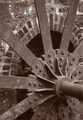
| 03/04/2006 09:52:07 PM |
Rock Run Millby LN13Comment: The two things I liked best in this picture was the texture provided by the wall and the leading lines the wheel provides to axis. Your composition was smart... placing the axis at the rule of third location. The axis, itself, however, is not as strong a visual reward to keep the eye there.
The narrower DoF gives it a sense of being a little out of focus, but I dont' think it was. It has nice contrast... not over doing it.
So in general, I think it is a great picture and one to take some pride in. It will also be fun to "antique" it some with techniques not permitted for the challenge. |
| Photographer found comment helpful. |
Home -
Challenges -
Community -
League -
Photos -
Cameras -
Lenses -
Learn -
Help -
Terms of Use -
Privacy -
Top ^
DPChallenge, and website content and design, Copyright © 2001-2025 Challenging Technologies, LLC.
All digital photo copyrights belong to the photographers and may not be used without permission.
Current Server Time: 04/11/2025 04:57:06 AM EDT.