| Image |
Comment |
| 12/28/2005 08:41:33 AM |
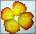
Old Rose Pedalsby Sunshine86Comment: I think it is time you go in with my fav photographers now:))
You have alot of well set up photos all with a unique look which I like so I want to keep up to date with all your latest photo's only the second person on my fav list.
This pic is simple yet striking the colours and set up are nice hope to see you on par with joey l soon.:) |
 Photographer found comment helpful. Photographer found comment helpful. |
| 12/28/2005 08:26:29 AM |
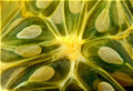
Horned Melonby Sunshine86Comment: This is like something I was trying with the patterns challenge but in the end I dropped mine too. anyway getting back to your pic it is really good in all aspects I think you would have done well with this pic in the challenge. I would have given it 7/8 |
| Photographer found comment helpful. |
| 12/28/2005 04:23:00 AM |
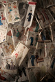
Sew Retroby RKTComment: You may get a few low votes with this but i see where you are coming from with the design |
| Photographer found comment helpful. |
| 12/24/2005 12:42:57 PM |
Fly Fishingby dsa157Comment: Now I looked at this for a while and couldnt figure it out then my brother came over and said str8 away oh yeah his flys open very good photo:) |
| Photographer found comment helpful. |
| 12/19/2005 08:08:37 AM |
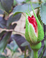
An Early Bloomerby olddjComment: Greetings from the Critique Club :)
First Impression:
At first I was a little distracted by the background on your photo which is taking away from your main subject however I like the colours and the placing of your subject.
Composition:
Good use of thirds. But your subject is the last thing you look at on your shot. As when we look at a photo we tend to look from left to right meaning that we are seeing the distracting background first instead of the outstanding flower.
Subject:
This is a good choice of subject for this challenge. Yet something I may have thought about doing is putting a white backdrop behind it. It does not have to be anything special just something that will bring the flower to the front of the photo by eliminating any distracting background.
Technical:
As it is natural light there is not much I can comment on for your lighting. As for colour the colour in the petals is absolutely spectacular and I feel would have being enhanced even more by the use of a backdrop as I have already mentioned.
My Opinion:
I am afraid I agree with the voters here. It is half way it is a nice shot but with a little extra work could have gone way up maby as far as the top 20�s
Feel free to contact me via the pm system if you have any questions about this critique.
T. Wiggins |
| Photographer found comment helpful. |
| 12/19/2005 08:01:35 AM |
|
| Photographer found comment helpful. |
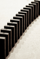
| 12/19/2005 07:04:57 AM |
dominoby soerenComment: Originally posted by KiwiPix:
I'm sorry, your profanity in the comments are offensive |
Agreed |
| 12/18/2005 01:02:39 AM |
|
| Photographer found comment helpful. |
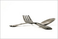
| 12/17/2005 10:37:44 AM |
Simplicityby hollisterGqComment: Greetings from the Critique Club :)
First Impression:
A well taken shot I like everything about this shot. The slightly dirty spoon and fork give them a used look which is appealing and the background brings them to the forefront of the photo.
Composition:
Perfect use of thirds.
Subject:
You couldn�t have chosen a better looking spoon and fork for this image. The old and rusty look gives them a lot more interest than just plain clean items.
Technical:
The shot is well lit and there seems to be no blown out sections on the metal. I like the rusty kind of a look on the tip of the fork and spoon as it adds interest to the photo.
My Opinion:
This is an excellent example of a well taken and perfectly set up photo. The look of the fork and spoon make it so you just can�t take your eyes off the image. A fork and a spoon have never looked so good.
Feel free to contact me via the pm system if you have any questions about this critique. Message edited by author 2005-12-17 15:42:01. |
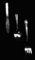
| 12/17/2005 10:04:28 AM |
Contrastby angela_packardComment: Greetings from the Critique Club :)
First Impression:
The photo has a lot of contrast. It could have being a very nice photo if a little more time had being spent on the lighting and the set up of the items. Also hardly any of the detail on the knife is visible which would have really helped the shot.
Composition:
The composition is good in this photo and fills the photo nicely with each item leading you to the next.
Subject:
As it says in the challenge knife fork and spoon. I like the detail on the fork handle and wish that I could see the same detail on the knife.
Technical:
The lighting on this shot could have being set up a little better maybe by placing the a light at the side of subjects shining across you would have being able to keep the dark shadows in the grooves of the subjects while having an even light across all three items.
My Opinion:
A nice photo that with a little more work on the set up could have being a really good image.
Feel free to contact me via the pm system if you have any questions about this critique.
T.Wiggins |
| Photographer found comment helpful. |
Home -
Challenges -
Community -
League -
Photos -
Cameras -
Lenses -
Learn -
Help -
Terms of Use -
Privacy -
Top ^
DPChallenge, and website content and design, Copyright © 2001-2025 Challenging Technologies, LLC.
All digital photo copyrights belong to the photographers and may not be used without permission.
Current Server Time: 04/08/2025 04:52:55 PM EDT.