| Image |
Comment |
| 01/04/2006 04:08:26 AM |
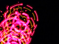
spining lightsby polkopComment: thanks for a nice helpful comment:)
Originally posted by macrothing:
I gave this a 4. There was a pattern there but in my opinion the colors were too harsh (ie: contrast/etc) and the pattern a bit too 'busy', especially for the composition. Also 640 width (height too perhaps) may have helped this, again, with a slightly different composition, depending of course what you had to work with. |
Message edited by author 2006-01-04 09:40:22. |
| 01/03/2006 05:52:13 AM |
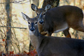
Protective Momby neenee1999Comment: You must have being quick to get this:) focus is great. Some of the twigs on the left are a bit distracting but I am sure you didnt have much time to think about them:)
first put it as 8
now put it at 9 |
 Photographer found comment helpful. Photographer found comment helpful. |
| 01/03/2006 05:48:33 AM |
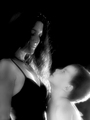
The Mothers Look!!by JudiComment: Great photo the expression on the boys face is cool and the soft feel works well with the photo:) |
| Photographer found comment helpful. |
| 01/02/2006 04:56:55 AM |
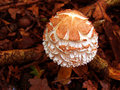
r.i.p.by focus57Comment: WOW how strange I was going to do the same thing for this challenge now I am glad I didnt because it wouldnt have being this good:) 10 |
| Photographer found comment helpful. |
| 12/30/2005 07:39:37 PM |
fung.jpgby polkopComment: same again with this one :( computer had to be formatted and I had no way of storing the orig photo so I salvaged it from an email I sent this was taken in the early days of my photography and I sent emails in alot smaller size as I did not know how to ps that well. |
| 12/30/2005 07:36:46 PM |
mfung.jpgby polkopComment: Yeah this photo was salvaged from a resize I did for email after my computer had to be formated it was taken on s5500 but can not remember date or anything |
| 12/30/2005 06:15:02 AM |
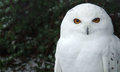
Odd Birdsby GermaineComment: Top 10? cool pic should have finished higher it is odd in 2 ways but oh wait thats even:)) |
| Photographer found comment helpful. |
| 12/30/2005 03:02:25 AM |
owl1.jpgby polkopComment: thanks all Message edited by author 2005-12-30 08:24:05. |
| 12/29/2005 04:28:44 AM |
|
| 12/28/2005 09:25:02 AM |
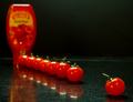
Hey, small tomato at the end! KETCH UP!by M&MComment: Greetings from the Critique Club :)
First Impression:
Yes Yes Yes When I click that critique button I don’t know what I am going to get and I am glad to see one that I already like. I have seen this image in the challenge and thought it was really good
Composition:
Perfect use of thirds. The line of tomatos leads you nicely through the photo
Subject:
Everything in this shot looks like it is made to be an advert for a magazine clean and crisps
Technical:
The lighting in this shot is brilliant and the reflection in the worktop looks really good and the colours here really jump out at you and make you want to look.
My Opinion:
There is little to nothing I can say against this photo everything in it looks like it has being set up for an advert. Nice work would have expected to see this getting a ribbon. (I am not too sure if it did or not)
Feel free to contact me via the pm system if you have any questions about this critique.
T. Wiggins
|
| Photographer found comment helpful. |
Home -
Challenges -
Community -
League -
Photos -
Cameras -
Lenses -
Learn -
Help -
Terms of Use -
Privacy -
Top ^
DPChallenge, and website content and design, Copyright © 2001-2025 Challenging Technologies, LLC.
All digital photo copyrights belong to the photographers and may not be used without permission.
Current Server Time: 04/08/2025 04:52:50 PM EDT.