| Image |
Comment |
| 05/03/2007 07:40:02 PM |
"Stock" photoby ClayaComment: CRITIQUE CLUB COMMENT
It's obvious right away from the photo that you put some real work into setting this up. I find that DPC tends to reward those who put effort into their photos and I think that fact helped you out here. The technicals are good. Depth of field is just right, composition is good (though a little too centered for my tastes), lighting is excellent. However, the colorful hat distracts me a little. It's just too wild and pulls my attention away from the kitchenware which is the focus of the challenge. But, obviously the votors weren't bothered by the hat that much judging by your solid 6.0 score. I'm having a hard time critiquing the photo because personally it doesn't move me as being a great photo and I don't really know why. All I know is that I tend to give 5's for scores unless the picture moves me as better or worse and this one sort of leaves me in the middle. As I said, I can tell you put real effort into it but the coloring of the photograph doesn't seem pleasing to my eye. Ok, what can I say? Once again, your technicals are solid, you met the challenge dead on, and you scored well for your efforts. Sorry I couldn't be more help. Congratulations on a your high finish. |
 Photographer found comment helpful. Photographer found comment helpful. |
| 05/03/2007 07:18:50 PM |
Turned Onby marvinComment: CRITIQUE CLUB COMMENT
First off I'd like to say that the coloring and the composition are both very nice. You also made good use of shallow depth of field so technically I don't find anything wrong with you photograph with the possible exception of it beeing perhaps a tad too dark. Looking at your voting curve I see a boat load of the voters gave you a 5...right dead down the middle. In fact the entire curve is evenly dispersed around 5. My guess is that voters didn't see anything in the photo that really moved them too much either way. The photo fails to say anything or evoke an emotion. It is simply a photograph of something in a kitchen and while technically that's what the challenge was, voters might have been expecting something more creative. To get a few more points out of the score you might want to look for something that makes the photo truly unique. Either a piece of kitchenware that most people don't have anything like it or do something creative with an everyday object. Again, you have a solid photograph in the technicals department though. Might be a good shot for a micro stock agency. Keep up the good work. |
| Photographer found comment helpful. |
| 05/02/2007 04:50:35 AM |
The Window by ZoomdakComment: Greetings from Eastern Washington! Like you, I find this area so uninspiring photographically. My father says to take good pictures we will have to travel someplace pretty. It seems you somewhat agree with your ribbons being at Canon Beach, etc and this being your first from Spokane. Your photo is great because it could have been taken just about anywhere in the world and proves you don't have to be some place stunning to have a shot. :) |
| Photographer found comment helpful. |
| 03/10/2007 02:21:33 PM |
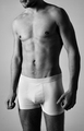
cKby haakkyComment: CRITIQUE CLUB COMMENT
I like the lighting on this shot and I think you came close to acheiving what you wanted to acheive. The model is well toned and you hit the shadows nearly perfectly to enhance definition. Unfortunately the crop bothers me. Having half the face in the photo seems ackward in my opinion. I would have rather had from the neck down or all of the face - either or. Having the lower part of the face in the shot also makes the model feel like he's leaning, almost hunching forward. The models pose seems a little uncomfortable to me, as if he isn't real relaxed. Maybe resting a hand on the hip and shifting his weight to one leg or another would have helped. It seems the model is standing flat footed and it leads to a stiff looking pose. The hairy legs are distracting for me because hsi chest is clean shaven and the hair on the legs draws me downward. Being a male commenter the last thing I want on this photo is my attention to be drawn downward! LOL. Anyway, I think you were trying to duplicate a style of Calvin Klein ads here and for that you did a good job. Keep up the good work! |
| Photographer found comment helpful. |
| 03/06/2007 07:23:35 PM |
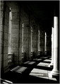
Passageby vroyComment: What a shame this didn't finish higher. I think this image smokes and meets the challenge dead on. I didn't vote on the entire challenge but when I saw your photo I thought it was the best in the first 23% I'd voted on. Great job. |
| Photographer found comment helpful. |
| 03/06/2007 03:58:03 AM |
He loves me, He loves me notby JackieKComment: CRITIQUE CLUB COMMENT:
I like the colors in your photo, very vibrant and expressive of love. I like the purplish background and the way it compliments the color of the flower.
Unfortunately your foreground seems to distract from your image in my opinion. There is a bit too much going on in the blurred area that I'm left trying to figure out exactly what I'm looking at while the focus of your photo is obviously on the middleground. In otherwords the forground distracts from your subject.
As a general rule flowers are so commonly shot that in order to score well you have to have an exceptional shot of a flower. Often times it is necessary to really isolate the flower in your photo and compose it in a unique way, neither of which were accomplished here. I think a lot of people would vote 5 on the photo because it appears to them as "just another flower." Next time concentrate on making it really stand out as something we haven't seen before.
Other than the distracting foreground mentioned above, I think the composition is fine. I think the photo shows real promise that you will have some great shots to offer. Keep up the good work! |
| 02/02/2007 01:40:21 PM |
Big Mouthby JudiComment: Oh my goodness what a killer shot! I can't belive how cool this is and that it didn't ribbon. You got robbed! :)
|
| Photographer found comment helpful. |
| 01/26/2007 04:24:22 PM |
|
| Photographer found comment helpful. |
| 01/26/2007 04:23:15 PM |
|
| 01/26/2007 04:21:55 PM |
E Street Exitby LanceWComment: On a scale of 0-2 in five different categories: Image quality - 1.5. Composition - 1. Lighting - 1.5. Post Processing - 1. Choice of Subject - .5. WOW FACTOR - +1. TOTAL SCORE - 7 |
| Photographer found comment helpful. |
Home -
Challenges -
Community -
League -
Photos -
Cameras -
Lenses -
Learn -
Help -
Terms of Use -
Privacy -
Top ^
DPChallenge, and website content and design, Copyright © 2001-2025 Challenging Technologies, LLC.
All digital photo copyrights belong to the photographers and may not be used without permission.
Current Server Time: 04/07/2025 06:12:14 AM EDT.