| Image |
Comment |
| 07/29/2007 08:30:02 PM |
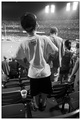
Getting a Better Viewby trevytrevComment: I love the perspective on this shot. Excellent shot and perfect DOF. I don't know how you'll score but it's worthy of a high one. |
 Photographer found comment helpful. Photographer found comment helpful. |
| 07/29/2007 08:27:24 PM |
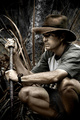
Watching and Waiting by JudiComment: Nice photo but it seems staged and doesn't see like "street life" more like "wild life" |
| 07/29/2007 08:19:07 PM |
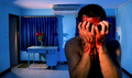
What have I done?by boodComment: Morbidly fascinating! A strong contender in what I feel is a fairly weak challenge. You should do well with this despite the voters who will not like the death theme. Great job. |
| Photographer found comment helpful. |
| 07/29/2007 08:16:35 PM |
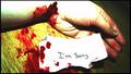
Extreme surrenderingby KrisbyComment: Not the best picture and there are several suicide shots but I have to say, the "I'm sorry" note is a great touch. Makes me sad despite the fact that it isn't the best picture. Work on your lighting...the hand has blown out highlights. Again, great job on the note...you were close... |
| Photographer found comment helpful. |
| 07/29/2007 08:14:22 PM |
|
| Photographer found comment helpful. |
| 07/29/2007 08:12:41 PM |
|
| Photographer found comment helpful. |
| 07/19/2007 08:22:33 PM |
|
| 05/12/2007 02:26:46 PM |
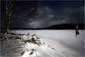
Dreamingby sz1_Comment: CRITIQUE CLUB COMMENT
Nice concept here that I think you pulled off fairly well. The dark dramatic sky gives an eerie feel to the photo and is a good contrast with the brighter/white foreground. Perhaps would have been better if the tree was a little more well lit. I feel it's too dark for the foreground. The footprints in the snow in the foreground (not the ones made by the walking man) are a bit distracting. It may be all natural but I'm left trying to figure out if the walking man made them or if they were already there. In any case, it served as a bit of a distraction for me. This next comment may be really nitpicking but for some reason the snow around the tree and leading to the foreground almost has a shiny reflective type surface which seems out of place with the more powdery looking snow on the right side of the picture. A suggestion I might make is perhaps the photo would be enhanced by the man wearing something white so he pops off of the dark background. As it is he almost blends in with a quick look. Compositionally the photo is good though some may have been annoyed at the man's shadow trailing off the edge of the photo. Again, I think you had a nice concept and came really close to having something really special here. Brighten up the tree and the man a bit more and I'd think you be a contender for a top 50 shot in a difficult Free Study challenge. Keep up the good work. |
| Photographer found comment helpful. |
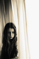
| 05/12/2007 11:53:54 AM |
mary janeby simplesilentComment: CRITIQUE CLUB COMMENT
I really like this shot on first impressions. I think your lighting is very good here...nearly perfect with the possible exception being a bit too dark on the right eye - but that's really nit picking. I love the shadows captured on the face...quite excellent. I'm not sure how I feel about the long flowing curtains. Something seems off about them. For the most part I like them but as I'm trying to imagine what is going on in the photo I'm left at a bit of a loss at first. After really studying the photo it appears to me that what she is doing is looking out of the curtain to something below on the street (I imagine she's up a floor or too looking down). In retrospect, all of this is excellent because your photo indeed tells a story when I can imagine she's looking at something out the window from a second story window and I'm curious what it is. Unfortunately you have about 2 seconds for the average voter to "get it" and I don't think it is obvious enough at first glance that she is looking out the opened curtain. Doing something to enhance that part would really help. Perhaps open the curtain up a bit more and have more light coming in from that spot directly, lighting up that side of the face. As I'm trying to find something to explain why this shot didn't score better I'm really coming up with a loss here. I really think it's a strong photo. Perhaps the curtains are too wrinkled? Perhaps the model's hair is a tad mussy and out of place which causes a slight distraction. See...nitpicking again. Honestly, I can't explain it. I can tell the photo isn't a top 10 contender but I can't put my finger on it. Sorry about that. Take pride in the fact that you got zero 1's or 2's in voting. I.E. NO ONE thought it sucked. Converserly you got 3 9's and 10's which means some people thought it was fantastic. My biggest form of criticism would simply be that it isn't the strongest photo for a Free Study challenge. As you may well be aware, Free Study encourages the best of the best to come out. You really have to do something over the top to get noticed here. Had this photo been in a weekly challenge such as "Pensive" or something you'd probably be a top 10 contender for sure! Great job, really. |
| Photographer found comment helpful. |
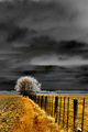
| 05/11/2007 07:55:46 PM |
Surreal Landscapeby ShamanComment: CRITIQUE CLUB COMMENT
The orange foreground against the dark or black background makes a very nice contrast. Unfortunately, the tree in the distance seems out of place. The composition of the fence and tree in the photo work for me but the actual negative effect the tree has (i.e. looks like a film in negative) bothers me. The tree line on the horizon (also appearing negative) also seems completely out of place to me and the white halo effect around the tree line is tremendously distracting. Nice use of dodge and burn on the clouds...really makes them dramatic and helps the photo compensate a little for the distracting elements mentioned above. Overall I think this is a photo with a lot of promise that just fell short of being a real contender. Keep practicing with HDR and looking for what works best. I think the photo demonstrates you have a good eye for photography and will turn out outsanding work. |
| Photographer found comment helpful. |