| Image |
Comment |
| 10/04/2019 08:46:54 AM |
|
 Photographer found comment helpful. Photographer found comment helpful. |
| 12/16/2009 06:53:05 AM |
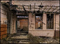
Reform Schoolby npaselComment: Great urban decay. Frame is slightly tilted - a pet peeve of mine. Don't do it unless it's intentional |
| Photographer found comment helpful. |
| 12/16/2009 06:51:15 AM |
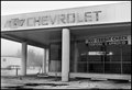
Seemed Like A Good Idea At The Timeby scarbrdComment: Great journalism piece. Tells a current story of today's failed economy. The "no credit check" sign is a great contrast with the Chevrolet name above. I think it would help if you backed up a bit catching the corner of the building in the frame. |
| Photographer found comment helpful. |
| 12/16/2009 06:48:33 AM |
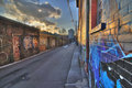
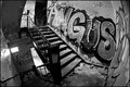
Graffiti Alleyby Shutter-For-HireComment: Nice color, almost metallic in feel. Your image might be helped with adding a subject or person sitting in the background maybe just beyond the gutter on the right. Just an idea. I like that the sun is just peaking above on the left. Nice touch. |
| Photographer found comment helpful. |
| 12/16/2009 06:43:30 AM |
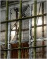
Barred, Broken and Boardedby MaryOComment: HDR? Nice color. When I view it I feel a little closed in. Maybe pull back a bit and show the full window might look more interesting. There is a cable in the upper left corner of the image that distracts a bit from the overall image. Maybe consider a crop here. |
| Photographer found comment helpful. |
| 12/16/2009 06:41:10 AM |
Squatter's Delight by jegerComment: Good use of the fisheye here. There is some nice movement going on in this image but I feel it could be enhanced with a subject (model) wither at the top or bottom of the stairs. When leading your viewers through your image, consider where their eyes will stop and give them something interesting to look at and ponder, maybe a woman weeping at the bottom of the stairs suggesting she is a product of this harsh environment she lives in, a mop and bucket on the landing to the right suggesting someone is about to clean this mess up. It should tell a story. |
| 12/16/2009 06:32:43 AM |
Watcher On The Terminal Beachby rooumComment: The colors pop here but it's too dark. Also, I feel you have two subjects that compete for attention - the dark building and the artwork on the left. |
| Photographer found comment helpful. |
| 12/16/2009 06:27:05 AM |
Just-steps-awayby justineComment: Interesting scene but lacks a strong subject, maybe a man sitting on the steps. |
| Photographer found comment helpful. |
| 12/16/2009 06:25:41 AM |
Slow Deathby ScholtenComment: Great color and textures. Horizon is tilted to the left and distracting to the eye. |
| Photographer found comment helpful. |
| 12/16/2009 06:24:25 AM |
A foundation witheredby wolfComment: The frame is slightly tilted. This looks accidental and not intentional. The strong leading lines on the right should bring the viewers eyes to the main subject of the image. Good color and texture in the vines on the left. |
| Photographer found comment helpful. |
Home -
Challenges -
Community -
League -
Photos -
Cameras -
Lenses -
Learn -
Help -
Terms of Use -
Privacy -
Top ^
DPChallenge, and website content and design, Copyright © 2001-2025 Challenging Technologies, LLC.
All digital photo copyrights belong to the photographers and may not be used without permission.
Current Server Time: 04/11/2025 03:58:30 AM EDT.