| Image |
Comment |
| 03/16/2006 09:22:19 AM |
recollections of old school daysby streets_of_dublinComment: nice image - kind of small - but you can still make everything out. I like the green tone of coloring it has, the lighting on your main model seems a bit much - but I kind of like it as well as her expression :) |
| 03/16/2006 09:19:36 AM |
Learning to ARTICULATE: Putting into words or expressionby emmylouComment: You can tell I'm getting old - I used to agree with this "expression" but now I know how important school really is. I guess I don't care for the message but it meets the challenge and I really like the lighting from below and the perspective. Nice job :) |
 Photographer found comment helpful. Photographer found comment helpful. |
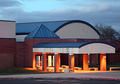
| 03/16/2006 09:11:21 AM |
Carver Middle Schoolby ElaineComment: Not very interesting, perhaps a different perspective or maybe people in the shot, I wouldn't know that this building has anything to do with education except for the title, it actually resembles our Dr's office. Maybe if you included the sign saying "Carver Middle School." It's in focus though and the lights have a good glow standing out against the rest of the natural light. :) |
| Photographer found comment helpful. |
| 03/16/2006 09:06:01 AM |
|
| Photographer found comment helpful. |
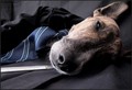
| 03/16/2006 08:59:30 AM |
I Can't Go To School Today Dad, I'm As Sick As A Dog!by Penny LaneComment: LOL - cute idea - not sure if it meets the challenge that well - relying on title alone I think, not sure what is lying next to him, a little distracting - a thermometer? and I think his nose and face could have a bit sharper focus, crop seems a bit too tight - especially on the right - my preference would have been to see more space past his ears - funny though - great model :) |
| Photographer found comment helpful. |
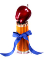
| 03/16/2006 07:47:27 AM |
Bouquet for the Teacherby brizmamaComment: clever set up - rather pretty, my preference would have been to have less crop on the sides allowing some space past the ribbon ends and the lighting seems a wee bit much - blown out on pencil tips and especially front of erasers - a good studio idea though and certainly meets the challenge - good job :) |
| Photographer found comment helpful. |
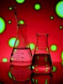
| 03/16/2006 07:44:38 AM |
Chemistry by jodiecostonComment: Love the idea - but the green is rather distracting - I don't think it enhances the image as much as you might expect, also seems to be a wee bit crooked - maybe a very slight rotate and my preference I think would have been for each beaker to be in focus as it appears the one in front has a softer focus. Good idea and title though - meets the challenge well - good job :) |
| Photographer found comment helpful. |
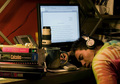
| 03/16/2006 07:40:59 AM |
My Life at 12:00 AMby climbin2thetopComment: LOL - great shot, like the busyness it has and I'm kinda glad you left it in color instead of switching it to black and white - though that would probably look real good as well. Calculus - ugh! nice job :) |
| Photographer found comment helpful. |
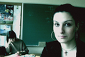
| 03/16/2006 07:39:08 AM |
== think again ==by chedathedogComment: I really like this image, love the black and white and softness, nice expression on her face and chalkboard in background is great - I even like the slight slant it has - nice work :) |
| Photographer found comment helpful. |
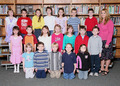
| 03/16/2006 07:38:05 AM |
Picture Dayby oilofoleComment: awww..this screams "education" to me - great idea - and how lucky for you to have this opportunity for this challenge. great title, seems the lighting is a bit harsh - a little too bright and blown out in some areas - super idea though - it matches the challenge perfectly :) |
Home -
Challenges -
Community -
League -
Photos -
Cameras -
Lenses -
Learn -
Help -
Terms of Use -
Privacy -
Top ^
DPChallenge, and website content and design, Copyright © 2001-2025 Challenging Technologies, LLC.
All digital photo copyrights belong to the photographers and may not be used without permission.
Current Server Time: 04/12/2025 05:21:23 AM EDT.