| Image |
Comment |
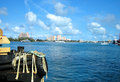
| 01/27/2007 05:03:16 AM |
The Bankby GeneralEComment: This clearly fits the challenge, but it doesn't do much for me. The reflections in the glass (the actual entrance) are extremely distracting for me, as is the focus (which seems off when it comes to the doors. I generally do not like the lighting, which is a bit drab toward inside the pillars. Taking this shot at a different time of the day might have helped, though I'm not sure how to overcome the reflections in the glass. |
 Photographer found comment helpful. Photographer found comment helpful. |
| 01/27/2007 02:04:28 AM |
Porthole to the Mindby holdingtimeComment: This image just didn't work for me; if the eye is the portal, I didn't see enough of the eye itself, though the selective desaturation is interesting, the image has too much under the eye and of the nose to really work for me, and the brightness under the eye was distracting for me. |
| Photographer found comment helpful. |
| 01/27/2007 02:02:58 AM |
Enter Tourismby k175ck175cComment: The idea here is good, but the buildings in the back are too overexposed to be useful to the composition, and the clouds are too blue to make much difference either. Watching the white balance and perhaps going a bit darker might have helped here (though then the whole may have been too dark). |
| Photographer found comment helpful. |
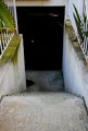
| 01/27/2007 02:01:16 AM |
Down to where...?by Jarrod.Hayes@usc.eduComment: The subject matter here, and the generally drab lighting, didn't do much for me. The set of stairs, down to a black door with the door handle showing (but not in focus), didn't make it mysterious enough to hold up to the title. |
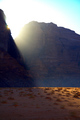
| 01/27/2007 01:48:54 AM |
entrance to heavenby jaimeDpComment: This is a nice concept, and it's carried off reasonably well, but I'm not a huge fan of completely backlit subjects, and I would have liked it better without the person standing in the middle and blocking the light from the sun. Still, bumping you up from the first score I gave it. |
| Photographer found comment helpful. |
| 01/27/2007 01:47:10 AM |
Entrance to Pleasureby view360Comment: This image didn't do much for me, primarily because the subject matter didn't interest me, and the narrow depth of field left me wanting more sharpness on the overall image. |
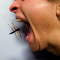
| 01/27/2007 01:46:03 AM |
Don't Fly That Way!by LERtasticComment: Interesting idea, but the focus is either too narrow or is off altogether; with more light and a higher f-stop to bring in some sharpness, this might have worked, but without it doesn't work for me. |
| Photographer found comment helpful. |
| 01/27/2007 01:45:00 AM |
A Glamorous Entrance!by fkahhalehComment: While I like the idea here, I didn't like the loss of quality from the brightness at the top (especially to the rocks to the right) and the loss from too dark shadows at the lower left. |
| Photographer found comment helpful. |
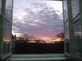
| 01/27/2007 01:43:43 AM |
sky entranceby LoreComment: A suitable idea, but the image itself isn't sharp enough for me, and I found the reflections in the windows distracting; having the shot set so that the windows were straight would have helped it for my eyes, as well. |
| Photographer found comment helpful. |
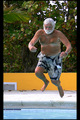
| 01/27/2007 01:42:31 AM |
Last One In 's a Rotten Egg!by JuliBocComment: Nice stop action, but the shot as a whole doesn't really work for me. The background is distracting, and there isn't a feeling of motion in the shot to my eyes (it looks like he's hanging there to me, not jumping). |
| Photographer found comment helpful. |
Home -
Challenges -
Community -
League -
Photos -
Cameras -
Lenses -
Learn -
Help -
Terms of Use -
Privacy -
Top ^
DPChallenge, and website content and design, Copyright © 2001-2025 Challenging Technologies, LLC.
All digital photo copyrights belong to the photographers and may not be used without permission.
Current Server Time: 04/12/2025 10:03:01 AM EDT.