| Image |
Comment |
| 03/27/2005 02:54:48 AM |
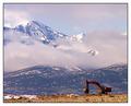
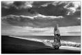
Nature vs Machineby dwterryComment: It's a nice subject, I have to agree with that.
However, the picture is oversharpened to the point that it is quite distracting.
In addition I think this picture would have been improved a lot if it were in B&W instead of color. As a black and white picture I would probably also say that the contrast should be increased a bit, the dark area below the clouds should especially be made darker, I think and also the blue sky to increase the contrast between the sky and the clouds. |
 Photographer found comment helpful. Photographer found comment helpful. |
| 03/27/2005 02:48:59 AM |
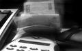
Easy Come, Easy Goby petur-fotoComment: A logo should preferably not been seen in a stock photograph. In addition you should use a larger image size. The maximum size is 640 in either direction. Use that.
As for the image I fail to see the point with it. Why are all those elements needed, the calculator, the mouse, the keyboard and the money? Of what are you taking a photograph? Remember, less is more and that very much applies to this photograph. |
| 03/20/2005 04:47:05 AM |
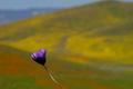
Purpleby Ram21Comment: Now, I quite like this flower photo though I would perhaps have dodged the flower a bit and maybe it would have been better if it were a tad larger in the picture. I'm fond of the background though, especially the red part at the bottom.
However, I don't find this photograph to fit the lines challenge that well, there are perhaps few lines one notices but they are certainly not a major part of the picture. |
| Photographer found comment helpful. |
| 02/18/2005 03:22:28 PM |
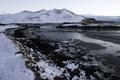
Bridge in Borgarnes Icelandby pallComment: The main fault I see with this picture is that it is too grey and dark for my taste. I guess you should have exposed it a bit more but it should still have been possible to enhance it by using curves and perhaps increasing the saturation a bit. In addittion, a lot of detail is currently hidden in the shadow areas of the picture which could be recovered with the shadow/highlight filter in Photoshop.
I'm also of the opinion that this picture would be much better if you tried to crop it slightly from below and make it a panorama crop. I don't find the foreground to be interesting enough to warrant it's place in the picture. I think I would crop it slightly below the stone in the snow to the left.
In addition, try to convert the picture to B&W instead. |
| Photographer found comment helpful. |
| 01/31/2005 10:35:41 PM |
Summer breeze by heidaComment: Heiða, best à heimi!
Congratulations, Heiða, on a terrific photo and yet another blue ribbon. :-) |
| Photographer found comment helpful. |
| 01/31/2005 09:32:43 PM |
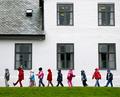
In a straight lineby arnitComment: I have a quite vivid remembrance of this picture as it appeared in the newspaper Morgunbladid here in Iceland last May. If I remember correctly it ran beside the editorial in the midsection of the Sunday edition.
I received quite an enjoyment from this picture on that particular Sunday morning and spent quite a while looking at the picture (and reading the [long] editorial beside it).
You see, while the picture itself is quite funny and and precisely the type of picture one wants to see in the newspaper while eating breakfast on a Sunday morning, what completes the picture were the strange circumstances at the time surrounding the house the kids are strolling past.
I'd better explain myself a bit. The house behind the children houses the offices of the prime minister of Iceland and at that time the prime minister was putting forth an extremely controversial law proposal (involving the media) that would later in the summer be the cause of a sort of constitutional crisis here in Iceland.
At that time I found it particularly amusing that this picture captured so well that while the adult world was up in flames these children's daily lives were entirely unaffected by it! I mean, here we have these children having a normal field day and strolling past the office of the prime minister in the midst of a major political turmoil, just like that!
I must admit I envied those children a bit how they could just ignore the idiocy of the so called "grownup world" and get away with it. Wouldn't that be wonderful sometimes?
Anyway, it also happens to be one of my favorite photographs by �rni Torfa. Message edited by author 2005-02-01 08:43:46. |
| 01/31/2005 04:28:50 AM |
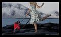
Surreal Vacumingby arnitComment: I'm wondering whether I'm biased about this photograph as I knew instantly who the author was and he happens to be a terrific photographer as well as a fellow Icelander. ;)
Anyway, I frankly can't understand how this picture could score so low and end up in the 11th place! It's a good photograph, cute model, a bit surreal as well as funny, it has nice colors and composition, and there is no face showing.
The only two reasons I could come up with to justify this picture's low score is that the model's face is cut off the frame instead of it being "faceless" in the strictest sense, and perhaps some people consider vacuuming at this certain place not to be an exactly normal activity (well, for people like �rni and Brynja, I'm sure it is normal to iron and vacuum at strange locations ...). |
| Photographer found comment helpful. |
| 01/29/2005 08:03:27 PM |
Why Me?by DiscraftComment: Nice lightning but the overexposed areas, the pants (it seems) and the model's leftmost finger draw quite an attention to the themselves.
I like how you place the model in the frame to the right.
I also think the highlights in the hair should have been toned down a bit, but I guess that's just my personal preference. As they are now, I find the highlights to be somewhat distracting. |
| Photographer found comment helpful. |
| 01/29/2005 03:53:31 PM |
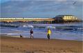
Walking The Dogby vasilkovayaComment: I understand you were trying to include the bird in the photograph but this picture would have been much better if the person walking the dog had been much more to the right of the frame so it would be like she's entering the frame.
The guy in the yellow jacket is also quite a distraction and if you would have managed to have exclude him from the picture (by taking it earlier or waiting for the next person walking a dog) it would be quite an improvement.
In addition I sorta think that high-contrast B&W would suit this picture much better than color.
But I do like the pier and the footsteps in the sand in the foreground ... |
| Photographer found comment helpful. |
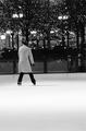
| 01/26/2005 07:08:28 AM |
Lone Skaterby milo655321Comment: It's a bit out of focus.
I'm also pondering whether the large area of ice in the foreground serves any purpose for this picture and whether it might be beneficial to crop the picture slightly below the skater's feet? |
| Photographer found comment helpful. |
Home -
Challenges -
Community -
League -
Photos -
Cameras -
Lenses -
Learn -
Help -
Terms of Use -
Privacy -
Top ^
DPChallenge, and website content and design, Copyright © 2001-2025 Challenging Technologies, LLC.
All digital photo copyrights belong to the photographers and may not be used without permission.
Current Server Time: 04/07/2025 06:08:52 AM EDT.