| Image |
Comment |
| 04/12/2005 09:51:33 PM |
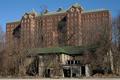
It's turn will comeby psychephylaxComment: Haha, when the picture first loaded up I first saw the title and this large and grand house and I thought; is this really an abandoned house??
Then I noticed the smaller house at the bottom which is certainly not as grand as the larger one. ;)
However, the composition isn't that great. I don't really like those architecture pictures where the photographer tilts the camera upwards (well not unless it is very well done). Here I'd have liked you to move further away from the building and keep the camera level and crop the bottom part off. (A tilt/shift lens would have been another option.) |
 Photographer found comment helpful. Photographer found comment helpful. |
| 04/12/2005 09:39:33 PM |
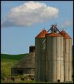
Stand against the Elementsby DDYJRComment: A composition that makes one smile!
What I don't like here is the posterisation in the clouds and the noise in the sky.
The composition is spot-on in my opinion apart from the fact that you cut a small portion off the cloud and that the picture is not 100% level, it seems. I'd have rotated it slightly. |
| Photographer found comment helpful. |
| 04/12/2005 09:28:58 PM |
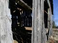
Open barn doorby ShamanComment: When I see the blue sky and the trees I really see an opportunity for a really nice photograph. Of couse, I haven't been in this place so I can't say for sure but I think that if I were shooting at this location I'd take a photograph of this barn with a long lens (100mm?) at a distance and keep the barn to the left of the frame and use the remainder to show the nice trees to the right of the barn and the beautiful blue sky.
As for the picture you chose to photograph instead I believe it would have been much better if you had shot the open barn door straight on. Think about it, what purpose does the tree and the blue sky serve on this photograph? Do they add any 'value' to the picture. I think not. |
| Photographer found comment helpful. |
| 04/12/2005 09:14:05 PM |
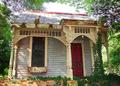
Le Garconierreby TruegshtComment: A fun and colorful photo!
However, there are certain things here that irritate me.
1) I really, really don't like the overexposed white area above the house. A shorter exposure time and perhaps shooting in RAW-format might have helped here.
2) Instead of tilting the lens up you should instead tried to be somewhat further away from the building (and/or zoom away) and shoot straight on without tilting the camera and then crop in postprocessing.
3) I'd be curious to see more of the enviroment around the house.
4. I don't like how the columns to the left of the door obscure it. You should have been more the the right when taking the picture.
5) Perhaps some unsharp mask might have helped here? |
| Photographer found comment helpful. |
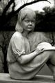
| 03/29/2005 12:34:00 AM |
Watching. Waiting.by fstopopenComment: This is a nice statue, that's for sure but I fail to see any interpretion of the scene on your behalf or you adding any value to the photograph.
E.g. if you could have tried a bit different angle of view and perhaps tried to include some background (a nice vista of the cemetery, the trees or the sky) or perhaps some foreground (maybe a flower or a real little girl?) this picture would be something more than a plain picture of a beautiful statue.
In addition, I don't like how you have failed to include the whole statue in the photo - the feet are missing. |
| Photographer found comment helpful. |
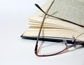
| 03/27/2005 03:18:48 AM |
glassesby ceyvalComment: Look at the other glasses with a book photograph in this challenge and notice why it is superior to you your entry.
a) If a short portion of text could have been seen through the glasses the picture would have been better.
b) Cutting the glasses in half as you have done with your crop is quite distracting. |
| Photographer found comment helpful. |
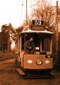
| 03/27/2005 03:13:40 AM |
Tramtalisingby michael_pComment: The sepia effect here is much too strong. In addition this is one those cases where the addition of a person in the photograph actually makes the picture worse as the man controlling the train is much too modern looking (lose the sunglasses, please) and in addition looking downwards instead of in the camera or at the rail-track.
I also fail to see the point with including the sky in the picture as it is totally white and of no interest. |
| Photographer found comment helpful. |
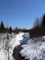
| 03/27/2005 03:09:57 AM |
Keywords = Winter, Stream, Spring, Blue Sky, Forest, Cold, Snow, Water, White, North, Evergreens.by AlainComment: Now, what I would probably have done differently here would to have gone much lower and tilt the camera slightly downwards to be able to use the small stream as a foreground. As it is there isn't really much of a foreground in this picture.
I'm also of the opinion that photographs with a lot of small details are less useable as dcp entries as the image size one can use is so small. |
| Photographer found comment helpful. |
| 03/27/2005 03:03:18 AM |
Nature's Grandeur by pncowleyComment: A bit of a cliche, but then again cliches sell (and score high on dpchallenge). ;)
Anyway, I would really have liked this photograph if there were more a foreground - a person standing and looking at the view would have, I think, been terrific.
The sun also seems to be to your right so I think a polarizer would have been nice here to make the sky a bit bluer. (You didn't use a polarizer, did you?)
I'm also curious whether a fill flash pointed to the dark area at the top would have made the picture stronger (that is, if that area is small enough for flash to be useable). |
| Photographer found comment helpful. |
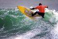
| 03/27/2005 02:57:40 AM |
Surf's Upby bryanbrazilComment: For photographs like these I consider it essential to be able to see the surfer's face -especially if one were to actually try to market it as a stock photo.
I'm also not very fond of the colors in the picture, perhaps high-contrast B&W would suit it better? |
| Photographer found comment helpful. |