| Image |
Comment |
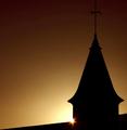
| 11/16/2005 12:16:05 PM |
Daybreakby BrinComment: Daybreak implies sun; sun not an artificial light source |
 Photographer found comment helpful. Photographer found comment helpful. |
| 11/16/2005 09:21:28 AM |
|
| 11/15/2005 04:00:57 PM |
Joyby arsenalComment: Beautiful portrait. The high (photographic) contrast underscores the contrasts between the two girl and the tree: smooth/rough, organic/geometric, animated/static. |
| Photographer found comment helpful. |
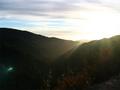
| 11/15/2005 03:29:19 PM |
Big Surby E yenocpr2Comment: Wow! Big Sur! One of the most scenic spots on the planet! And you choose to photograph sunlight bouncing around inside your lens. ;-) (Pardpn my sarcasm...it's a rhetorical device and not intended to be harsh or hurtful.)
Careful tweaking of this image with with the Photoshop 'curves' controls will separate the fore-, middle-, and backgrounds, and improve the image greatly, IMO. |
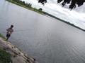
| 11/15/2005 03:19:19 PM |
Fishing Tripby Wilson LowComment: I don't believe the tilted horizon works well here. For an example of a picture in which it does work, see "Landscape with sheeps" in this challenge. |
| Photographer found comment helpful. |
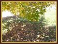
| 11/15/2005 02:59:53 PM |
Fall Leavesby jamesgsladeComment: good depth-of-field, and I like the slight over-exposure. Nevertheless, the narrow field of view stretches the concept of landscape a bit too much for my poor conservative brain to grasp. |
| 11/15/2005 02:57:48 PM |
Falling For Beautyby Mel34Comment: Interesting and pleasant 'hour-glass' composition, but, IMO, the field of view seems a bit too narrow to be called a landscape. The upper right area is blown out. Try adjusting your image using the 'levels' control (or, better, curves) in Photoshop (or their equivalents in your software). |
| Photographer found comment helpful. |
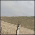
| 11/15/2005 02:18:58 PM |
Landscape with sheepsby RasmusComment: Well, that's one way to get a nice diagonal in the foreground...and it's effective. I love the geometry: two nearly equal rectangles, one of which is divided diagonally into two triangles. (You've invented a new 'rule-of-thirds'.) Each of these three areas has a different texture and color. High key works here, too. 8 |
| Photographer found comment helpful. |
| 11/15/2005 02:01:37 PM |
busted clutch discby imagesloyolaComment: I reaslly like the juxtaposition of these two same-yet-different cluch plates. I would to see more detail in the dark item, though. |
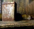
| 11/15/2005 01:58:33 PM |
The Lurkerby barbaraanneComment: Love the light and the textures:rust, wood, fur. But, dead or alive...enquiring minds want to know. |
| Photographer found comment helpful. |
Home -
Challenges -
Community -
League -
Photos -
Cameras -
Lenses -
Learn -
Help -
Terms of Use -
Privacy -
Top ^
DPChallenge, and website content and design, Copyright © 2001-2025 Challenging Technologies, LLC.
All digital photo copyrights belong to the photographers and may not be used without permission.
Current Server Time: 04/08/2025 04:55:37 PM EDT.