| Image |
Comment |
| 06/08/2005 04:34:30 PM |
Temporary Stepsby cloudsmeComment: I would have liked it more if the stairs didnt go out of focus near the bottom... very nice still though, love the colour of everything. |
 Photographer found comment helpful. Photographer found comment helpful. |
| 06/08/2005 04:10:07 PM |
Building a Haven for Historyby SebiComment: Overexposed, but it looks like you did it on purpose, i just dont get why. For something overexposed like this, the picture looks rather empty since most of it is just white sky. |
| Photographer found comment helpful. |
| 06/08/2005 04:08:36 PM |
|
| Photographer found comment helpful. |
| 06/08/2005 04:07:19 PM |
Newby Jade 11Comment: I know that it's hard to do much about, but I feel the lamp post really doesn't fit well at all, and that it would have been a lot better if it wasn't in there, and if you'd backed up just that much more to get the top of the crane in. The lamp post is just in a strange position and gives your picture a bit of wierd framing, specially in conjuction with the crane arm. |
| Photographer found comment helpful. |
| 06/05/2005 12:15:20 PM |
3-5 or Expressby DKYoungJrComment: Seems like it's a bit to bright. Some of the colour is washed out, and up in the top, in what looks like a parking lot I'm going to guess it's completly washed out. Good subject though. |
| 06/05/2005 12:13:20 PM |
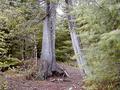
Fork in the Pathby mahobbesComment: A bit to contrasty would be my only complaint. The white on the rock, and in a few other spots like the sky on the left, and some of the patches on the ground are washed out, and one of the trees and some of the shadows are a solid black. It'd be nice to see some detail in them. Not always easy to do though, so good job. |
| Photographer found comment helpful. |
| 06/05/2005 12:11:09 PM |
|
| 06/05/2005 12:07:50 PM |
Choose your Destinyby RulerZigzagComment: Being a Star Wars fan, I obviously like the subject matter a lot. My first suggestion though, would be more dramatic lighting. It's obvious, mainly for Yoda, that he's just a toy. Instead of having a bright light, taking away any shadows that might have been on him, you could use more selective lighting. Light side or dark, it's something dramatic, give it some dramatic lighting! Also, I find the shadow of Vader's mask doesn't help, since Yoda doesn't have one. Nice try though, good idea for sure! |
| Photographer found comment helpful. |
| 06/05/2005 12:04:35 PM |
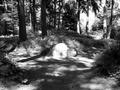
Take a Chance Under or... Go Left?by Drew_BComment: I find there is a lack of contrast in the pic, first of all. Normally in a forest, the greens really stand out from the bland browns of the ground, here it all seems to blend together. Also, as for in the context of the contest I don't really see the big decision. Maybe I'm just looking at it the wrong way, I'm not to sure. Nice attempt though. |
| 06/05/2005 12:02:25 PM |
Of Shoesby SimonkasprzakComment: I really like this picture, even outside of the context of the contest, but with the way the feet are placed it just goes perfectly with that 'which should i pick' type of thing. |
| Photographer found comment helpful. |
Home -
Challenges -
Community -
League -
Photos -
Cameras -
Lenses -
Learn -
Help -
Terms of Use -
Privacy -
Top ^
DPChallenge, and website content and design, Copyright © 2001-2025 Challenging Technologies, LLC.
All digital photo copyrights belong to the photographers and may not be used without permission.
Current Server Time: 04/09/2025 10:52:08 AM EDT.