| Image |
Comment |
| 07/11/2005 10:59:35 AM |
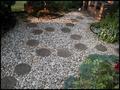
Garden Pathby mkcatsComment: The brick structure in the top right is distracting, not least because it has the sunlight on it whilst the rest of the photo doesn't - cropping this back and changing the colours and levels would help. Shooting at a different time of day would also change the colours.
I'm a great fan of texture without distraction, so going right into the centre of the flagstones with more interesting lighting would have scored very highly for me, but that is purely subjective, and should in no way influence your decisions on your photos. |
 Photographer found comment helpful. Photographer found comment helpful. |
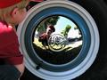
| 07/11/2005 10:45:04 AM |
Hubcaps on the Ceilingby CrystalFuryComment: This is quite blurry - neither the centre cap nor the one directly beneath it in the photo is in sharp focus. The shadows are distracting - adding a soft light from the right would have helped alleviate them somewhat without adding much extra reflection. |
| 07/11/2005 10:39:32 AM |
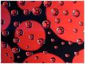
Fantasy Circlesby ninjaComment: nice! The highlights are slightly overblown, but hey, its better than having only red and black in the picture... |
| Photographer found comment helpful. |
| 07/11/2005 10:37:51 AM |
Spiritualityby SimonkasprzakComment: Nice photo, but where's the fully geometric circles? :p
I don't think the extra large border really supports this photo.
|
| Photographer found comment helpful. |
| 07/11/2005 10:35:32 AM |
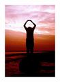
Unwind by nico_blueComment: This shot has everything going for it, except for the top right corner... - lots of tone, contrasts, silhouettes. It does seem a very tight crop to the left - having the stairwell in it's entirety would have really boosted the dynamics of this image. Still, I'm voting in the upper quartile. |
| Photographer found comment helpful. |
| 07/11/2005 10:31:18 AM |
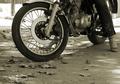
Let me show you boy!by PascalComment: This is a great image - the brake disk is clearly the main subject - the eye is drawn to it from any part of the photo. The tight crop on the mudguard's a shame - it's curve would have lent a greater emphasis to the wheel. I don't find the overblown highlights a problem, although some might - it gives added emphasis to the tyre. Only minor issue is the bleed into the tree trunk in the background - shooting ever so slightly to the right would have fixed this :)
riding a bike without any safety gear is just silly, though.
|
| Photographer found comment helpful. |
| 07/11/2005 10:18:32 AM |
|
| Photographer found comment helpful. |
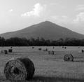
| 07/11/2005 10:15:03 AM |
Crop Circlesby SJCarterComment: whilst there are circles in the image, my eye is constantly drawn to the mountaintop, which becomes the subject of the photo. Only a minor criticism to an interesting photo, though. I'm curious to know why there are some very sharp features on the mountain edge without obvious sharpening artifacts nearby? |
| Photographer found comment helpful. |
| 07/11/2005 10:08:59 AM |
Cool Circleby sharkavComment: shame about the highlight on the wooden background top left. It slightly distracts from the interesting reflections in the centre. |
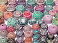
| 07/11/2005 09:59:46 AM |
CIRCLESby nikmaticComment: Circle Overload! The plain white background is overpowering - the )( shapes stand out - and there's no sense of creativity in the arrangement. The picture is very busy, which is somewhat distracting. Having fewer elements in a more interesting arrangement would have gained bonus points!
As it stands, a nice texture shot. |
| Photographer found comment helpful. |
Home -
Challenges -
Community -
League -
Photos -
Cameras -
Lenses -
Learn -
Help -
Terms of Use -
Privacy -
Top ^
DPChallenge, and website content and design, Copyright © 2001-2025 Challenging Technologies, LLC.
All digital photo copyrights belong to the photographers and may not be used without permission.
Current Server Time: 04/07/2025 06:19:11 AM EDT.