| Image |
Comment |
| 02/22/2008 09:24:04 AM |
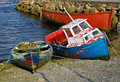
Resting in peace ...by smr78Comment: The worn out paint, the red spots on the boat rather suggest the "violent past" I think. |
 Photographer found comment helpful. Photographer found comment helpful. |
| 02/22/2008 09:18:43 AM |
Spring is comingby tennernieComment: The brownish dead leaf at the top is a bit distracting, may be you could try inverting the image upside down. The lighting is a bit too harsh, but i like the DOF in this picture |
| 02/22/2008 09:15:17 AM |
Peace - At One With Natureby DIGITALinsanityComment: The details are lost mainly because of the image size (long and short). I don't know if its mist or an artifact bang in the middle of the frame, but it is distracting. Overall a nice capture of a symmetric reflection. :) |
| Photographer found comment helpful. |
| 02/22/2008 09:11:45 AM |
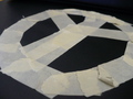
Taped peaceby justin27Comment: The soft focus, the torn and uneven pieces of the tape are a little distracting. I like the point of view rather different from a straight top down shot. |
| 02/22/2008 09:01:37 AM |
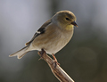
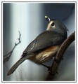
The Simple Goldfinchby DrakeComment: Nice and simple capture, but would like to see bit more light on the eyes, hard to get that I guess |
| Photographer found comment helpful. |
| 02/07/2008 07:35:16 PM |
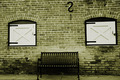
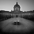
Someone Should Be Sitting On That Bench...by sudhiComment: Originally posted by taterbug:
Great eye on this one. Very nice choice of subject. I like the centered approach for the composition, there is good symmetry here, and the single black 's' at top offers nice opposition, and tension in the shot, a good 'break up' for the scene. However, it is just a little 'off', just enough to seem careless, and not fully thought out. I think in a shot like this, it can be greatly strengthened by really nailing the symmetry present, and emphasizing and driving home the centered comp. With all the lines that are here, going right to the edge of the frame, it is easy to see that it is not 'straight', or in line. Also, the distance from the edge of both sides of the frame, to the edge of the windows is not the same. I would say it looks like your shooting position could of been just a step or two to the left, and really squared it all up tight. I mean, this is just so close to that, it seems like that is the intent. This is just not 'off' enought to seem like it was the chosen POV. But if it was, then ignore me :-) Still a nice shot. |
thanks all for the comments..
taterbug: you are right.. a bit lazy on my part and I found lateral misalignment is tricky to correct in PP :-) |
| 01/30/2008 09:47:07 PM |
|
| Photographer found comment helpful. |
| 01/30/2008 09:43:32 PM |
|
| Photographer found comment helpful. |
| 01/30/2008 09:37:59 PM |
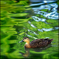
Heading Homeby EssAreDubyaComment: the main subject does not really stand out with the background and foreground having similar color |
| Photographer found comment helpful. |
| 12/30/2007 06:53:11 PM |
|
| Photographer found comment helpful. |
Home -
Challenges -
Community -
League -
Photos -
Cameras -
Lenses -
Learn -
Help -
Terms of Use -
Privacy -
Top ^
DPChallenge, and website content and design, Copyright © 2001-2025 Challenging Technologies, LLC.
All digital photo copyrights belong to the photographers and may not be used without permission.
Current Server Time: 04/07/2025 06:09:22 AM EDT.