| Image |
Comment |
| 05/19/2008 07:24:23 PM |
|
 Photographer found comment helpful. Photographer found comment helpful. |
| 05/19/2008 07:24:03 PM |
|
| 12/18/2007 09:45:53 AM |
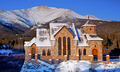
Port of Entryby hahn23Comment: Find a new angle. St Elmo's has so much more to offer than the view from the road. |
| Photographer found comment helpful. |
| 12/18/2007 09:41:31 AM |
|
| 11/17/2007 12:25:03 PM |
|
| 02/06/2007 10:33:44 PM |
Orchardby undieyatchComment: Mostly nice composition. Not sure why it's not working for me overall.
I think it is because the composition isn't strong enough to carry the whole photo. It needs some other element of interest.
The lines of the tree bases draw your eyes in the the center of the photo to what? The horizon might be OK. But it's just an empty field that is too far away to see any detail. |
| 02/06/2007 10:31:01 PM |
Good Poker Handby whiterookComment: Why is the knuckle in focus instead of the cards?
Poor composition - try adding a little more space near the top or somthing. Google "rule of thirds" for ideas. |
| Photographer found comment helpful. |
| 02/06/2007 10:29:22 PM |
Good time for a sundownerby kerryleaComment: Try shooting in raw, and using either Photoshop (not elements) or RawShooter Essentials (free for a little while longer), so you can adjust in 12+ bits. Then you won't get the rings around the sun - more bits = smoother skies (generally speaking). |
| Photographer found comment helpful. |
| 02/06/2007 10:26:05 PM |
As Good as it gets...by tezza73ukComment: Maybe use some sort of light weight cloth or paper to reduce the glare on the figurine. I'm guessing you tried that, and it ruined the shadow. Dunno, but that glare sticks out like a sore thumb. |
| Photographer found comment helpful. |
| 02/06/2007 10:23:58 PM |
Sea of sendby natalka9Comment: The colors are too yellow. Maybe it was an attempt at artistry. Dunno. I just know the color is not working for me.
I like the three groups of kids, but I would have left a little more space around the edges, especially on the lower left child. |
| Photographer found comment helpful. |
Home -
Challenges -
Community -
League -
Photos -
Cameras -
Lenses -
Learn -
Help -
Terms of Use -
Privacy -
Top ^
DPChallenge, and website content and design, Copyright © 2001-2025 Challenging Technologies, LLC.
All digital photo copyrights belong to the photographers and may not be used without permission.
Current Server Time: 04/11/2025 05:08:46 PM EDT.