| Image |
Comment |
| 09/28/2005 01:39:44 AM |
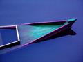
CRW_6768.jpgby fitmpdnsthtrComment: I like the dynamism added by the arbitrary angle, and even though the boat and peer in the painting by the male model's head helps, the girl still feels a bit dominated / heavy.
Almost all of the histogram on this one is in the darker half. Push the contrast and brightness in levels a bit and see the colours jump out. Message edited by author 2005-09-28 05:44:14. |
 Photographer found comment helpful. Photographer found comment helpful. |
| 09/28/2005 01:37:22 AM |
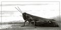
IMG_2237.jpgby fitmpdnsthtrComment: She looks like she would Kick the butt of anybody who even looks at her funne hehe.
I think your camera angle shows this too.
I find myself looking for a story in the photo. She has an interesting expression, but I keep looking for "something?" |
| Photographer found comment helpful. |
| 09/26/2005 01:54:40 AM |
Mr and Mrs Rupertssonby IncarlightComment: Unless, of course, that IS her happy face. In that case it would be better to include the bottom left of her dress, if it's there. Otherwise it looks good.
A few other hints: It is not only her smile that makes her look uncomfortable. Watch your backgrounds. She is dark brown bark, he is light green. This seperates them. Pose, he is looking straight at you, hands in the crotch. This isolates him, and she is just "with" him. Her head is tilted towards the outside of the frame, not towards him, and she is looking "out" of the frame.
It also feels as if your vantage point is slightly higher than them?
Nice light and processing, and that is one beautifull boquet(sp)! |
| Photographer found comment helpful. |
| 09/25/2005 01:30:59 AM |
submergedby BudComment: This is so great!
Very beautifully sad. |
| Photographer found comment helpful. |
| 09/23/2005 03:53:07 AM |
curious visitorby MsMiaComment: Very nicely done!
He is a bit close to the frame, either that or the frame is too big.
Nice balance and tones, though there is possably a bit too much negative white space.
Hope to see more of your work soon:) Message edited by author 2005-09-23 07:55:17. |
| Photographer found comment helpful. |
| 09/22/2005 11:15:08 PM |
|
| Photographer found comment helpful. |
| 09/16/2005 12:46:41 AM |
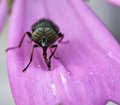
stripeyesby Pug-HComment: Cool shades!
Judging by the dots(pollon) in the flower petal, it looks a bit pre-focussed, slightly, but with such narrow dof, it makes a bit of difference.
Very nice Macro. |
| Photographer found comment helpful. |
| 09/15/2005 09:48:46 PM |
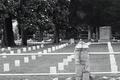
Old Cemetaryby madison461Comment: Nice big headstones and perspective haze.
The foreground does not really contribute much. I think a shot from inside the fence may have been nicer. Having something light (SAMS) being cut off by the frame is also a bit distracting. |
| Photographer found comment helpful. |
| 09/15/2005 09:43:28 PM |
Confederate Cemetaryby madison461Comment: I love cemetary shots.
The top of the stone upright in the front, and the white "fence" is a bit of an attention hog. Because of it I almost did not notice all the graves in the background.
Nice b&w. |
| Photographer found comment helpful. |
| 09/14/2005 04:34:21 AM |
DSC_9862.jpgby nomad469Comment: My third fav of this set. I think a little more dof would have helped, and a little bit more light on the hair so it does not contrast so much with the hand. |
| Photographer found comment helpful. |
Home -
Challenges -
Community -
League -
Photos -
Cameras -
Lenses -
Learn -
Help -
Terms of Use -
Privacy -
Top ^
DPChallenge, and website content and design, Copyright © 2001-2025 Challenging Technologies, LLC.
All digital photo copyrights belong to the photographers and may not be used without permission.
Current Server Time: 04/07/2025 06:12:31 AM EDT.