| Image |
Comment |
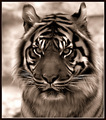
| 02/23/2006 03:55:55 AM |
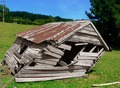
Portrait of Regalby SandyPComment: Very nice textures and patterns. Picked a very nice subject. I find the top of the head to be a bit soft. But over all very nicely done. I gave it a 8. |
 Photographer found comment helpful. Photographer found comment helpful. |
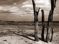
| 02/23/2006 03:55:48 AM |
...Parched...by DefyTimeComment: I love the composition. The details in the wood and its casting shadows match very well with the muted clouds and horizon. I gave it a 9. |
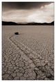
| 02/22/2006 03:11:26 AM |
Moving Rocksby gaurawaComment: The textures are just tremendous. Nice rule of thirds. This image would work well in almost any challenge. I gave it an 8. |
| Photographer found comment helpful. |
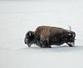
| 02/11/2006 01:55:12 PM |
Death-Walk.jpgby midnightride2Comment: Looks very cool. I could imagine it in a panoramic and I think I think it would look very nice. The texture of the fur looks a bit muted to me. But I can also see it could add more appeal. Little bit of noise cleaning and you could have a print. |
| 02/09/2006 05:11:34 PM |
Centrally Challengedby KiwiShotzComment: From the Critique Club:
My inital thoughts were I needed to adjust my vertical and horizontal settings on my monitor. I love the idea and I do think it fits the challenge. I do feel that alot of other people will think it does not. And with the subject like this it is hard to just crop half of it away.
The greens are very nice and rich. The rust is a nice touch as well in the center of the frame. I do not know if a different crop would have helped much. I think it just came down to voters personal tastes. But very nice job and nice find. |
| Photographer found comment helpful. |
| 08/10/2005 08:11:35 AM |
Channel-Mixer.jpgby sheapodComment: I like the face this way...makes the hair on the tiger stand out more to me. I just think it looses more detail on the front chest area. Still very nice. |
| Photographer found comment helpful. |
| 08/05/2005 08:06:48 AM |
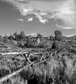
Barrier of Times Pastby cools98Comment: From the Critique Club
I like the composition. The way the fence trails off. Definately reminds me of the southwest (where I live). I think the fence blends in too much with the surroundings. It sort of gets lost. I like the B/W but I think you could have used a little dodge and burning to make the photo a bit better. I know dodging and burning is over used at DPC. But I find you could have done it sublty enough most would have never known you use it. |
| Photographer found comment helpful. |
| 08/05/2005 07:02:40 AM |
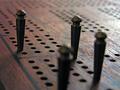
Cribbageby LadeeMComment: The glare or lighting is a bit harsh for my tastes in the top right corner. I would have liked to see a more "flat" point of view. I like the wood grain and the DOF on the pieces. I would have liked to have seen the pieces a bit futher away and maybe only 1-2 up close.
I think subjects like these are to personal tastes but I gave it a 6 while voting. |
| Photographer found comment helpful. |
| 08/04/2005 06:11:05 AM |
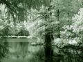
Duotone.jpgby sheapodComment: I find it to be a great edit. I love infrareds to begin with. I suppose I think the green is a bit "minty" looking to me but that is just a personal choice. Nice composition as well. |
| Photographer found comment helpful. |
| 08/01/2005 10:46:17 AM |
Reach Out & Conquerby ClickNSeeComment: From the Critique Club
I do not think the overall composition works. I think their are lots of textures to be had their but the light just does not seem to enhance any of them. Probrably a closer crop on one selected element would have helped. I do find the colors to be very vibrant and the red/burngundy contrasts nicely. |
Home -
Challenges -
Community -
League -
Photos -
Cameras -
Lenses -
Learn -
Help -
Terms of Use -
Privacy -
Top ^
DPChallenge, and website content and design, Copyright © 2001-2025 Challenging Technologies, LLC.
All digital photo copyrights belong to the photographers and may not be used without permission.
Current Server Time: 04/07/2025 06:14:50 AM EDT.