| Image |
Comment |
| 03/13/2006 03:48:07 AM |
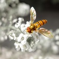
Flyby TejComment: From the Critique Club:
Congratulatons on a top 20 finish and for almost making the top 10.
Very stunning image color balance wise. The white or light colored background makes the rest of the colors pop right out. Nice pose on the subject as well. I myself would have liked to have seen the flowers the insect was perched on in a little more focus. IE not such a shallow depth of field. The size of the insect is perfect. Perfectly placed as well within the frame. I think it works perfectly for a square crop. But ultimately I think people are tired of seeing macro insects. Thats about the only reason i can think for you not to finish in the top 10 or even higher. |
 Photographer found comment helpful. Photographer found comment helpful. |
| 03/12/2006 04:51:44 AM |
Watching the flowers grow... this conforts herby carreraComment: From the Critique Club:
For me the balance of this image just doesn't work very well. The window blinds meangling with the plants distract my eye. Not a bad point of view of the subject. But having to try and twist and turn my head to check her expression. The colors seem a bit muted. The browns of the rug and the dark upholstery seem block out the greens of the plants for me. The lighting is not bad but its not great either. Besides the top of the chair everything seems so flat. I think you could have kept the same point of view but pulled the vertical shades flush and it would have helped some. |
| 03/11/2006 05:42:17 AM |
Heaven & Hell by pearlseyesComment: From the Critique Club:
Congratulations on a Yellow Ribbon.
First off a very well balanced image. The sunset has great toning and colors. The 2 subjects are balanced well on the right side of the image drawing the viwers eyes across the sunset to them. The darkness, even though their is a lot of it, is not overpowering. Each aspect of the image goes hand in hand with each other. Overall the image does seem a bit soft to me. But that is totally acceptable. It has a dreaminess quality to it. The only negative comment (and its just a personal thing) is the border. I like the black border on the sunset but it gets lost in the foreground. If their was a way to make the bottom border white allowing for the top to remain black I would have liked the image even more. |
| 03/10/2006 05:05:18 AM |
O U T C A S T S — A Tale of Forbidden Loveby Bear_MusicComment: From the Critique Club:
Congrats on a top 20 finish.
I think this is a very striking image. I always thought to try not to ceneter subjects up in the frame. Even though to me the subject is in the ceneter of the frame. The angle of the legs buckling, head tilt, ducky to the side. Make the image not very cenetered even though it may be. The lighting is spectacular! Very even and soft at just the right angle. As a newbie I would have left the entire shadow. But I see now how it fits without needing the entire piece. I personally can not find anything negative about the image. So i think as all to often it comes down to subject matter. Only being on the site for almost a year I have seen maybe 10-15 woody - ducky challenge images. So in my mind they are not to over done. But I am sure their are people who do not care for them. |
| Photographer found comment helpful. |
| 03/08/2006 10:39:14 AM |
Felix and Oscarby banmornComment: From the Critique Club
First off congrats on top 10. Very stunning and brilliantly colored image. Nicely balanced between the opened and unopened tulips. Nice lighting overall. I do think the black background makes the edges on the opened one seem a bit harsh. Maybe it is just me but it also seems a bit soft. But that is probrably just me. You know more about photography than I do. This is just me personally. But I would have liked to seen a little more negative space. The tulips a little further back. But I figure when you get in the top 10. It's more of a hit or miss type of thing. So I do not know what to tell you as far as what you could have done better. Not much of a critique and I apologize. |
| Photographer found comment helpful. |
| 03/08/2006 04:26:00 AM |
odd couple , Napolean and Davidby 2462muComment: From the Critique Club:
At first glance besides the smallness of the image, it does not look like a bad image. Because it is so small however the detailing in the statuettes is lost. Also I am not sure if one is made of wood and the other metal. But the flash on Napolean seems harsher then on David. I do not mind the choice of subject. But I think a different point of view from below, showing how dominant each of their lifes were. Would make for a more dramatic effect. Also the subjects seem to centered. If they were starring face to face at each other it may have created a more odd couple effect. Also as an unwritten rule statues and the like never really do well in challenges. Do not be discouraged by the low score. I would never try and tell you how to do your photographs but a few tweakings here and their would have greatly increased your score. |
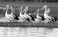
| 03/07/2006 10:22:04 AM |
BIG BIRDS.by CONRADComment: From the Critique Club:
I find this image overall cramped. The foreground (water) would be better if it was smooth and had the reflections of the birds. It would indeed make them appear larger. I would have cropped all of that away. And opened the top off and not cropped off the background trees. Everything is nicely in focus. The grass seems a bit busy and ie like before if it was not in the center of the image it would look less busy to me. Nice black and white image. Nice birds that have a nice contrasting color. I would have liked to seen the birds cropped a little bit closer. That way you can see all the details and tones of their bodies. Otherwise it is a nice image. |
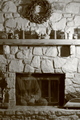
| 03/07/2006 10:11:20 AM |
Where am Iby tngrndreamComment: From the Critique Club:
I love the overall idea behind the image. I do think it is a bit narrow. Meaning it gets the fireplace and mantle but makes everything vertical. And competes with the mantle and horizontal stone piece. Witht he exposure it has made the lighting a bit hard in places. But it did do a nice job on creating depth to the stonework. It does seem to be out of focus or soft in places. Probrably do to the lenght of exposure. I would have liked to seen less clutter. Often in these critiques it is the critiquers personal choices. Does not mean they do not value your choices and ideas. Do your photography how you like it. But I think a wider broader image maybe cropped just below the mantle would have worked out somewhat better. Good luck and never give up. |
| Photographer found comment helpful. |
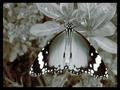
| 03/07/2006 05:01:35 AM |
DONT TOUCH MEby sandeepsalwan45Comment: From the Critique Club:
Straight away I like the composition and how you were balancing everything. I believe the sunlight or angle of it. Makes your photo seem very flat. There is also a fuzziness to it. Maybe a slight focus issue and maybe just due to the light or lack of it. None of the textures pop out and basically no shading or shadows. I understand trying to chase and catch a butterfly without it flying away is very difficult. I do think the shading would have worked out well and helped your score tremendously if not for the flat looking light. There also appears to be some noise issues. Most of this stuff can be corrected and your well on the right track. Don't give up. |
| Photographer found comment helpful. |
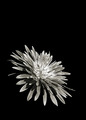
| 03/07/2006 03:28:45 AM |
Singleby fiveriversComment: From the Critique Club:
The first thing that pops out to me is the balance of the image. Well compositioned. I also like how the petals are only visible. I however would have liked to seen a little less negative space allowing for more detail in the flower and a larger flower. The black background seems to make the long hard shaped petals seems jagged and a bit coarse. The darks in the petals ate nicely balanced and not to dark to get lost witht he background. I would have liked to seen a little larger water drops. I know that may not have been possible but critiquing can be a "wish list" of stuff. Took a very ordinary subject and with nice lighting and nice tones made a drmamtic peice. I do not know what would have helped your score. I think flowers and the like have only a certain obtainable score. |
Home -
Challenges -
Community -
League -
Photos -
Cameras -
Lenses -
Learn -
Help -
Terms of Use -
Privacy -
Top ^
DPChallenge, and website content and design, Copyright © 2001-2025 Challenging Technologies, LLC.
All digital photo copyrights belong to the photographers and may not be used without permission.
Current Server Time: 04/07/2025 06:20:03 AM EDT.