| Image |
Comment |
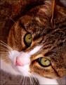
| 04/10/2005 05:25:18 AM |
|
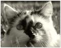
| 04/10/2005 05:24:34 AM |
Baskingby BradComment: This is my second go around =) - Very nice portrait! I only think it's a little too over-exposed on the right side... it's distracting from your kitty's face. Otherwise, good job! |
 Photographer found comment helpful. Photographer found comment helpful. |
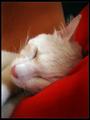
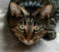
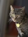
| 04/10/2005 05:23:32 AM |
Sweet Dreams 2by FyzarlComment: This is my second go around =) - Beautiful soft lighting! I love the colors, tones, everything! I would only recommend leaving more space on the left or croppeing it landsape instead of portrat... normally it'a good idea to leave excess space in the direction the face is pointing to. But overall I think this is excellent!!! =) |
| Photographer found comment helpful. |
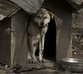
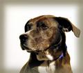
| 04/10/2005 05:22:07 AM |
The Family Dogby aplomb76Comment: This is my second go around =) - Awh... he doesn't look too happy. Very nice desaturation... I think there should be some more highlights (brighter white)- it looks a little too dull. Otherwise, great job! |
| Photographer found comment helpful. |
| 04/10/2005 05:20:54 AM |
Lincolnby jamijcComment: This is my second go around =) - Looks sneaky! haha. Very cute! The picture looks a little off balance... looks like it is too heavy on the right (it's slanted to the right plus his paw is there). Otherwise, great job!!! |
| Photographer found comment helpful. |
| 04/10/2005 05:19:07 AM |
Jumboby JohannesFrankComment: This is my second go around =) - Awh... so cute! I would have liked to have seen this in b&w, for some reason. I think the red veins in her eyes are distracting, I would have cloned them out... may be just me because veins make me queesy =) haha. Otherwise, beautiful portrat! Excellent job! |
| 04/10/2005 05:16:39 AM |
Blackieby C_Steve_GComment: This is my second go around =) - Very nice portrait! WI would only recommend not burning the edges... you really did not need it for this portrait. Also, I would have left a little more open space on the left. Otherwise, excellent job! |
| Photographer found comment helpful. |
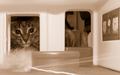
| 04/10/2005 05:15:36 AM |
Eulerby ralphComment: This is my second go around =) - So cute! I would have liked to have seen it cropped so it only shows the door with the cat's face, instead of th eone on the right too. However, I love the tone you used and excellent contrast & grey scale. Overall, great job! |
| 04/06/2005 04:38:11 PM |
Tabby glamourby LevTComment: This is my second go-around =) - Cute kitty! I would only suggest increasing your contrast a little... I do not see any dark blacks, so there is a dull appearance. I also would have liekd to have seen it cropped a little differently... I think there's a little too much background on the left and top. Otherwise, good job! |
| Photographer found comment helpful. |
| 04/06/2005 04:36:35 PM |
|
| Photographer found comment helpful. |
Home -
Challenges -
Community -
League -
Photos -
Cameras -
Lenses -
Learn -
Help -
Terms of Use -
Privacy -
Top ^
DPChallenge, and website content and design, Copyright © 2001-2025 Challenging Technologies, LLC.
All digital photo copyrights belong to the photographers and may not be used without permission.
Current Server Time: 04/07/2025 06:28:03 AM EDT.