| Image |
Comment |
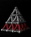
| 05/12/2005 01:33:05 PM |
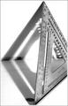
Triangle! No.... Square!by mcraelComment: great composition. I am a fan of the high contrast, but I think it might be a tad harsh, losing the texture of the wood. I would have to play around with the file in order to see if less contrast would look better, it's hard to tell. |
 Photographer found comment helpful. Photographer found comment helpful. |
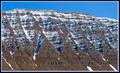
| 05/12/2005 01:30:51 PM |
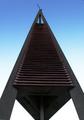
Where's the church? Here's the steeple...by mexicoComment: ...the church has landed... very cool shot, almost has an abstract quality. it would be nice to have a little more texture in the dark parts of the "object", small adjustments in curves could do the trick. |
| Photographer found comment helpful. |
| 05/12/2005 01:28:53 PM |
|
| 05/12/2005 01:28:23 PM |
|
| Photographer found comment helpful. |
| 05/12/2005 01:26:31 PM |
|
| Photographer found comment helpful. |
| 05/12/2005 01:24:47 PM |
|
| Photographer found comment helpful. |
| 05/12/2005 01:23:40 PM |
|
| Photographer found comment helpful. |
| 05/12/2005 01:22:49 PM |
Rack 'Emby mommaof2Comment: it's a good idea, but i think the picture would be stronger if the foreground were lighter and the background darker. Try different lighting conditions next time, sometimes a desk lamp can do wonders. |
| Photographer found comment helpful. |
| 05/12/2005 01:21:30 PM |
|
| 05/12/2005 01:20:51 PM |
|
| Photographer found comment helpful. |
Home -
Challenges -
Community -
League -
Photos -
Cameras -
Lenses -
Learn -
Help -
Terms of Use -
Privacy -
Top ^
DPChallenge, and website content and design, Copyright © 2001-2025 Challenging Technologies, LLC.
All digital photo copyrights belong to the photographers and may not be used without permission.
Current Server Time: 04/07/2025 05:52:11 AM EDT.