| Image |
Comment |
| 02/07/2005 11:50:01 AM |
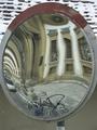
Mirrorby barkaComment: very artistic, and the neutral colors let the distortions take precedence. |
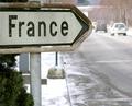
| 02/07/2005 11:48:34 AM |
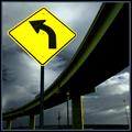
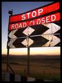
Roadblockby RulerZigzagComment: unrealistic, I think, and too much touch-up. Otherwise, it effectively communicates the true purpose of the sign. |
 Photographer found comment helpful. Photographer found comment helpful. |
| 02/07/2005 11:47:39 AM |
Good advice by BrennanOBComment: I like the contrast of the sign, though the touch-up may be too much. The overpass curve adds a lot to composition. |
| Photographer found comment helpful. |
| 02/07/2005 11:46:31 AM |
|
| Photographer found comment helpful. |
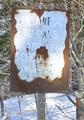
| 02/07/2005 11:44:12 AM |
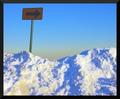
Waiting for Springby kebmod54Comment: Effective b&w! the sign is a bit dark and I think that the arrangement of buildings/sign is a bit confusing. The field definitely and hills in background give depth. |
| Photographer found comment helpful. |
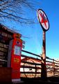
| 02/07/2005 11:41:48 AM |
Fill Her Upby TaikimonsterComment: I like the repetition of circles. The colors in the sky are good contrast with the bright red. fence gives perspective. |
| 02/07/2005 11:40:07 AM |
|
| Photographer found comment helpful. |
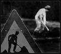
| 02/07/2005 11:39:25 AM |
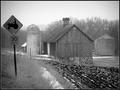
Here's your signby HrutsenComment: effective exposure, but it's hard to tell in b&w if the back figure is alive! interesting! |
| Photographer found comment helpful. |
| 02/07/2005 11:38:10 AM |
|
| Photographer found comment helpful. |
| 02/07/2005 11:37:18 AM |
|
| Photographer found comment helpful. |
Home -
Challenges -
Community -
League -
Photos -
Cameras -
Lenses -
Learn -
Help -
Terms of Use -
Privacy -
Top ^
DPChallenge, and website content and design, Copyright © 2001-2025 Challenging Technologies, LLC.
All digital photo copyrights belong to the photographers and may not be used without permission.
Current Server Time: 04/12/2025 07:39:26 PM EDT.