| Image |
Comment |
| 04/09/2006 07:05:40 AM |
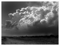
Stormfrontby e301Comment: Should have placed much higher. A great picture! |
 Photographer found comment helpful. Photographer found comment helpful. |
| 04/09/2006 02:39:51 AM |
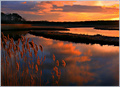
The Fisherman by arnitComment: Man oh man :) Thanks a bunch for all the great comments. I usually don't go so extreme on the post processing but because of the no editing restrictions for this challange I decided I had to.
The History:
I took this photo in the Vestfjords of Iceland while on a trip visiting my relatives that live there. This man was a part of an outdoor museum about fishing in the old days.
Editing steps:
Worked on different areas with adjustments layers. Brightness/Contrast, Levels. Added a layer and used soft light and lowered the opacity. At the end I added another layer on top and made it bw and used variations to make it brown. Then instead of soft light I used hue and the picture got this brownish/old feel to it. Lowered the opacity a bit.
If you need some further information about this e-mail just send me an e-mail or personal message. Thanks again :)
The Original:
 My Entry:
 |
| 04/07/2006 01:23:53 AM |
|
| Photographer found comment helpful. |
| 03/30/2006 07:54:06 AM |
The Gymnast by arnitComment: Thanks for all the wonderful comments. I'm glad dpc'ers took it with open arms. Not usually pictures like this one that do well in challanges :) I'm pretty happy with it. First time I ever shoot gymnastics... and I kinda like it. I've got some more shots of the same event that I will post here on dpc shortly.
Gary: First to 25 wins ;) |
| 03/20/2006 02:48:56 AM |
|
| Photographer found comment helpful. |
| 03/01/2006 03:26:13 AM |
|
| Photographer found comment helpful. |
| 02/28/2006 04:43:24 PM |
The Beast Withinby balmikiComment: Critique by arnit
I like the black negative space. In my opinion the lighting could have been better. The burned out hand bother me a bit because that is the first thing that I see and my eyes keep on moving to that spot. I would like to see a bit more light on his face and on the blade. Maby the whole right side of him lit. Good luck in future challanges.
Arnit
Critique Club |
| 02/28/2006 04:40:54 PM |
Greed: The Love of Moneyby SamDoe1Comment: Critique by arnit
This is a good idea. The composition and placement of the money is good. I think you could have placed the bill-hearts a litle bit better so we could see the shape of the heart better. I'm not sure if it is just my monitor but I can see some shades at the back. Probably from the cloth that the money is lying on. Next time you could try to use a thick paper instead of cloth. You will get much smoother surface for your shut. Other than that this is a fun picture and a good idea.
Arnit
Critique Club |
| Photographer found comment helpful. |
| 02/28/2006 04:37:07 PM |
The Book of Loveby glodaComment: Critique by arnit
I like this picture. The color of it is just perfect. It is so smooth and the shadow inside the heart is just spot on. The light that shines on the pages at the bottom of the heart is just perfect. The burning really frames the subject that is the heart. My eyes go straight to the heart and that is good. That is what a picture is suppoast to do. Lead you to the main subject. The only thing I see that could have been done better in my opinion is to find pages that had text all over it. The page on the left has fewer letter than the one on the right.
Arnit
Critique Club |
| Photographer found comment helpful. |
| 02/28/2006 04:01:32 PM |
Like My Hat?by kdeleonComment: One of my favorites in this challange. I would like to have seen this one with a square crop. A bit more black on the top and a bit less on the left. Great picture! Congrats. I'm thinking top 5. |
Home -
Challenges -
Community -
League -
Photos -
Cameras -
Lenses -
Learn -
Help -
Terms of Use -
Privacy -
Top ^
DPChallenge, and website content and design, Copyright © 2001-2025 Challenging Technologies, LLC.
All digital photo copyrights belong to the photographers and may not be used without permission.
Current Server Time: 04/11/2025 10:58:58 PM EDT.