|
|
|
Showing 181 - 190 of ~455 |
| Image |
Comment |
| 03/01/2006 08:10:21 AM | Turn up the radio!by eliniasComment: Hi! Here’s a comment from the Critique Club.
First Impression:
Nice shot. Drawn to the eyes, smile, speaker and then down the yellow tie.
Composition:
Good choice of colours. Very vibrant. May have over done the red balance.
Framing worked, helps with the expression.
Subject:
I agree with the comments, met the challenge well.
Technical:
Find the off colour shadow to the right distracting. A second light, or post processing may have helped. Moving subject away from the back drop would have reduced the harshness of the shadow behind the hand holding the radio. Focus is a little soft.
Summary:
Nice shot! His expression and your colour choices worked really well.
p.s. Welcome to the site. Based on your first four entries, you are off to a good start!
|  Photographer found comment helpful. Photographer found comment helpful. |
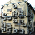
| 02/28/2006 07:41:54 AM | Obsessive About Aircon (Greed)by scared_of_the_darkComment: Hi! Here’s a comment from the Critique Club.
First Impression:
Very busy. My eyes kept searching for a point of interest. Thenâ€Â¦what a lot of AC units!
Composition:
Very busy. May have been cropped to tight. Move back or a wider lens would have put the building in more context with it’s surroundings, with out losing the “greed” feel.
Subject:
May have fit under “Gluttony” better that “Greed.” Don’t know what the building was used for. Good eyes for seeing such a monster usage of AC units.
Technical:
Focus is soft and picture a bit grainy. 800 ISO would not have helped with the grain. Sky is blown as well. Green light creates a hot spot. Given the drab colours, and the lighting conditions, a B&W version may have been more effective.
Summary:
Good capture of the theme.
|
| 02/27/2006 07:24:19 AM | Wrath of the Shooterby drisComment: Hi! Here’s a comment from the Critique Club.
First Impression:
What is it? “Wrath of the shooter” still doesn’t helpâ€Â¦.Maybe two marbles, one broken?
Composition:
Objects lack context information. Verging on abstract.
Subject:
The voter needs to understand this picture to make the connection to “Wrath”
Technical:
Harsh glare, appears as blown whites. DOF is very shallow. More DOF may have helped identify the objects.
Summary:
I don’t know how many voters would have taken the time to figure this picture out. I did get it eventually, but maybe I’m slow!
|
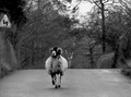
| 02/23/2006 07:54:24 AM | Leaving for the cityby PatrolComment: Hi! Here’s a comment from the Critique Club.
First Impression:
Eyes drawn directly at the animals face, then up to the sign, over to the sky , the dark tree on the right and then back to the animal. Then the more practical question, was it running at you? Good thing you were looking up!
Composition:
Found the sign, sky and trees distracting. Given your subject, tighter cropping may have helped.
Subject:
No problem meeting the challenge. Animals expression is really good! I liked your title. It went with the expression.
Technical:
With no post editing comments, I don’t know what you were trying to achieve. A little more contrast may have improved the flatness of the picture. I found the focus soft with nothing sharp. Given your comment, you may not have had time to keep your subject in focus!
Summary:
The subject and mood were stronger than the technical aspects of the picture.
| | Photographer found comment helpful. |
| 02/16/2006 08:07:27 AM | Be my Valentineby DigiFotoBuddyComment: Hi! Here’s a comment from the Critique Club.
First Impression:
Nice picture! Well titled.
Composition:
Positions are good, lamp on table is effective, but the round object, bottom right is distracting. Perspective is off. You look disproportionaly bigger than your wife. Background lines are distracting due to perspective. You may have cropped too tight. Seeing more of you on your knees may have helped.
Subject:
No problem meeting the challenge. Good choice of subject.
Technical:
Since you didn’t give any post processing notes, I can’t comment on your intent. I find the picture too grainy. Your 1600 ISO would not have helped. The lighting created darker shadows on the objects on the right. The sharpness is soft on the two of you, but more defined on the objects on the right. You two have more gray. The eyes keep getting drawn towards the darkside, (sorry I couldn’t resist)
Summary:
I liked your concept, unfortunately the execution created some distractions. Congratulations on this being your personal best.
| | Photographer found comment helpful. |
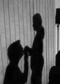
| 02/15/2006 07:47:33 AM | Leaning Shadowby _eugComment: Hi! Here’s a comment from the Critique Club.
First Impression:
Looks like a person standing beside a character with big ears and a hat!
Composition:
Very monotone in terms of colour. Nothing of interest to catch your eye. Including more of you legs may have helped. The “shadow” dominates the image vs being a focal point of interest.
Subject:
You did capture your shadow, so you met the challenge. Unfortunately you didn’t capture your shadow in a very interesting setting
Technical:
Colours are flat, and the added blur softened any contrast you may have been able to create.
Summary:
After reviewing your portfolio, this is not one of you better picturesâ€Â¦.
|
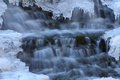
| 02/14/2006 08:08:41 AM | Framed by Ice and Snowby JEFFJSBComment: Hi! Here’s a comment from the Critique Club.
First Impression:
Eye keeps looking for a focus point. Eyes drawn to the frame of ice not the water.
Composition:
You may have cropped too tight. Majority of your picture is blurred
Subject:
Good eyes to see the interesting subject mater.
Technical:
Find there is a tab too much blue. DOF captures the ice well, and your shutter speed adds a nice blur to the water
Suggestions:
More depth of field to include some of the rocks may have made the picture more interesting. (ie your “Beauty in Motion”)
Summary:
Ice adds a very effective frame, but I think you need to modify the balance between “blur” and “in focus”
| | Photographer found comment helpful. |
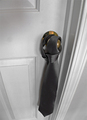
| 02/14/2006 07:32:44 AM | The Flag of Loversby PedxerComment: Hi! Here’s a comment from the Critique Club.
First Impression:
Interesting lines, eyes drawn to the bottom and then back to the door knob. Question, how does this fit with romanceâ€Â¦.aw yaâ€Â¦.now I get itâ€Â¦.
Composition:
Interesting angle but you suffer some perspective distortion. I like the brass colour as a contrast.
Subject:
Don’t know how many people would get this. Does not fall within the “typical” romance theme. I’m sure those who did get it smiled.
Technical:
With no comments to go by, I can’t tell what you did or what you were trying to do. Door & frame are splotchy. Can’t tell if it’s the door or your lens.
Find the focus a little soft. Some USM may have helped. (Hand held @ 1/13?)
Also find the grey scale very narrow. Don’t know what post processing you have available, but a little more contrast would also help.
Summary:
Nice perspective, and cropping. A “clever subject” may have cost you “traditional votes”
| | Photographer found comment helpful. |
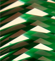
| 02/13/2006 07:36:18 AM | green web (reflection of 2 green hair combs)by AzCKellyComment: Hi! Here’s a comment from the Critique Club.
First Impression:
Busy, interesting patterns, nothing in focus, white is bright
Composition:
Bright white distracting from the green. Some colour would have helped. Nothing really drew my attention. Busy, lots of geometric shapes.
Subject:
Don’t think the description in the title helped. I know when I voted on this picture, the title description threw me. You directed me to look for “the comb”, and not enjoy the “abstraction.”
Technical:
Given the post processing detail you provided, and your comment, you achieved the effect you were looking for. I wasn’t keen on the soft focus and lack of any sharp edges.
The white appeared blown. Some colour could have complemented the green and made the image more interesting.
Summary:
I liked your concept. Abstract is very subjective, what works for one may not for another. For me, I think your post processing may have gone for the wrong effect.
| | Photographer found comment helpful. |
| 02/09/2006 05:22:34 AM | Tiltedby dpattersonComment: Technically not a bad picture, but not very abstract |
|
Showing 181 - 190 of ~455 |
Home -
Challenges -
Community -
League -
Photos -
Cameras -
Lenses -
Learn -
Help -
Terms of Use -
Privacy -
Top ^
DPChallenge, and website content and design, Copyright © 2001-2025 Challenging Technologies, LLC.
All digital photo copyrights belong to the photographers and may not be used without permission.
Current Server Time: 04/14/2025 02:03:28 AM EDT.
|