|
|
|
Showing 111 - 120 of ~455 |
| Image |
Comment |
| 08/28/2006 08:41:25 AM | |  Photographer found comment helpful. Photographer found comment helpful. |
| 08/28/2006 08:15:26 AM | The Habitby timfythetooComment: Hi! Here’s a comment from the Critique Club.
Nice Shot. Congratulations on your 10th place finish.
Well what more can I sayâ€Â¦ you received lots of good comments.
The line in your shirt and some of the blown whites around the hands were the only things that I could comment on. And in Basic Editing, there’s not much you could do about it.
Too bad your timing didn’t catch the red glow of the cigarette being lit. (But being a nonsmoker, drawing in would have been a real choreâ€Â¦or even made you sickâ€Â¦)
Everything else was really well done. I liked the framing, lighting, colours, focus and DOF.
Good luck with future entries
| | Photographer found comment helpful. |
| 08/24/2006 08:44:58 AM | Sparklersby dynamomomof2Comment: Hi! Here’s a comment from the Critique Club.
I’m going to break from my normal form for critiquing for this shot. I normally use a template to cover the different aspects of photography, but a more informal approach may be more effective here.
First, welcome to DPC! This is a great site, and you have the resources of so many excellent photographers to draw upon.
Make sure you enter as many challenges as you can. Learn from the feedback, try to incorporate the learning’s into your future shots. Practice, take lots and lots of shots, try new approaches. That’s the beauty of digital! But most important “Have fun”!
You have already received lots of good feedback on this shot. Poor depth of field, out of focus, grainy, blurry and centered. No need to repeat.
Given your idea, here is how I may have approached it.
1) The sparkler is so bright that it will be totally white with no detail, so ignore the “sparkle” when setting your camera. Set your camera, pointing at what ever else you want to be in focus and properly exposed. (Assuming you are using auto focus)
2) Put the sparkler in some sort of context, totally isolated, in the hand of a child, (show the glow in their face and the sparkle in their eyes), be creativeâ€Â¦
3) The wire rod around the sparkle itself will have a nice red/orange glow, try to capture the “heat.” The spent part of the wire will be nice and black with interesting texture. (Play with B&W but see what colours you can capture)
4) DPC voters typically like sharp photos that “pop.” Blur and out of focus need to be done very carefully. Don’t forget the basic rule of thirds. In most cases it’s a safe technique to follow.
Good luck in future challenges!
Please PM me if you have any questions. (â€Â¦There are no dumb questions!!!)
Bruce
| | Photographer found comment helpful. |
| 08/22/2006 08:14:52 AM | Legs.by APComment: Hi! Here’s a comment from the Critique Club.
First Impression:
Nice shot!. My eye went to the runner, over to the trees, down to the sky and then down the building skyline.
Composition:
Nice framing with the trees. I really like the arch effect. Find the amount of dark trees distracting. I would consider cropping the three trees on the right. This would draw more attention to the runner.
Subject:
Meets challenge
Technical:
Nice DOF and focus. I like the details and colour in the sky and clouds. Very effective lighting on the distant buildings. Green a little bit oversaturated in the trees to the right.
Summary:
Good eye to put this picture together. Not sure about your scoreâ€Â¦may have been the imbalance between dark/light and your subject. Voters don’t spend a lot of time looking at the picture, so 1st impression is important for their initial score.
Good luck with future entries!
| | Photographer found comment helpful. |
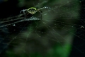
| 08/21/2006 08:16:12 AM | Web of Lifeby honikumComment: Hi! Here’s a comment from the Critique Club.
First Impression:
Nice shot! My eyes went to the spider, the bottom right corner along the bottom and then back to the spider body
Composition:
I like the balance of dark and green. Top left dark balances with the bottom right dark area. The spider balanced by the green area in the bottom right. I think I may have changed the angle slightly to see more of the spider body.
Subject:
Meets challenge, but does not come across as an obvious “looking up” shot.
Technical:
I like the lighting and colours. DOF is really shallow. Would have been nice to have more of the spider and web in focus. You didn’t mention cropping. If this was out of camera placement, well done.
Summary:
Nice capture and colours. The lack of obvious “looking up” and the shallow perspective on the spider may have hurt your score. Voters usually don’t spend a lot of time figuring out what they are looking at. Good luck in future entries!
| | Photographer found comment helpful. |
| 08/17/2006 08:39:52 AM | Jump shotby NuzzerComment: Hi! Here’s a comment from the Critique Club.
First Impression:
Nice shot! My eye went straight to the cue ball, down to the “13”, “1” and then the cue stick. Vivid colours!
Composition:
Nice lines and colours. Some how the balls look too small compared to the bumper height. I like the crop aspect ratio
Subject:
Meets challenge, even though you created the impression!
Technical:
Nice lighting. Yellow ball has a couple of blown areas. Entire shot is soft . Adding blur to the cue ball works, but the rest of the table and balls could have been sharper. Felt looks flat.
Summary:
You had an excellent idea. The overall soft focus may have hurt you with the voters. In this kind of a shot, I think they expect to see everything “pop” to be sharp.
| | Photographer found comment helpful. |
| 08/11/2006 12:49:23 PM | Meditationby zaflaboutComment: Hi! Here’s a comment from the Critique Club.
First Impression:
Nice shot. Eye drawn to the dark hair then up to the sun glow, the shore and then back to the person.
Composition:
Centered composition works for this shot. Wide works, but I find the shallow height raising questions. Given the light & shadows, it makes me think you cropped out a bridge. Not very Zen like. I would have liked to have seen a bit more shore between the person and the bottom. They look crowded.
I like the feeling of “space.”
Subject:
Meets challenge
Technical:
Given the Zen topic, I like what you did technically.
Suggestions:
I like the attempt at “space” but more height would have been effective
Summary:
Nice shot and post processing. I think the cropping and the aggressive aspect ratio may have worked against you.
| | Photographer found comment helpful. |
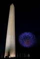
| 07/19/2006 08:02:49 AM | ’Tis of Theeby xlr8tnComment: Hi! Here’s a comment from the Critique Club.
First Impression:
Nice clean lines, nice colours and lighting
Composition:
Perspective of monument seems un-natural. Right side vertical, Left side significant lean. May be optically correct from where you took the picture, but it feels uncomfortable for the viewer. Rotating the picture a few degrees CCW would make it less noticeable.
Too bad you could not have captured the bust in the top third of the frame.
Subject:
Meets challenge
Technical:
Not sure what you did in terms of post processing, but based on your “10” entry, you did do some. Colours, contrast, focus and DOF are really well done.
Suggestions:
You may want to move the burst and add picture to your portfolio. Would be a really great shot!
Summary:
Congratulations on your 11th place finish and your first 6+ shot!
|
| 07/18/2006 08:05:14 AM | Parked behind barsby ArnarHComment: Hi! Here’s a comment from the Critique Club.
First Impression:
Neat shot! Those lines are distracting!
Composition:
Nice angle for picking up the line of trucks. Close crop supports the large truck feel. Very strong colours. Find the “semi transparent” bars distracting. May have worked better for me if they were solid. My eyes want to stay focused on the trucks, to see more detail to appreciate the truck placement.
Subject:
Meets challenge
Technical:
Like the colours, focus and DOF with the trucks. I think you were too close to the bars, creating the semi transparent effect.
Summary:
Voters who speed vote would probably react the same way I did on my “first impression comment.” That would have hurt your score. Those who took time and actually commented gave you a 6.571 avg. vote. As far as Photoshop goesâ€Â¦that can be a crutchâ€Â¦it’s all in what you “see”
| | Photographer found comment helpful. |
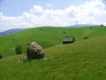
| 07/17/2006 08:18:57 AM | lonelyby anotherdayComment: Hi! Here’s a comment from the Critique Club.
First Impression:
My eyes went to the “what appears to be a bale of hay” then to the white object on top then the cabin to the right then the cabins on the far hill.
Composition:
Nice classic thirds. I like the fact that nothing is centered. Given the foreground location, I assume the hay is your main subject.
Subject:
Meets challenge, but I’m not sure what I’m looking at. As mentioned by the voters, it’s a very nice landscape shot, and I agree, what a really nice location!
Technical:
Everything is a little soft. Nothing jumps out as being in focus. Assuming your bale of hay is your main subject, I would have expected it to be full of detail and in sharp focus.
Given the light, you could have closed down your Fstop and shot at a slower speed. F6.3 would have limited your depth of field. It also looks like you used center weighting for your light meter and focus setting. That would explain why the bale does not have better attributes.
Summary:
Congratulations on your 4th best shot with a 81% placement. I would have liked to have seen a stronger main subject. Something that jumps out at you, and catches your attention. I think the vista view and nice lines really carried this shot.
| | Photographer found comment helpful. |
|
Showing 111 - 120 of ~455 |
Home -
Challenges -
Community -
League -
Photos -
Cameras -
Lenses -
Learn -
Help -
Terms of Use -
Privacy -
Top ^
DPChallenge, and website content and design, Copyright © 2001-2025 Challenging Technologies, LLC.
All digital photo copyrights belong to the photographers and may not be used without permission.
Current Server Time: 04/12/2025 11:24:57 AM EDT.
|