| Image |
Comment |
| 05/21/2007 12:46:26 PM |
Shawlby lecter1963Comment: This is a nice photo. I can't tell, but is there a streak from the corner of her mouth extending down the shawl to her shirt that is supposed to be desaturated? It's kind of hard for me to tell. |
 Photographer found comment helpful. Photographer found comment helpful. |
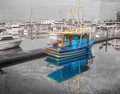
| 05/21/2007 12:44:42 PM |
REFLECTIONSby coolblueComment: Great selection. I'm not sure that it would help or not, but I'd be curious to see what this would look like if only the reflection of the boat was in color, rather than both boat and reflection. Still, well done. 8 |
| Photographer found comment helpful. |
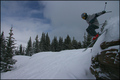
| 05/21/2007 12:43:17 PM |
Discarded...by mistComment: This is a funny photo. Is that gravel desaturated, or is it naturally gray like that? Either way, I like the look on Kyle's face. It goes with the title well. |
| Photographer found comment helpful. |
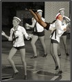
| 05/21/2007 12:41:45 PM |
Boogie Woogieby runericComment: Interesting selection. The color really stands out...to the point that it almost seems that she was cut from a different photo and pasted in, though that is clearly not the case. |
| Photographer found comment helpful. |
| 05/21/2007 12:39:38 PM |
|
| Photographer found comment helpful. |
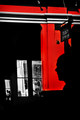
| 05/21/2007 12:39:07 PM |
Kissby grigrigirlComment: Interesting. The only problem that I have is that the red highlights take away from the kiss. I think you want to force the viewer's eye to the kiss in this case by highlighting the couple rather than the surrounding wall. |
| Photographer found comment helpful. |
| 05/21/2007 12:37:02 PM |
ponderby guillermo21Comment: I think I understand what you were going for here, but I would recommend one of two things. Either have her eyes open, with an intense stare at the camera, or make it seem that she's feeling the wind on her face with a fan or something. Just a couple thoughts. |
| Photographer found comment helpful. |
| 05/18/2007 12:26:21 AM |
Please prepare for landing...by geahsklzComment: Originally posted by awpollard:
I took the liberty to work up your shot a bit to illustrate that it is a great shot that just needed some TLC in the digial darkroom. Hope you don't mind.

I may have over sharpened it a bit, but I felt it was a little soft as it stood. Always remember to check your sharpness after a resize because you will lose some detail.
Under basic rules, I worked the dark end of the curve to bring up the shadows and mids which also brightened the overall shot. Once I worked the curve, I added a little contrast to give it a little pop. I added a couple of clicks of saturation and then boosted the greens just a little more.
Again this is a great composition and playing with curves possibly would have brought your score up a whole point or more.
Andy |
Hey Andy...really well done. Thank you so much for making the effort. It looks light years better. I'm just glad to know that it's possible to improve this shot. I honestly have very little skill in the digital darkroom, and just need some help. I knew it needed some TLC, but didn't know where to start. Thanks again.
Ryan |
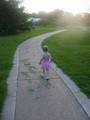
| 05/16/2007 04:49:40 PM |
Walking Awayby tUpAc_LiL_bRoThAComment: Good idea, but I wish it was in focus. Seems that the lighting may have made it difficult to get a quicker shutter speed considering that the little girl probably wasn't interested in standing still. I like the idea of having her in the foreground though. |
| Photographer found comment helpful. |
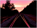
| 05/16/2007 04:37:46 PM |
The Life Beyond the Tracksby Dirt_DiverComment: Great color and choice of location for this photo. The curved tracks, in combination with the high contrast and tone editing (?) create a very interesting image. Well done. |
| Photographer found comment helpful. |
Home -
Challenges -
Community -
League -
Photos -
Cameras -
Lenses -
Learn -
Help -
Terms of Use -
Privacy -
Top ^
DPChallenge, and website content and design, Copyright © 2001-2025 Challenging Technologies, LLC.
All digital photo copyrights belong to the photographers and may not be used without permission.
Current Server Time: 04/08/2025 04:52:49 PM EDT.