| Image |
Comment |
| 06/20/2003 06:53:17 AM |
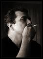
Alone for the Momentby lmhrComment: this is a very nice portrait. i can't really find much to say about it. good use of light and tones, well framed, good depth of field. the lighter texture of the background on the right sets apart the subject nicely and creates a nice sillhouette. there's something i can't put my finger on that keeps me from really loving this, but it's definitely very well done. 9. |
 Photographer found comment helpful. Photographer found comment helpful. |
| 06/20/2003 06:51:32 AM |
Lockedby nathaliedooComment: good lighting and textures. the subject doesn't speak a lot to me, and is almost kind of crowding the image a little too much. although i'm normally a big fan of a shallower depth of field, the slight blur at the top left corner of the object is actually detracting a bit here. maybe instead of framing the entire subject in the center, you could have gotten a bit closer and chosen an abstract detail of the locking mechanism itself. overall, a well composed shot that's just a bit lacking in subject matter. 5. |
| 06/20/2003 06:48:52 AM |
Black Featherby AnnidaComment: this image doesn't have a lot to offer. it's mostly very dark, and while i understand that the challenge topic may have steered you in that direction, i think it really needs more contrast to make the textures pop. brighter light from the side would have helped lighten up some of the feather and show more of its contours and textures. 4. |
| Photographer found comment helpful. |
| 06/20/2003 06:47:25 AM |
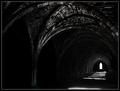
Fountains Abbey by BobsterLobsterComment: this is really nice. i love the shapes and tones here, especially the path of white coming from the window. this must be a really awesome place to be in. good job controlling the light and tones. my only (very) minor gripe is the little cyan blue line in the window. i would have edited that out. it draws my eye while i'm looking at that portion of the image. 9. |
| Photographer found comment helpful. |
| 06/20/2003 06:45:52 AM |
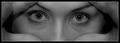
Loving eyesby kiwinessComment: this is a pretty nice shot. you did a good job getting it to be nice and symmetrical, though the eyes are a bit crooked. the lighting is good and works okay with the spirit of the challenge. i'd like to see a little more contrast (brighter highlights, especially in the eyes). it also looks like it may have been a tad over sharpened in post-processing. i like the crop, also. the only thing really lacking is that it doesn't particularly convey much feeling or emotion in me. it's kind of empty. still a good effort. 6. |
| Photographer found comment helpful. |
| 01/27/2003 03:38:04 PM |
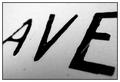
Avenueby mciComment: thanks for the kind words, guys. i appreciate it.
moondoggie - i wasn't getting pissy, it was just an off-handed comment referencing ptlparsons' worthless comment that my photo lacked "validity".
okay, maybe i was getting pissy. heh. |
| 01/27/2003 09:42:06 AM |
Avenueby mciComment: hey, thanks to everyone who liked this. it was my first attempt at a challenge in several months and it scored way below my expectations. i guess i forgot how frustrating this community is as a whole.
apparently this photo has no validity, so i guess i can't complain. |
| 12/16/2002 12:54:38 PM |
Yuleby KimblyComment: completely ripped off. this is just a great, great shot. great concept, colors, cropping, composition, and other c words. |
| 12/08/2002 07:20:08 PM |
A Melancholy Songby indigo997Comment: my favorite this week. a very moody and elegant shot. nicely done. easily better than anything that came in above it, in my opinion. |
| Photographer found comment helpful. |
| 12/08/2002 07:15:03 PM |
|
Home -
Challenges -
Community -
League -
Photos -
Cameras -
Lenses -
Learn -
Help -
Terms of Use -
Privacy -
Top ^
DPChallenge, and website content and design, Copyright © 2001-2025 Challenging Technologies, LLC.
All digital photo copyrights belong to the photographers and may not be used without permission.
Current Server Time: 04/09/2025 07:53:18 AM EDT.