| Image |
Comment |
| 06/26/2003 06:40:28 PM |
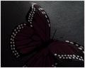
Night Landingby dsidwellComment: i think the background texture really kills this. the lighting is decent, and the shapes and colors of the butterfly are nice, but the texture in the background is really distracting. 5. |
| 06/26/2003 06:38:12 PM |
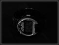
Ironmanby orussellComment: a very boring subject with very flat tonal range. 4. |
 Photographer found comment helpful. Photographer found comment helpful. |
| 06/26/2003 06:36:52 PM |
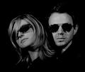
MiB III (The Sequel - Man & Woman in Black)by hughletherenComment: i feel like there has been a very slight motion blur applied to this image and it's kind of unsettling. pretty good lighting, though, especially in the highlights in the glasses and the texture and color the hair. 6. |
| Photographer found comment helpful. |
| 06/26/2003 06:26:08 PM |
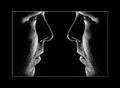
Timeless Youthby dodobirdComment: very dark. i think this kind of photography is all about contrast and areas of very bright light to highlight the contours and shapes of the subject. this loses all of that by using a very low, flat light which doesn't really set the subject apart from the background. 3. |
| Photographer found comment helpful. |
| 06/26/2003 06:25:08 PM |
Dreaming of the Major Leagueby SonifoComment: well done. i like this. the light on the ball and the hand and the glove and the protruding knee is very nice, but i feel like the image goes tonally flat when it moves toward the right. i'd almost like to see him wearing a black t-shirt so that it really broke down to just light and highlights. overall a very strong image, though. 8. |
| Photographer found comment helpful. |
| 06/26/2003 06:23:38 PM |
Reflecting On Self by smellyfish1002Comment: very nice. great light, and very nice concept. my minor gripe is the extrreme white border is kind of hurting my eyes, and the large black border is maybe just a bit too big. the image itself, stripping the borders, is very strong. 9. |
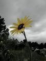
| 06/26/2003 06:22:33 PM |
Left Aloneby K-RobComment: this is nice. i think maybe the sky is just a tad flat though, and it's kind of making me lose the subject in all that gray. i'd love to see this with the sky pushed to a whiter color to highlight the sillhouettes of the tree line and the subject. the rest of the photo has some really nice tones. 7. |
| Photographer found comment helpful. |
| 06/26/2003 06:21:13 PM |
Such is Lifeby karmatComment: good depth of field, but i almost feel like the background cards are just cluttering this up. the black of the lettering on the card would probably look great when coupled with the complete black of the background, but you've thrown a lot of other whites and colors in there and it seems to just clutter it. 5. |
| Photographer found comment helpful. |
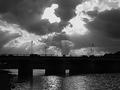
| 06/26/2003 06:20:08 PM |
Bridgeby draney4Comment: i like the idea of stark contrasts here and the sky is really neat, but overall the image seems to just have too much contrast. the blacks are so black that they ultimately lose detail, and the white highlights of the sun are blown out too much. i'd like to see a large image of this, because this small crop is really making it lose a lot of detail. 5. |
| 06/26/2003 06:18:27 PM |
Night Falls on the Ohio Riverby alanfreedComment: this is a nice image. the more i look the more i like it. i think the only thing detracting is the grain, which makes it seem like it's soft on the focus. also, that red light kind of draws the eye, but there's not much you can do about that (maybe clone it out in software). well framed and captured tho. 7. |
| Photographer found comment helpful. |
Home -
Challenges -
Community -
League -
Photos -
Cameras -
Lenses -
Learn -
Help -
Terms of Use -
Privacy -
Top ^
DPChallenge, and website content and design, Copyright © 2001-2025 Challenging Technologies, LLC.
All digital photo copyrights belong to the photographers and may not be used without permission.
Current Server Time: 04/09/2025 07:53:18 AM EDT.