| Image |
Comment |
| 09/05/2002 06:08:00 PM |
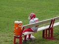
Keeping the Water Companyby karmatComment: I like this subject and the contrast of green and reds in the photo but the one thing that i'm only partial to is the composition. For me, there is too much grass in the upper and left sections of the frame and it distracts from the player. It might be more appealing to me if the left side of the bench were closer to the left edge of the frame and if it were situated a bit higher in the frame to better balance out the color. Plus, it would show more of the bench (if it's empty) and lead the eye through the entire frame, left to right. Good job. Score: 7 Courtenay |
 Photographer found comment helpful. Photographer found comment helpful. |
| 09/04/2002 04:01:00 PM |
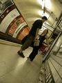
Holding my bag woulda killed you?by annelizabethComment: This is a very well composed shot. Love the angle. The camera performed excelllently with the lighting, kudos! Great depth of field too, everything is perfectly clear. I can't really find any faults with it. Score: 10 Courtenay |
| 09/04/2002 12:29:00 PM |
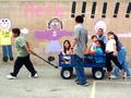
my turn next!by queen 91Comment: Nice shot of kids doing what they love to do best. I like the colorful background and the strong blues. Some of the white areas do look a little overexposed and it looks like the focus is on the wall as the kids appear soft. Good shot. Score: 8 Courtenay |
| 09/04/2002 11:55:00 AM |
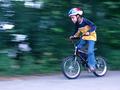
Speed Racer!by KarenBComment: Really good motion photo. Great job keeping focused on the kid's face and having some leading space in front of him. Score: 9 Courtenay |
| Photographer found comment helpful. |
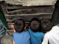
| 09/04/2002 10:05:00 AM |
Spyingby eloComment: This is very well done. I like the framing (not getting the boys' entire bodies or torso in the frame and having enough of the boarded up passageway visible at the top of the frame) as it helps build the mystery of what is behind the boards. Having the boy on the right sticking out of the bottom right of the frame also builds more tension as it seems like he is (and me too) straining to see what is there. Excellent. Score: 10 Courtenay |
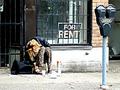
| 09/04/2002 01:04:00 PM |
For Rent: Desperateby JakComment: This is a good photo. With this subject I would say the overexposure works and doesn't really detract from the image. Good framing and placement of the woman within the frame (the parking meter fits right in there). I hope more people notice this too, but the Lucky Charms box is the perfect accent to this photo and the perfect thing to have next to her (for the photo's purposes). The Lucky Charms box seems to be there to mock her "unluckiness". Great job. Score: 9 Courtenay |
| 09/04/2002 09:55:00 AM |
Noodle Manby MartinComment: This is a wonderful photo. The subject is perfectly situated within the frame to let us see what he's doing and his environment; the focus is very sharp and the depth of field is just right to blur the background but not so much that we lose the sense of location. Exposure appears to be dead on. Great job! Score: 10 Courtenay |
| 09/06/2002 09:51:00 AM |
Captivatedby sgtpepper6344Comment: The boy is a good subject but I would like to see more in frame in front of him than is behind him. It would help to give us an idea of what he is looking at or doing (possibly waiting for parent with groceries?). Since he is looking to the right, some of the background stuff on the left is a little distracting. Score: 7 Courtenay |
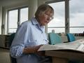
| 09/04/2002 12:49:00 PM |
The news, day by dayby johnmkComment: This is such a pleasing photo. The soft light filling the room gives everything even amounts of light and nothing is overexposed. I like the blue tones present throughout the photo and the expansive dual background (the room wall/windows and the sky outside). Great photo. Score: 8 Courtenay |
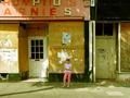
| 09/05/2002 07:02:00 PM |
girl waitingby grahamgormanComment: This is a nice shot. I like the storefronts as the background, they have a great deal of character and add a lot to the composition. The shadow of the tree coming in from the bottom left helps too, especially with the subject standing in it. For me though, the image loses some of its flair and possible impact because the subject is so young and brightly dressed. Others may see this differently though, as a kind of contrast between young and old. For me though she doesn't fit. If a shot like this could have been set up, I would like to see an older person in neutral colored clothing sitting on an old chair or something. But, I do still like it! :) Score: 8 Courtenay |
Home -
Challenges -
Community -
League -
Photos -
Cameras -
Lenses -
Learn -
Help -
Terms of Use -
Privacy -
Top ^
DPChallenge, and website content and design, Copyright © 2001-2025 Challenging Technologies, LLC.
All digital photo copyrights belong to the photographers and may not be used without permission.
Current Server Time: 04/11/2025 12:06:21 AM EDT.