|
|
| Image |
Comment |
| 03/05/2006 03:24:07 PM | Like My Hat?by kdeleonComment: *Critique Club*
If you didn't find any of the other 20+ comments you received as helpful, I'm not sure if I will be able to add anything as I do agree with some of the previous comments, but I'll try.
Per your request, your in depth critique from the Critique Club...
The very first thing I notice about the photo is the chest. The way the shirt blends right in with the black background, it makes the chest seem malformed, or something. The shadow in the cleavage area also looks odd making the chest seem to have indents that seem very unnatural.
The shadow from the head on the upper chest is distracting, and I would have added some kind of side light or something to help reduce those harsh shadows.
The black background works except for the fact that the shirt blends in with it too well, maybe have a different color shirt?
The pattern on the chair makes the photo look too busy to me. The floralish pattern really clashes with the dotted pattern on the hat.
Focus seems ok, maybe just alittle soft, but nothing that seriously harms the photo in that aspect.
The pose seems awkward, like she is sitting on a cactus and although the cactus is there, she really wants to sit down anyway, but just can't.
I think I would have prefered the negative space to be in front of the model. Model and chair on the left of the photo...neg space to the right. As is, the negative space isn't really adding anything to the photo.
I don't think I like the makeup, but for the purpose of fashion, I think it fits. The hat is interesting and I like the 'fashion' aspect of the photo. So it fits the challenge very well.
~Heather~ |
| 02/26/2006 12:32:09 PM | play2.jpgby HBunchComment: Thanks for your comments. It's a self portrait. The cross in the back is actually a towel holder in my bathroom, lmao. I was going to clone it out, but then after editing and looking at it, it kind of looked neat, like it was suposed to be symbolic of something, so I left it. |
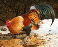
| 02/25/2006 11:05:37 AM | "John-Boy! Have you fed the chickens yet?"by sajinComment: *Critique Club*
This is a very well done photo. The focus and clarity are good. I love the details shown in the feathers and color. Very nice presentation of the rooster.
Lighting is also really good on the rooster, no distracting shadows or bright spots.
The couple things I notice that I think might have improved upon the shot are the division line in the background. it's almost right smack in the center of the photo, which to me doesn't create a good balance in the upper and lower halves. The lower half seems heavy to me.
Also, the crop. I might have liked to see a little more room in front of the rooster, or maybe back it up a bit or take it from a slightly angled position. Something to add a little tad bit of extra visual appeal to the already beautiful rooster.
The leaf 'coming out of the rooster's butt' is a little distracting since it is almost the same color as the rooster's feather's in that area and almost blends in there making a break in the rooster's form. I thin that leaf might be best cloned out.
Otherwise, excellent shot, lovely texture and detail. Beautiful animal. ~Heather~ |  Photographer found comment helpful. Photographer found comment helpful. |
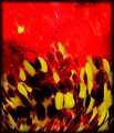
| 02/19/2006 09:38:05 AM | Hot Colorsby gwendyComment: *Critique Club*
This photo is very busy. Definately abstract, but not that attractive to me.
The colors don't seem like the pop as much as I would like them to. The red is nice and vibrant, but the yellow is just kind of dull. I think that if the yellows stood out more against the red, that it would help to add some visual appeal.
It's hard to critique the technical aspects of an abstract, especially with the lack of phtoographer's comments, I can really only offer my opinion since I don't know for sure what your intentions were with this photo.
If I were to guess, I think this would be a blown glass paperweight or something similar.
It's interesting, but just doesn't hold my attention long.
~Heather~ | | Photographer found comment helpful. |
| 02/19/2006 09:31:11 AM | Architecturally abstractby kama0529Comment: *Critique Club*
Definately abstract. I think I could have guessed what this was, especially with the title, so maybe a little lose on the challenge, but still abstract non the less.
The color is nice. The photo is just not holding my attention much. I think that the area in the lower right appears to be the main focal point, since that's where all the lines are drawing my attention to, and that area lacks visual appeal. It's hard to critique the technical aspects of an abstract, but your focus looks good. I wonder what this would be like with a soft focus? Maybe give it a more abstract feel or add something of interest?
Overall, I think it's very representative of an abstract, but lacking something that really holds my interest.
~Heather~ |
| 02/19/2006 09:23:55 AM | Gold & Blueby GIS_boyComment: *Critique Club*
Without any photographer's comments on this, i can only offer my critique based on personal opinion alone, since I have no clue what you were trying to accomplish with this photo.
That being said, I think it's an interesting abstract. Someone suggested that it may be a cactus, but I don't see that. I see something metal here. Not sure what, but somethig metal.
The colors are neat, and the lines add something to the photo, but for me, it lacks something that really makes it pop. It's hard to give technical review on an abstract, but I see your focus is good, and the angle of the object isn't boring, but still lacking something for me. Overall, nice colors, focus and angle.
~Heather~
Edit to add that I saw your Alien Remnants photo and THAT one really stands out to me. I much prefer that one. I like the lines, the color and that one holds my interest much much more than this one does. More to look at, I think. Message edited by author 2006-02-19 14:26:04. | | Photographer found comment helpful. |
| 02/19/2006 09:17:58 AM | Cosmicby InnaNComment: *Critique Club*
How do you touch base on the technical aspects of an abstract? Tough one.
I will say that I love the color, the way that the slight variations of the color flow through the photo is nice, I like the background with the forground colors and I think the soft focus works really well to create an abstract feel.
Placement of the subject (curved line) is great. Not dead center, but off center works really well to create some visual appeal.
I think with abstracts, you gotta go mostly with visual appeal, and to me, this photo has just that. I really love the colors and the overall feel and flow of the image.
Not really much to add, due to your lack of photographer's comments, I am not really sure what you personally were going for, so I wouldn't be able to tell you if you succeeded in YOUR goal, but the image is appealing.
~Heather~ | | Photographer found comment helpful. |
| 02/03/2006 07:27:52 AM | The Shawl Of Purple Passionby JunieMoonComment: This photo has a very odd appearance. Because it's a shadow, with her legs together and not seperated, it makes her look like she's got an enormously long torso. Very unflattering stance in this shadowedness. Also, there is very little in focus. All I see in focus is a bit of the shawl, which is definately not the most interesting part of the photo. The shasow of the girl seems not in focus to me, apparent by the fuzzy edges.
The crop is also not my personal preference. It's very close on the sides, chopping off one of her hands, and the long vertical crop even further makes her look distorted enhancing the 'long torso'.
Now, for the most obvious, the editing. Horrible brush marks in the lower legs, head and upper chest. The shadow is grey, and the editing is black. Looks very sloppy that way. Overall, a neat idea, but just not my cup of tea. ~Heather~ |
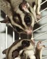
| 01/31/2006 09:53:50 AM | gliders.jpgby HBunchComment: They are mean as fire. lol. Some are nice and will actually fly between 2 people or cuddle up in your pocket, but when I got these, they had been neglected and didn't like people much. All they ever had was each other. They are kind of like lovebirds, in the sense that when they are partnered, if one of them dies, the other will die. These 2 guys were brothers and were very close. They eat bugs, worms, and sweet fruits like strawberries.
These guys got in a fight over something one day, and Sukari (means sweet) killed Chico. It was his ultimate fate, that he soon followed, since they don't like to live life without their partners. After Chico was killed, Sukari opened up to us a bit and didn't mind us so much, but still I guess there's no replacement for his partner, and he eventually quit eating and climbing, and died of what looked like a typical case of depression. :(
They also smelled really bad, since they weren't descented. I miss them, but wouldn't ever like to get them again. lol
They are called Sugar Gliders, if you are interested in them. |
| 01/29/2006 08:15:15 PM | radiator repair man T.U.by undieyatchComment: I'm a radiator repair man too! Uhh...repair PERSON actually, I build them, and if they get dented up when we are making them, we fix them. Anyway... I like him. He's got a lot of character and the photo has personality. I don't mind the darkness on the right because there is a catchlight in his eye that makes up for it. I wish his eyes were crisper, but the overall photo has nice focus. The background works, and color is nice as well. Very lovely photo. ~Heather~ |
Home -
Challenges -
Community -
League -
Photos -
Cameras -
Lenses -
Learn -
Help -
Terms of Use -
Privacy -
Top ^
DPChallenge, and website content and design, Copyright © 2001-2025 Challenging Technologies, LLC.
All digital photo copyrights belong to the photographers and may not be used without permission.
Current Server Time: 04/06/2025 09:50:12 PM EDT.
|