| Image |
Comment |
| 07/28/2005 07:02:07 PM |
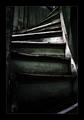
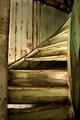
Stairsby jonasvalComment: I love this shot! The coloring/effect gives it such wonderful character and mystery. Great shot! |
| 07/28/2005 06:21:49 AM |
Pocket Acesby reemasComment: I'm giving this one a 10 - I'm not sure what attracted me to it, aside from the color, but I really like it. It's different than all of the other entries I've seen so far. And, of course, I know how hard it is to get a good shot like this. I like your depth of field - not being able to see the community cards is a good thing. Constructive criticism - the background is noticeably grainy. The foreground looks good and sharp, though. Great shot! |
 Photographer found comment helpful. Photographer found comment helpful. |
| 07/27/2005 07:32:34 PM |
The Studentby irikaComment: Great composition. I love the lines of the glasses and the clean white background. Great shot! 9 |
| Photographer found comment helpful. |
| 07/27/2005 07:30:51 PM |
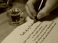
The Poetby rlpenman1Comment: Love the idea, and the composition. My one criticism is the choice of font - it's very easily recognized, and makes it obvious that the page was printed and not actually written by hand. There are tons of free handwriting fonts available for download that wouldn't be so easily recognized. I love the creativity, though! |
| Photographer found comment helpful. |
| 07/26/2005 07:54:17 PM |
smoothby FigoComment: This has a vintage feel to it...like something you'd take with a Polaroid in the 60s or something. (If I'm a decade off, please forgive me....I wasn't born till the 80s :o)) I really like the vintage look, as well as not being able to see her face much. Great shot. |
| 07/26/2005 07:11:50 PM |
|
| Photographer found comment helpful. |
| 07/26/2005 07:11:02 PM |
Polishedby cajayComment: Gorgeous...I love your cropping. One of my favorites. |
| Photographer found comment helpful. |
| 07/26/2005 07:10:02 PM |
Old Stairby russiComment: I really, really like the composition and subject here. I think it would have had more impact in black and white, however. Personally, I think black & white would really help bring out the character in the wood and the peeling paint. Great shot! |
| Photographer found comment helpful. |
| 07/26/2005 07:08:32 PM |
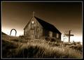
All made from woodby JohannesFrankComment: Beautiful lighting. I love the sepia tone, the composition,the character that shows in the old building, everything. If I could vote, I'd give you a 10. Great shot! |
| 07/26/2005 07:07:17 PM |
2x4by fifieldComment: I love how you made such a simple subject interesting. Great perspective. |
Home -
Challenges -
Community -
League -
Photos -
Cameras -
Lenses -
Learn -
Help -
Terms of Use -
Privacy -
Top ^
DPChallenge, and website content and design, Copyright © 2001-2025 Challenging Technologies, LLC.
All digital photo copyrights belong to the photographers and may not be used without permission.
Current Server Time: 04/07/2025 06:19:14 AM EDT.