|
|
| Image |
Comment |
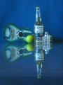
| 10/03/2002 12:51:00 AM | The 3 Amigosby RichiComment: This is a fantastic idea and a superb shot technically. I can't fault lighting, exposure or sharpness. But, I do feel that the subject area looks a little too busy. Although you have followed all the rules of still life to perfection, I think fewer objects would have improved the shot dramatically. For example, to the right of the beer bottle Ãḃ above the dice / dominos Ãḃ there is another jar of some kind, but I can't make out what it isÃḃÂḊ This may sound a little pedantic, but it certainly Ãḃ in my opinion Ãḃ takes a lot away from the overall shot. I really like the balance of the shot and the colours blend together really well. (8) Yes, despite what I say as a critic, I still think it's a class capture Ãḃ just not quite perfectÃḃÂḊ |
| 10/03/2002 12:40:00 AM | Where Butterflies Drinkby LanSnakeComment: CoolÃḃÂḊ Great shot, weird but wonderfulÃḃÂḊ The only gripe I have relates to the extreme top corners. I know this is a tiny area, but it is does drag the eye away. The corners are incongruous to the rest of the image, and although tiny, cropping them, in my opinion, would have enhanced what is otherwise a perfect picture. (9) Great shootingÃḃÂḊ |  Photographer found comment helpful. Photographer found comment helpful. |
| 10/01/2002 05:56:00 AM | |
| 10/02/2002 06:55:00 AM | Bowler's Worst Nightmareby psychephylaxComment: Wicked ideaÃḃÂḊ Great picture, I love the drama captured here. The exposure is superb, but there is a slight lack of sharpnessÃḃÂḊ Great capture (9) |
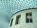
| 10/02/2002 05:21:00 AM | Past, Present & Future.by KaveyComment: Wickedly done. Fantastic use of symmetry and linesÃḃÂḊ Superb composition Ãḃ even the shadows add to the shot positively. Awesome piece of photography (10) | | Photographer found comment helpful. |
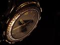
| 10/02/2002 06:27:00 AM | Time of Deathby nards656Comment: Macabre but outstandingÃḃÂḊ This is a superbly composed and dramatically lit shot. The reflection is subtle and hard to make out until you see what it is Ãḃ then it becomes obvious. This is one of those shots that grabs you by the neck and drags you inÃḃÂḊ Brilliant photography (10) | | Photographer found comment helpful. |
| 09/30/2002 06:29:00 AM | Reflection without mirrorby prkembyComment: This is good, really good. The composition makes the image look like the objects are carefully balanced rather than reflected - and the lighting effect is just superb. The much darker surrounding objects add to the balanced effect Ãḃ you have to look really closely to see any reflection there. If I were being cynical, I'd say you have used a mirror and cleverly disguised the fact. But, I have spent the last 20 minutes trying to decide, but can't Ãḃ so, I'd have to say, wicked shot (10) Ãḃ thanks for making this shot really interestingÃḃÂḊ |
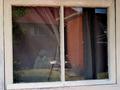
| 09/30/2002 05:36:00 AM | Sky Highby rnkathysComment: Nice shot, but I think you should have cropped it to only show the window frames. This would have created less conflict within the symmetry. The reflection of the sky really works well, but seeing so much of the building draws the eye away from the reflection, the central theme, and changes the composition of subject to the building itself, and not the reflection. Try cropping it down to just the windows and see what you thinkÃḃÂḊ (5) |
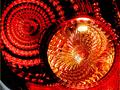
| 10/02/2002 01:00:00 AM | 2002 Toyota Taillight Reflectorby Dallas_TXComment: This is a great shot with a small, but jump in your face flaw. You should have Ãḃ in my opinion Ãḃ cropped the bottom left corner. It's like a magnet, pulling my eyes away from the main subject. OK, so, that's not a big point, but for me it almost kills the effect of the colours - and they really work well - and the sharpness of the overall image (which is first class). I also think the title gives too much away, letting people work things out for themselves can often make a person look at a picture for longer Ãḃ works like that for me. Only my opinion, good luckÃḃÂḊ (5) |
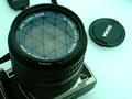
| 10/02/2002 01:51:00 AM | A way to see behind uby habesComment: I like the idea, but I think you should have included the entire window frame and either tilted the camera angle dramatically or remained completely level. Straight lines in a shot will add calm and diagonals will add drama. Mixing both often doesn't work. This shot is a little halfway between the two worlds. Having pointed out the bad bits, I think the idea is sound, the texture of the window frame works really well, it adds a lot of depth to the shot and the colours all work well togetherÃḃÂḊ (4) Sorry to score this so lowÃḃÂḊ Keep shootingÃḃÂḊ |
Home -
Challenges -
Community -
League -
Photos -
Cameras -
Lenses -
Learn -
Help -
Terms of Use -
Privacy -
Top ^
DPChallenge, and website content and design, Copyright © 2001-2025 Challenging Technologies, LLC.
All digital photo copyrights belong to the photographers and may not be used without permission.
Current Server Time: 04/09/2025 08:00:00 AM EDT.
|