| Image |
Comment |
| 01/20/2005 06:52:00 PM |
Witch Hazelby BilberryComment: Greetings from the critique club.
The first thing that strikes me about this picture is that there seems to be no real thought made about composition. I would like to have seen the blossom in the top left cropped out as it is distracting. I would also have preferred the main subject, the blossoms and branch in the foreground, to be whole, that is not cropped as on the right of the shot.
I like the way the shapes and colours from the foreground are carried through to the background providing some continuity to the overall theme but the fact that the foreground is not in sharp focus detracts somewhat. If this section was in sharper focus I think the bokeh in the background would provide more of a contrast and give the foregound more of an impact to really make it stand out.
The photo looks a little muddy on my monitor and could benefit from brightening up a little.
Overall, a nice shot which fits the theme well. |
| 01/20/2005 12:06:07 PM |
One lump ot two..by jonpinkComment: Greetings from the critique club.
It is difficult to find anything constructive to say about this shot that hasn't already been said which is no doubt why it achieved a top ten place.
The very shallow depth of field makes for some nice bokeh in the background, with the theme of coloured dots carried through from the foreground. However, I would like to have seen all of the cup and its contents in sharp focus rather than just the drops, as I believe this would have give the shot more 'punch'.
The composition is interesting but I would like to have seen the use of thirds for the cup and drops. There is a lot of empty space in the centre, which I find a little distracting. Maybe moving the point of view to the left a little and shooting in the direction of the main group of coloured dots may have resulted in a more pleasing composition which would draw the eye more to the main subject, the drops.
Finally, the border adds nothing to the picture. Maybe a black border would have worked better in contrast to the coloured dots, but the white border seems to weaken the effect of these bright colours. |
| 01/19/2005 03:18:34 PM |
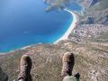
Feet Firstby ManicComment: This is a paragliding shot. I used to do a bit of this myself back in the UK.
Looks like Southern Spain or Canaries to me. |
 Photographer found comment helpful. Photographer found comment helpful. |
| 01/14/2005 02:28:16 PM |
|
| Photographer found comment helpful. |
| 01/14/2005 02:14:09 PM |
|
| Photographer found comment helpful. |
| 12/03/2004 02:09:36 PM |
|
| Photographer found comment helpful. |
| 12/03/2004 01:45:13 PM |
|
| 12/03/2004 12:33:33 PM |
|
| Photographer found comment helpful. |
| 12/03/2004 12:28:23 PM |
|
| 12/03/2004 12:26:04 PM |
|
| Photographer found comment helpful. |
Home -
Challenges -
Community -
League -
Photos -
Cameras -
Lenses -
Learn -
Help -
Terms of Use -
Privacy -
Top ^
DPChallenge, and website content and design, Copyright © 2001-2025 Challenging Technologies, LLC.
All digital photo copyrights belong to the photographers and may not be used without permission.
Current Server Time: 04/12/2025 09:34:13 AM EDT.