| Image |
Comment |
| 01/26/2005 12:13:50 AM |
Generationsby ComputergiComment: Arrgghh, lose the 'quirky' border please, it adds nothing to an otherwise fairly good shot.
Nice use of B&W. I love the old hand around the young girl but does it fit the theme? Maybe if the theme was Old & Young I would score it higher but old & new? |
| 01/26/2005 12:11:27 AM |
Béinchen (1684) & Rout Bréck (1966)by glodaComment: Don't really see the need for the selective desat here, I would have preferred it to me all B&W. Looks blurred in parts, especially around the edges and I can see 'jaggies' on the top bridge. |
 Photographer found comment helpful. Photographer found comment helpful. |
| 01/26/2005 12:10:09 AM |
Lens to Lensby HeavyComment: I'm sure I won't be the only one to dislike the red background. For me it is totally unnecessary and ruins an otherwise decent shot.
The shadows under the cameras are distracting adn it is very similar to many other entries. |
| Photographer found comment helpful. |
| 01/26/2005 12:08:54 AM |
The Ravages of Timeby jemisonComment: Great lighting and composition. Like the condensation on the can and shows more imagination than most of the entries I've seen so far.
Would liked to have a totally black background to give it more punch. |
| Photographer found comment helpful. |
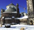
| 01/26/2005 12:07:38 AM |
Symbols of Powerby Toby-DogComment: One of the better buildings shots in this challenge. Strong composition (although I would like to see a tighter crop on the right to get rid of the sky there) and the light is good.
Difficult to get a good exposure with the reflective glass vs. the old stone but you managed it. |
| Photographer found comment helpful. |
| 01/26/2005 12:05:37 AM |
Corks to Threadsby AJFIComment: Nice idea, but the lighting lets this down. Shadows are very distracting. |
| Photographer found comment helpful. |
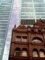
| 01/25/2005 11:58:31 PM |
New Storeys In Old Neighborhoodby badovComment: Wheres the juxtaposition of old & new? You can hardly see the new building in the background which sort of spoils it for me.
Light is very harsh too. |
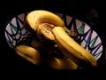
| 01/25/2005 11:57:26 PM |
Can You notice the old one?by greslizzzComment: Another banana shot! I dunno, but rotting fruit just doesn't do it for me,
The bowl adds nothing to the shot and the shadows falling on the lower fruit are distracting. |
| 01/25/2005 11:54:48 PM |
Old and Newby KellsFotosComment: Will suffer because it is WAY too small and full of 'jaggies'.
Would have been a good shot otherwise, although very similar to many other entries. |
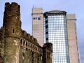
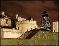
| 01/25/2005 11:54:44 PM |
The Castle and The Skyscraperby redmoonComment: I'm not keen on the harsh shadows on the castle or the green cast to the front wall. Sky looks a little strange too.
Certainly better than many of the building shots I've seen this challenge and fits the theme well. |
Home -
Challenges -
Community -
League -
Photos -
Cameras -
Lenses -
Learn -
Help -
Terms of Use -
Privacy -
Top ^
DPChallenge, and website content and design, Copyright © 2001-2025 Challenging Technologies, LLC.
All digital photo copyrights belong to the photographers and may not be used without permission.
Current Server Time: 04/12/2025 09:56:40 AM EDT.