| Image |
Comment |
| 01/30/2005 12:17:13 PM |
Evolutionby rbennyComment: I'm afraid this will suffer as it is so similar to other entries.
The main subject looks a bit out of focus and those two little marks on the background are distracting. As you couldn't clone them out because of basic editing rules, you perhaps should have spent a little time setting up the shot to get it just right. |
 Photographer found comment helpful. Photographer found comment helpful. |
| 01/30/2005 12:14:33 PM |
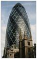
Towersby ManicComment: One of several 'Ghurkin' shots I've come across in this challenge but this one is by far my favourite.
You can almost feel the tension between the new and the old as if the new tower is intimidating the old with it's size and technical superiority. |
| Photographer found comment helpful. |
| 01/30/2005 12:11:06 PM |
|
| Photographer found comment helpful. |
| 01/30/2005 12:10:08 PM |
|
| 01/30/2005 12:08:48 PM |
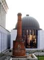
Architectureby AntoninoComment: I think this one needs rotating anti-clockwise a little as the verticals are titled to the right.
I find the foreground distracting and the sky is all blown out. I would like to have seen you zoom in so that you had just the lovely old brick of the chimney against the glass of the dome to give a more abstract and intimate feel to the image. As it is now it has a snapshot feel to it which doesn't do anything emotionally for me. |
| 01/29/2005 10:49:07 AM |
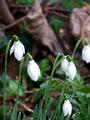
Seeing the World Differently...by TranquilComment: Greetings from the Critique Club.
This image has a lovely abstract feel to it that makes it much more interesting than just another macro of a flower.
The texture and detail in the stamen (thinking back to biology lessons, I think that's the word) provide a great contrast to the softness of the background. I wish that the other stamen in the foreground wasn't there, it niggles me and feels like it is 'in the way'.
I would like to have seen the composition less centred too, with the stamens over to the left a little. As it is now, my eye seems to wonder around the photo.
I think including a little more green from the leaf in the bottom right may have given some balance to the abundance of reds in the picture and also helped to even up the composition.
Lastly, it all looks a little dark and 'muddy' on my monitor, but that could be just be. |
| Photographer found comment helpful. |
| 01/27/2005 02:00:11 PM |
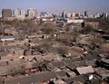
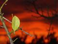
Sprouting Life against Dying Dayby JadeComment: Stunning backdrop and I like the imaginative link to the challenge. I'm hoping this will score well and that people don't score it lower because they think it doesn't fit the challenge (just because it's not a roll of film and a memory card).
The only thing that detracts for me is the foreground doesn't look like it is in sharp enough focus but maybe my eyes are going funny in my old age. 8. |
| Photographer found comment helpful. |
| 01/27/2005 01:56:54 PM |
Fall Colors and Spring Blossumsby fulgentComment: Beautiful colours, great bokeh which is not just there for the sake of it but really adds to the overall feel of the image.
I think this would have been a great contender for the Bokeh challenge too. |
| Photographer found comment helpful. |
| 01/27/2005 01:55:43 PM |
From Student to Masterby ps4610Comment: Many a good tune is played on a old fiddle? If so, that's a very imaginative link to the challenge and made me think a bit unlike some others.
I think it is let down by being a bit dark and I don't like the shadows in the background. Some people are not going to 'get' it. |
| 01/27/2005 01:53:30 PM |
Timelessby grahampComment: Nice enough shot but I'm not sure what that white strip at the top is for. |
Home -
Challenges -
Community -
League -
Photos -
Cameras -
Lenses -
Learn -
Help -
Terms of Use -
Privacy -
Top ^
DPChallenge, and website content and design, Copyright © 2001-2025 Challenging Technologies, LLC.
All digital photo copyrights belong to the photographers and may not be used without permission.
Current Server Time: 04/12/2025 11:25:01 AM EDT.