Leaving a trail of broken heartsby
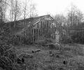
dsa157Comment: This is a good idea, but I think you need to play with it a lttle bit more. I see three problems with this picture, but the good news is that they are all easy to fix.
The first one is the spec on the left side of the picture. The rules allow for cloning it awy so that is easy to fix.
The second problem is that the red colour looks dirty, at least on my monitor. My guess would be that it is the result of to much compression. The picture is only 68kb, so if that is the problem, saving at a higher quality setting should take care of it. There is a tutorial on this that you might want to look at.
The third thing is that the shadows look somehow unnatural to me. Perhaps it is some kind of symbolism that you were aming for, but to me they are distracting. I think you could probably get rid of them by redesigning the lighting, perhaps softening it and moving it higher.
In reading this, you should have in mind that I am no expert photographer, just a bloke who likes to take photos. I just read my commentes above, and they might sound like I'm tearing your photo to pieces, but that is not what I am trying to express. It's not a bad photo actually, I just think it could be better with minimal tweaking.