| Image |
Comment |
| 05/04/2005 02:17:00 AM |
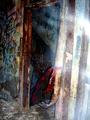
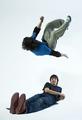
26apr.jpgby om10Comment: This image has lovely tone and light. I'm less keen on the angle and crop - it feels close and confined without really becoming intimate. I think some eye contact would have made it more personal. Mostly I just find myself wondering why he's at such an extreme angle. It looks like you've got a real talent for portraiture, though. |
 Photographer found comment helpful. Photographer found comment helpful. |
| 04/26/2005 03:00:43 AM |
Ghost Shotby Toniann220Comment: It's tantalisingly out of frame - good stuff. Looks more like some fluff close to the lens to me. |
| Photographer found comment helpful. |
| 04/11/2005 01:30:32 AM |
Plainfield, Indiana Riderby chuck50124Comment: Great capture. The slow sync flash really worked for you here. My only comment is that the red shirts in the background are a little distracting. Perhaps B&W would help? 10 |
| Photographer found comment helpful. |
| 04/11/2005 01:28:58 AM |
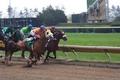
A Day at the Trackby lemondsterComment: Good shot but cropped just a little too far right for my taste. I would have liked the horses just a little more towards the centre. Also a bump in colour and contrast would have added drama. 7 |
| Photographer found comment helpful. |
| 04/11/2005 01:26:24 AM |
Spinning Globeby MaineNeffComment: Not a bad idea but what is that background all about? It's very distracting and is in better focus than the spinning globe. Perhaps a slow sync flash here could have stopped the motion of the globe while keeping the motion blur. That focus would have helped draw the eye back to the globe that should be the main subject of the image. Also, if the pattern on the backdrop is meant to be symbolic then perhaps use some negative space around the globe to really make that aparrent. Finally there is a brown/yellow tint to the image that is most aparrent in the whiter areas of the backdrop. This shot is a really good idea that needs just a little work in my view. 7 |
| 04/11/2005 01:22:15 AM |
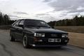
Audi UR Quattro Actionby David-SComment: A good attempt at a magazine style "car in motion" shot. Lacks detail in the black car and overall lacks contrast. The brightness of the sky has forced all the other values into the dark end of the range. 7 |
| 04/11/2005 01:19:54 AM |
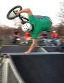
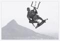
flipby JasComment: Great shot. My only comment is that there seems to be a green colour cast to everything. White balance off? Would have been nice to see the flipper's face too but I understand that might not be very easy. :) 8 |
| Photographer found comment helpful. |
| 04/11/2005 01:04:25 AM |
|
| Photographer found comment helpful. |
| 04/11/2005 01:02:16 AM |
Uuuuiiiiiihhhhhby WinterbergComment: Great motion and atmosphere in this shot. Would love to know how the blurred portions at the sides were done. Colours are a little posterised but that's a big part of the atmosphere. A real winner of a shot. 10 |
| Photographer found comment helpful. |
| 04/11/2005 12:59:22 AM |
Up, up and awayby JeanComment: Great subject and composition but seems to be lacking contrast. A little more work would bring out the detail on your subject and enhance the drama. Overall an excellent shot. 8 |
| Photographer found comment helpful. |
Home -
Challenges -
Community -
League -
Photos -
Cameras -
Lenses -
Learn -
Help -
Terms of Use -
Privacy -
Top ^
DPChallenge, and website content and design, Copyright © 2001-2025 Challenging Technologies, LLC.
All digital photo copyrights belong to the photographers and may not be used without permission.
Current Server Time: 04/09/2025 04:59:07 AM EDT.