| Image |
Comment |
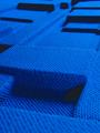
| 07/27/2002 05:38:00 PM |
Blueby pnichollsComment: Very cool. I don't know what it is, but I like it anyway. I give it an 8 |
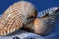
| 07/27/2002 05:41:00 PM |
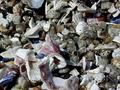
Textures in a Kissby ninaullerComment: Nice looking shells. I find that the cloth they're sitting on to be a little distracting. I love the colors on the outside of the shells, It shows great texture. I give it an 8 Nswenson0 |
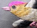
| 07/25/2002 12:35:00 AM |
Grandma's Pillowby Crystal StreamsComment: I really like the colors, texture and the placement of the bird. There's not much I can say against it. I might have shown the entire bird, but cropping it the way you did just seems to work. I'll give it a 9 Nswenson0 |
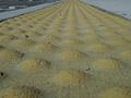
| 07/27/2002 05:58:00 PM |
Rocky Road Aheadby JakComment: That road in the corner is a little distracting, but I still give it a 9. I think this would do even better in a "pattern" challenge Nswenson0 |
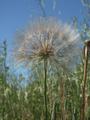
| 07/27/2002 05:37:00 PM |
Soft Enough to Wipe Your Nose Withby BigSmilesComment: I don't like how this picture resembles "The texture of nature", but I can't really count you off for it, so don't worry. The colors are nice and the focus is great, but I think I would have cropped some off the bottom. Tip: I wouldn't actually wipe your nose with this, because a shirt works a lot better! I give it an 8. good job Nswenson0 |
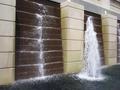
| 07/22/2002 11:48:00 PM |
Wet and Roughby jbolingComment: Looks very good. I think I would have cut off the (half of a) fountain on the very far right, or I would have shown the rest of it. Cutting that fountain right down the middle just doesn't seem right. I do like how you off-centered the big fountain in the middle (Which more than makes up for the cut off one) It's a pretty good picture and I've given you enough crap about it, so here's what I give you: 7 Nswenson0 |
| 07/28/2002 07:40:00 PM |
|
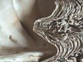
| 07/22/2002 11:37:00 PM |
Take the Rough with the Smoothby sulamkComment: It's a little fuzzy on the left side, but I love how you used more than one texture. Did I mention how cool the silver part looks? -8 Nswenson0 |
 Photographer found comment helpful. Photographer found comment helpful. |
| 07/25/2002 07:40:00 PM |
Red White & Blue.....Sandby rajronComment: Very sharp photo. Not too bad. I think I would have got a little more of the red, white and blue sand. I only see little bits of what the title suggests -8- Nswenson0 |
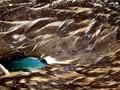
| 07/22/2002 11:52:00 PM |
Not as fluffy as he seems! by PointComment: He looks very daunting and focused (I SURE woudn't stick my finger in his cage!). The picture is VERY good. In fact, I cant really find anything to complain about. 10 |
Home -
Challenges -
Community -
League -
Photos -
Cameras -
Lenses -
Learn -
Help -
Terms of Use -
Privacy -
Top ^
DPChallenge, and website content and design, Copyright © 2001-2025 Challenging Technologies, LLC.
All digital photo copyrights belong to the photographers and may not be used without permission.
Current Server Time: 04/11/2025 12:10:59 AM EDT.