| Image |
Comment |
| 07/06/2005 08:56:25 AM |
|
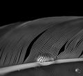
| 07/06/2005 08:54:40 AM |
Water off a ________by roadrunnerComment: this is great! I love the lines, broken by deformations and lens effect of the water drop. B/W works very nicely . My only nit on this one is the water drop in the lower right corner. It is a bit distracting, but overall this is really nice. Well done...bumping up |
 Photographer found comment helpful. Photographer found comment helpful. |
| 07/06/2005 08:51:37 AM |
squashby buzzmomComment: had to look at this for a while to figure it out. love the colors and textures. Can't decide if I would like the green and blue parts to be sharper or not. I'm deciding that they would maybe not look sharp even if they were(are?) though. Very nice shot and idea. bumping up |
| Photographer found comment helpful. |
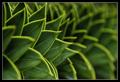
| 07/06/2005 08:48:11 AM |
Caution - monkey tree!by photobornComment: this is almost wonderful. I really like the isolated effect from shallow dof. If only one of the leafs were actually in sharp focus. I keep looking for the one that you had in mind, and can't find it. Nicely done overall though and a good idea. bumping up |
| Photographer found comment helpful. |
| 07/06/2005 08:44:26 AM |
Flower in the rainby marvinComment: a different angle or crop might have worked better here. I find the cut out flower bottom center distracting. pretty good focus - a bit soft - but the colors don't look very atural to me...a bit on the neon/flourescent side for my taste. |
| Photographer found comment helpful. |
| 07/06/2005 08:41:00 AM |
80Aby tcrock41Comment: this has potential, but there are several things I find distracting. the upside down lettering is disturbing as is the shallow dof. There seems to be a lack of continuity as it is not clear what the lower object is. |
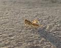
| 07/06/2005 08:35:09 AM |
Young Grasshoppaby mahobbesComment: seems a bit static and isolated. the centered composition doesn't work for me here and the hopper seems a bit out of focus. the back lighting has potential ...I think that you have a near-miss on this one. |
| Photographer found comment helpful. |
| 07/06/2005 08:31:13 AM |
Signs of Lifeby jjhanestadComment: very nice lighting...the colors are nicely muted, giving a real pleasant, peaceful feeling. for some reason, it looks upside down though |
| 07/06/2005 08:29:03 AM |
|
| Photographer found comment helpful. |
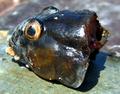
| 07/06/2005 08:25:42 AM |
Kiss Meby jab119Comment: Ha! nice composition...greater depth of field would have helped a lot here. The eyes are perfect but the kisser is out of focus. nice lighting and the colors are as well. |
| Photographer found comment helpful. |
Home -
Challenges -
Community -
League -
Photos -
Cameras -
Lenses -
Learn -
Help -
Terms of Use -
Privacy -
Top ^
DPChallenge, and website content and design, Copyright © 2001-2025 Challenging Technologies, LLC.
All digital photo copyrights belong to the photographers and may not be used without permission.
Current Server Time: 04/13/2025 04:33:19 AM EDT.