| Image |
Comment |
| 07/13/2006 01:15:31 PM |
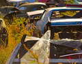
Is this what we call progress?by willhadlComment: I can almost feel the heat in this scene. The choice of viewpoint is excellent, I like the shallow depth of field and the way the background focus has been handled. |
 Photographer found comment helpful. Photographer found comment helpful. |
| 07/13/2006 01:11:00 PM |
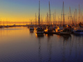
Log Raft to Modern Yachtby GIS_boyComment: This is my favourite picture in the challenge.
Gorgeous lighting and colours. The busy skyline with all those masts contrasts nicely with the subtle ripples of the reflections in the fore"ground". 10, of course. |
| Photographer found comment helpful. |
| 07/13/2006 12:22:59 PM |
|
| Photographer found comment helpful. |
| 07/13/2006 12:18:12 PM |
|
| Photographer found comment helpful. |
| 07/13/2006 12:07:49 PM |
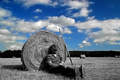
Summer Progressby NigelComment: Love the composition, content and lighting. Hate the selective desaturation, sorry. This would have been a 9 in colour or black and white. |
| Photographer found comment helpful. |
| 06/01/2006 04:33:20 AM |
The Resultsby amandaloreComment: I gave you a 10 for the picture. The harsh lighting, the blue of the towel, the position on the pan :) and the way your head and hands are held really did give an impression of disappointment or despair.
|
| Photographer found comment helpful. |
| 05/31/2006 04:30:32 AM |
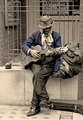
Blues Brotherby jimnessComment: I gave this an 8. It would have been a 10 but I really don't like selective desaturation.
Great subject, composition, lighting and tones. Get rid of the horrible blue and this (in my opinion) would be a fabulous picture. |
| Photographer found comment helpful. |
| 05/31/2006 04:03:33 AM |
Totally In Distressby KitaComment: I think the model's distressed because she's not going to beat her daughter in a challenge again :)
Very nice work. I could read into this that the bright colours of the clothing and the landscape represent what is wonderful in the world and then the fact that there is no direct light on the model and the landscape represents the despair, the disappearance or subdual of the light or hope. But maybe I'm just making all that up... |
| Photographer found comment helpful. |
| 05/17/2006 04:40:36 AM |
Holy n*nby birgirComment: You obviously upset the bigoted cultists ;)
I gave you a 7. I did knock a point or two off portraits if they didn't depict a place... |
| 05/17/2006 03:55:29 AM |
|
| Photographer found comment helpful. |
Home -
Challenges -
Community -
League -
Photos -
Cameras -
Lenses -
Learn -
Help -
Terms of Use -
Privacy -
Top ^
DPChallenge, and website content and design, Copyright © 2001-2025 Challenging Technologies, LLC.
All digital photo copyrights belong to the photographers and may not be used without permission.
Current Server Time: 04/07/2025 06:28:50 AM EDT.