| Image |
Comment |
| 10/12/2005 04:33:48 AM |
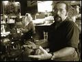
The Regularby tpocComment: Sorry I didn't have time to comment during the challenge itself. Nice work.
I gave you a 7 for this one. It would have been one of my favourites in the challenge but it had two "faults" (personal opinion only) which bothered me. One is that the subject of the picture is a bit too soft for my liking, my preference would be to see him a little sharper. The other is that I don't see any benefit in tilting the camera. I always knock a point off for that ;)
The burnt out window, crockery and table top just add to the atmosphere.
|
 Photographer found comment helpful. Photographer found comment helpful. |
| 10/06/2005 03:06:25 AM |
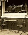
Corner Caféby SJCarterComment: The toning, composition and the rather dull lighting suit the subject. I can see a lot of "digital jaggies" here though which rather detract from the picture.
Just came back to say those leaves up in the top left of the picture really make it for me ;) |
| Photographer found comment helpful. |
| 10/06/2005 03:03:04 AM |
|
| Photographer found comment helpful. |
| 10/06/2005 03:02:16 AM |
into the deepby sodastreamerComment: Very simple but very effective. The composition is good, the colours work and that little swirl is a brilliant finishing touch. 8
Bumping up to 9 on second pass ;) |
| Photographer found comment helpful. |
| 10/06/2005 03:00:36 AM |
|
| Photographer found comment helpful. |
| 10/06/2005 02:59:36 AM |
coffee shop...camera..sun glasses...boredby sajinComment: Weird! I've had so much coffee this morning this one is making my head spin...
It's not just weird, it's also very effective. The detail is all interesting, the colours, composition and even the framing add something. 9
Bumping up to 10 on second pass, after my next pint of coffee ;) |
| Photographer found comment helpful. |
| 10/06/2005 02:58:45 AM |
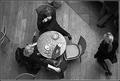
Coffeeby sigrun_thComment: Excellent viewpoint. The lighting and composition are superb and the desaturation works, probably takes out a lot of horrible colours ;)
The moving person adds some mystery and the other chairs just edging into the frame help establish context. Not being able to see any of the faces means that we can make up any story we like for what's happening here. Really nice work. 9
10 on my second pass. Could be a favourite. |
| Photographer found comment helpful. |
| 10/06/2005 02:29:32 AM |
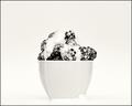
Berries and Creamby joezlComment: This one was so nearly a contender in my mind. The composition is great, I love the size and positioning of the cup or bowl. The arrangement of the berries and the cream really work well, down to the spilt cream around the base. But, (and there's always a but isn't there?) I feel that the lighting is a little too flat, it doesn't lift the bowl and the cream away from the background quite enough, perhaps the background needs to be a little whiter and we need to see a little more shadow? I'm not saying I could do it of course :) It's still a 7 anyway. |
| Photographer found comment helpful. |
| 10/06/2005 02:04:45 AM |
|
| 10/03/2005 04:10:17 AM |
coffee (before)by tateComment: Simple and effective composition, nice choice of background for the beans. I like the shallow depth of field but for me the softness of the leading edge of the subject bean is a tiny problem. I can almost smell the beans.... |
| Photographer found comment helpful. |
Home -
Challenges -
Community -
League -
Photos -
Cameras -
Lenses -
Learn -
Help -
Terms of Use -
Privacy -
Top ^
DPChallenge, and website content and design, Copyright © 2001-2025 Challenging Technologies, LLC.
All digital photo copyrights belong to the photographers and may not be used without permission.
Current Server Time: 04/13/2025 04:49:34 AM EDT.