| Image |
Comment |
| 02/03/2005 06:56:41 PM |
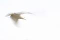
Striped Lightby gajmajComment: great colors, but I think the horizontal bars are more of a distraction then a complement to the image. I'd like to see it tried with the blinds raised, to get pure light unfiltered. -8 |
 Photographer found comment helpful. Photographer found comment helpful. |
| 02/03/2005 06:53:18 PM |
|
| Photographer found comment helpful. |
| 02/03/2005 06:52:22 PM |
Liteby cabaComment: interesting - took a while to see it though. Interested to see how you achieved this. |
| Photographer found comment helpful. |
| 02/03/2005 06:46:07 PM |
|
| 02/03/2005 06:40:52 PM |
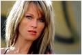
Catchlightsby PedroComment: great eyes! but what's with the dirty cheeks? and what's behind her head? Distracting a bit. -6 |
| Photographer found comment helpful. |
| 02/03/2005 06:40:03 PM |
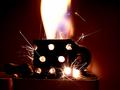
Old Sparkyby Geo_GriffinComment: nice, but I think I'd like to see a different perspective on it. Maybe a 3/4 turn with the dial turned towards the viewer...but nice effect. Love the sparks. - 6 |
| Photographer found comment helpful. |
| 02/03/2005 06:38:14 PM |
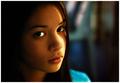
Flirting With The Morning Lightby librodoComment: Stunning portrait. I think I'd like a tighter crop on her...just remove a portion to the right just beyond her shoulder...to bring the focus more on her. Make the canvas a square. But it's breathtaking. - my first 10 |
| Photographer found comment helpful. |
| 02/03/2005 06:35:30 PM |
"Light" Milkby melsterComment: clever idea, but I think it would have been more effective if you put the glas a further distance from the background to remove the hars shadow. It also seems slightly blurred... |
| 01/31/2005 11:54:51 AM |
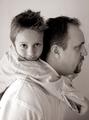
chase.jpgby daveitComment: I agree to some extent with everyonehere. The shot of the boy is great. His facial expression invites you into the picture. However the Father seems like he's saying "did you take the picture yet?" so that he can get his son off his back. Very contrasting thoughts. "come in closer, back away". Makes it very disconcerting.
Also, this is not a pure B/W photo - don't know what you were going for, but you need deeper shadows. Try switching the picture to grayscale to remove the color, then do adjustment levels to make the shadows richer. Then convert back to RGB so that you can add in sepia tones if you desire.
For poses, I'd have dad face the camera at least in 3/4 profile, with a smile on his face. It's is son he's holding. Not a reptile. :) |
| Photographer found comment helpful. |
| 01/31/2005 10:18:38 AM |
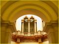
Temple of Lightby AndrewTOComment: having a colored border rarely helps a photo. In this case, since there's already a lot of yellow, I would have used black. I think it would also be better if you tried to remove some of the yellow, as your camera was apperenlty on the wrong exposure setting. Unless the walls really were yellow.... |
| Photographer found comment helpful. |
Home -
Challenges -
Community -
League -
Photos -
Cameras -
Lenses -
Learn -
Help -
Terms of Use -
Privacy -
Top ^
DPChallenge, and website content and design, Copyright © 2001-2025 Challenging Technologies, LLC.
All digital photo copyrights belong to the photographers and may not be used without permission.
Current Server Time: 04/09/2025 12:58:22 PM EDT.