| Image |
Comment |
| 11/16/2005 05:21:09 PM |
Reflection and shadowby sangeethComment: Out of focus. Looks as though you've oversharpened as well in an attempt to get it in focus. Shallow depth of field was the right choice though, but I guess that's what makes the focus so tricky. You could try gluing the coin in position. In terms of composition, I'd have moved the coin down and to the left to get the whole shadow in. |
 Photographer found comment helpful. Photographer found comment helpful. |
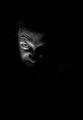
| 11/16/2005 05:16:16 PM |
Lookby arash1987Comment: It's nice to see that the texture of her skin isn't all neat imaged to hell. It's a nice shot. I think it might be improved if it wasn't cropped quite so close on the bottom--it's as if .5% of her nose is cut off (picky, I know). |
| Photographer found comment helpful. |
| 11/16/2005 05:08:51 PM |
|
| 11/16/2005 05:05:49 PM |
|
| 11/16/2005 05:03:29 PM |
|
| Photographer found comment helpful. |
| 11/16/2005 05:02:50 PM |
Morning stretchby trishialwComment: I think you could do with a background that contrasts a little more to give it a little more oomph. |
| Photographer found comment helpful. |
| 11/16/2005 04:58:01 PM |
|
| Photographer found comment helpful. |
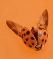
| 11/14/2005 05:10:24 PM |
Dog 1, Pup 0by mksnowhiteComment: This is a fabulous sequence of photos! I'm not very keen on the layout, but does allow you to make each of the three bigger than you could otherwise, which is helpful. |
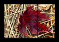
| 11/14/2005 05:07:28 PM |
Fallenby debitiptonComment: I don't think the triptych thing does anything for you at all here. In terms of the image itself, it seems to me that the focus is a little off--the lower edges of the leaf seem to be reasonably in focus, but the bulk of it isn't. There's good colour in the leaf, and there's potential for a really good shot here. If I were to take a shot of this same leaf, I would take it from an oblique angle. I'd probably try for a fairly shallow depth of field, while trying to keep the bulk of the leaf in focus. By shooting it at an angle the shallow depth of field will be more effective as the background and foreground are at a greater distance from the subject. |
| Photographer found comment helpful. |
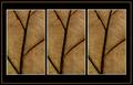
| 11/14/2005 04:55:23 PM |
Natureby aussieComment: I feel like I'm playing one of those "count the differences" games--these are the same photo right? Wouldn't work for most, but I kind of like it here, the repetition of an interesting texture and pattern. I think I would simplify the border a little (plain black would do it for me I think). |
Home -
Challenges -
Community -
League -
Photos -
Cameras -
Lenses -
Learn -
Help -
Terms of Use -
Privacy -
Top ^
DPChallenge, and website content and design, Copyright © 2001-2025 Challenging Technologies, LLC.
All digital photo copyrights belong to the photographers and may not be used without permission.
Current Server Time: 04/12/2025 05:23:49 AM EDT.